Living in a world of big data comes with a certain challenge. Namely, how to extract value from this ever-growing flow of information that comes our way. There are a lot of great tools that can help us, but they all require a lot of resources. So, how do we ease the burden on this CPU/RAM demand? One way to do it is to share the data we are working on and the results of our computations with others.
Imagine a team of data scientists working on a problem. Each of them attacks the problem from a different angle and tries various techniques to tackle it. But what they all have in common is the data lying at the base of the problem. So, why should this data be instantiated multiple times in cluster memory? Why shouldn’t it be shared between all team members? Furthermore, when someone on the team makes an interesting discovery about the data, they should be able to share their results with others instantly so that everyone can benefit from the new insight.
The Solution
Technologies
The IPython notebook is a well-known tool among the data science community. It serves both as a great experimentation tool and research documentation device. On the other hand, Apache Spark is a rising star in the Big Data world, that already has a Python API. In this post we’ll show how combining these two great pieces of software can improve the data exploration process.
Simple data sharing
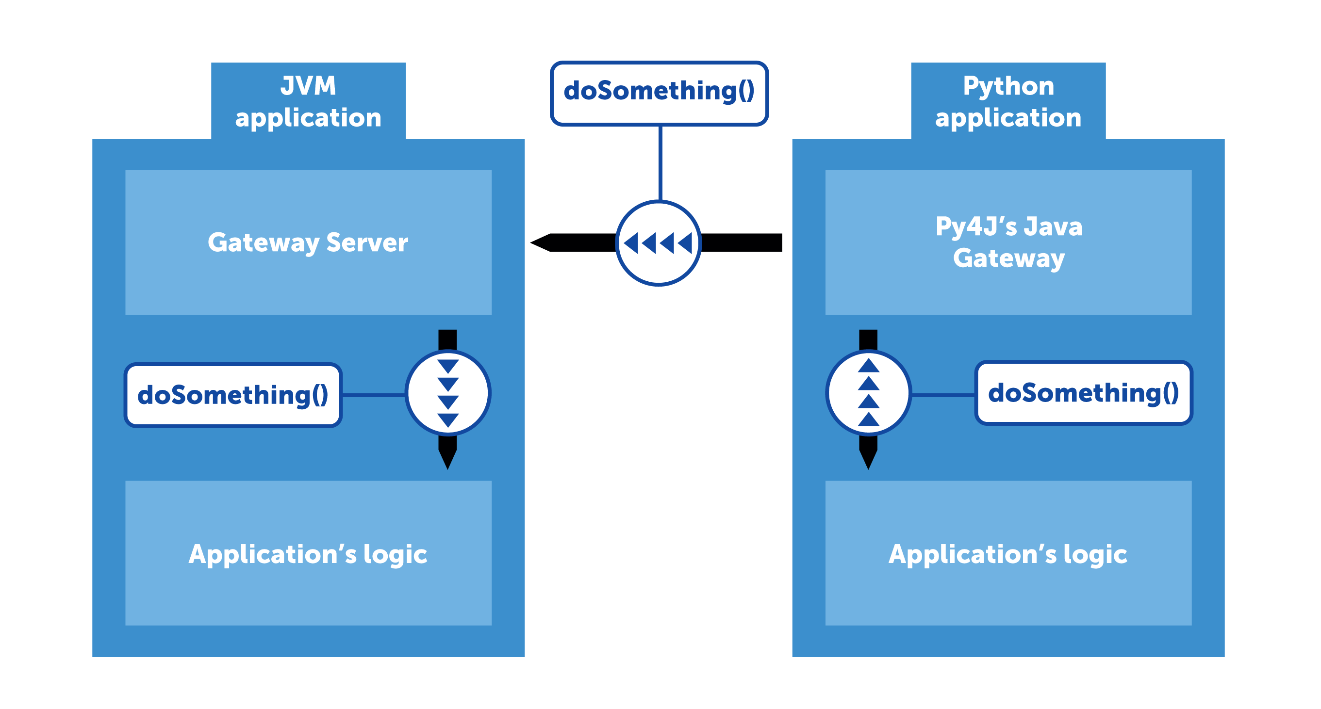
Let’s run a simple Spark application (in our heads, for now – it’s far easier to debug and compile times are awesome) that reads a CSV file into a DataFrame (Spark’s distributed data collection). This DataFrame is large – several gigabytes, for example (or any number that You feel is noticeable across the cluster). How can we share this DataFrame between multiple team members? Let’s think of our application as a server. A server can handle multiple clients and act as a “hub”, where shared state is stored.
Luckily for us, Spark is well prepared for such a use case. Its Python API uses a library called Py4J that acts as a proxy between Python code and the JVM-based core. Internally, Py4J works like this: the JVM process sets up a Gateway Server which listens on incoming connections and allows calling methods on JVM objects via reflection. On the other side of the communication pipe, Py4J provides Java Gateway, a Python object that handles “talking” to the Gateway Server and exposes objects imitating those in the JVM process.
Let’s quickly add this functionality to our imaginary application. By now it has read our big DataFrame and exposed a server to which we can connect and perform operations on JVM objects. But on which objects exactly? We can’t just say “let’s do a .select() on that DataFrame”. That’s why Py4J allows us to define the Entry Point: an object proxied to Python side by default. Let’s put our DataFrame in this object and define an access method that returns it. Now, anyone that connects to our Gateway Server can use the DataFrame without it being duplicated in cluster’s memory.
We’ve managed to convince our Spark application to serve a DataFrame. But when we build another DataFrame, we’d like other users to be able to access it. Let’s add a collection of DataFrames to our Entry Point. For simplicity, let it be a String → DataFrame map. Whenever we want to share our results with other team members, we just need to append a new mapping to the collection: “my new result” → DataFrame. Now, anyone can access the map and see what we’ve done. Just remember to stay thread-safe :).
Using this core functionality, it’s now easy to think of possible improvements like
user management, each user having their own namespace, being able to share what they want with only selected colleagues
notifications: “Look, John published a new result!”
sharing more than just data: any JVM object can be shared this way, provided it’s immutable (mutable objects can be shared as well, of course, but for obvious reasons it’s best to avoid that if possible)
Of course, this is only a taste of what can be achieved using this technique. Please let us know if you come up with an interesting application for it.
Putting it all together
Below is an outline of how to set up both JVM (Scala) and Python side of the above solution. Your Spark application should basically run in an infinite loop. In order to control it better, you could add some custom methods to the Entry Point like “shutdown application”, but it’s not mandatory.
Scala code
class MyEntryPoint() {
    def getDataFrame(id: String): DataFrame = // ...
    def saveDataFrame(id: String, dataFrame: DataFrame) = // ...
    // ...
}
val gatewayServer = new GatewayServer(new MyEntryPoint(), 8080)
gatewayServer.start()
The last line contains a reference to protected _jdf member of DataFrame object. While this is a bit unorthodox, it’s used here for simplicity. The _jdf object is Py4J’s proxy to the corresponding JVM DataFrame object. An alternative implementation requires us to share Spark’s SQLContext over Py4J connection and registering our output DataFrame as a temporary table.
https://deepsense.ai/wp-content/uploads/2019/02/cooperative-data-exploration.jpg217750Piotr Łusakowskihttps://deepsense.ai/wp-content/uploads/2023/10/Logo_black_blue_CLEAN_rgb.pngPiotr Łusakowski2016-01-27 19:18:432021-01-05 16:51:43Cooperative data exploration
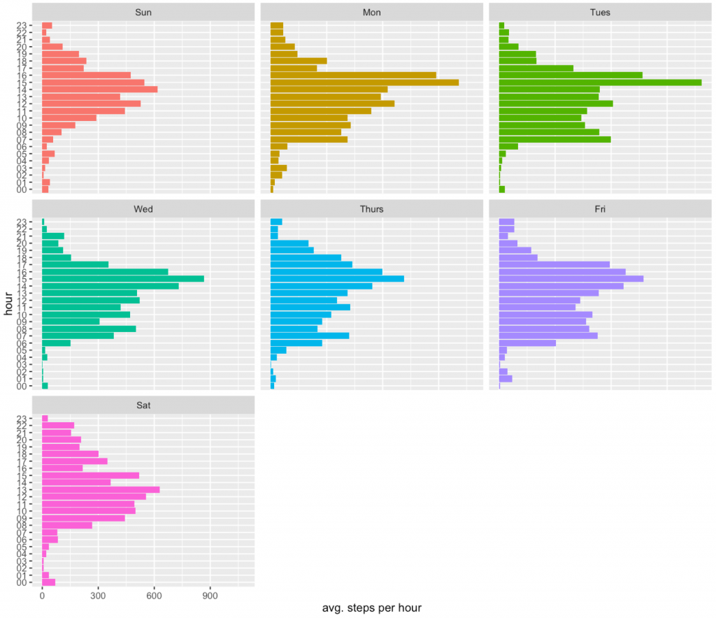
Last week we have downloaded and loaded into R data from fitness tracker (motion coprocessor in iphone). Then with just few lines of R code we decomposed the data into a seasonal weekly component and the trend. Today we are going to see how to plot the number of steps per hour for different days of week. And then same data will be used to check how often there was any activity at given time.
To plot the activity we need to do some aggregation. Here we will count number of steps per hour per day of a week.
dataDF <- xml_dataSelDF %>%
   group_by(wday, hour) %>%
   summarise(sum = sum(value))
head(dataDF)
# Source: local data frame [6 x 3]
# Groups: wday [1]
#
#     wday   hour   sum
#   (fctr) (fctr) (dbl)
# 1    Sun     00  2013
# 2    Sun     01  2475
# 3    Sun     02   347
# 4    Sun     03   919
# 5    Sun     04  2158
# 6    Sun     05  4062
Great. How to present this data? Of course with ggplot2!
Here the geom_bar geometry will be used to present number of steps per hour for different days of week.
As we see the largest activity is around 4pm (time to collect kids from schools).
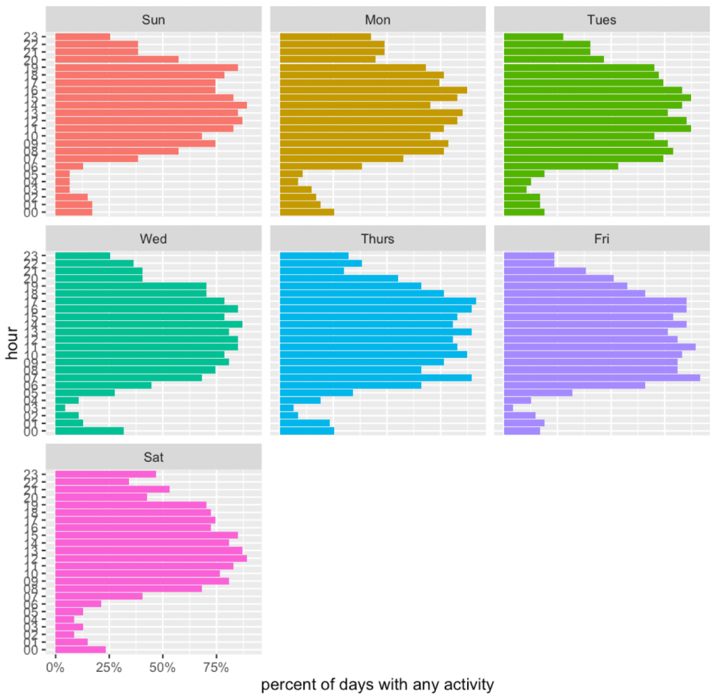
We can use such data to try other things.
Like for example, one can check if there was any activity during this hour. It will not be 100% accurate, since not always phone is in the pocket.
Then we will compute the fraction of days in which there was any activity during this hour.
Let’s see these patterns.
dataDF <- xml_dataSelDF %>%
  group_by(day, wday, hour) %>%
  summarise(sum = sum(value)>0 + 0) %>%
  spread(hour, sum, fill=0) %>%
  gather(hour, value, -day, -wday) %>%
  group_by(wday, hour) %>%
  summarise(mv = mean(value))
head(dataDF)
# Source: local data frame [6 x 3]
# Groups: wday [1]
#
#     wday   hour         mv
#   (fctr) (fctr)      (dbl)
# 1    Sun     00 0.17021277
# 2    Sun     01 0.17021277
# 3    Sun     02 0.14893617
# 4    Sun     03 0.06382979
# 5    Sun     04 0.06382979
# 6    Sun     05 0.06382979
And the ggplot.
ggplot(dataDF, aes(x=hour, y=mv, fill=wday)) +
  geom_bar(stat="identity") +
  facet_wrap(~wday) +
  coord_flip() + theme(legend.position="none") +
  ylab("percent of days with any activity") + xlab("hour") +
  scale_y_continuous(label=percent)
https://deepsense.ai/wp-content/uploads/2019/02/Exploration-of-data-from-iPhone-motion-coprocessor-2.jpg3371140Przemyslaw Biecekhttps://deepsense.ai/wp-content/uploads/2023/10/Logo_black_blue_CLEAN_rgb.pngPrzemyslaw Biecek2016-01-21 22:06:002021-01-05 16:51:47Exploration of data from iPhone motion coprocessor (2)
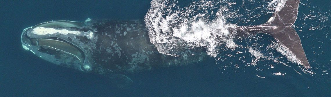
Right Whale Recognition was a computer vision competition organized by the NOAA Fisheries on the Kaggle.com data science platform. Our machine learning team at deepsense.ai has finished 1st! In this post we describe our solution.
The challenge
The goal of the competition was to recognize individual right whales in photographs taken during aerial surveys. When visualizing the scenario, do not forget that these giants grow up to more than 18 metres, and weigh up to 91 tons. There were 447 different right whales in the data set (and this is likely the overall number of living specimens). Even though that number is (terrifyingly) small for a species, uniquely identifying a whale poses a significant challenge for a person. Automating at least some parts of the process would be immensely beneficial to right whales’ chances of survival.
“Recognizing a whale in real-time would also give researchers on the water access to potentially life-saving historical health and entanglement records as they struggle to free a whale that has been accidentally caught up in fishing gear,”
— excerpt from competition’s description page.
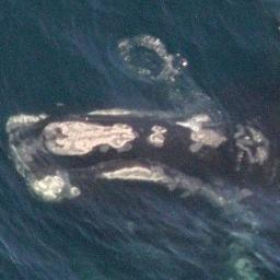
The photographs had been taken at different times of day, and with various equipment. They ranged from very clear and centered on the animal to taken from afar and badly focused.
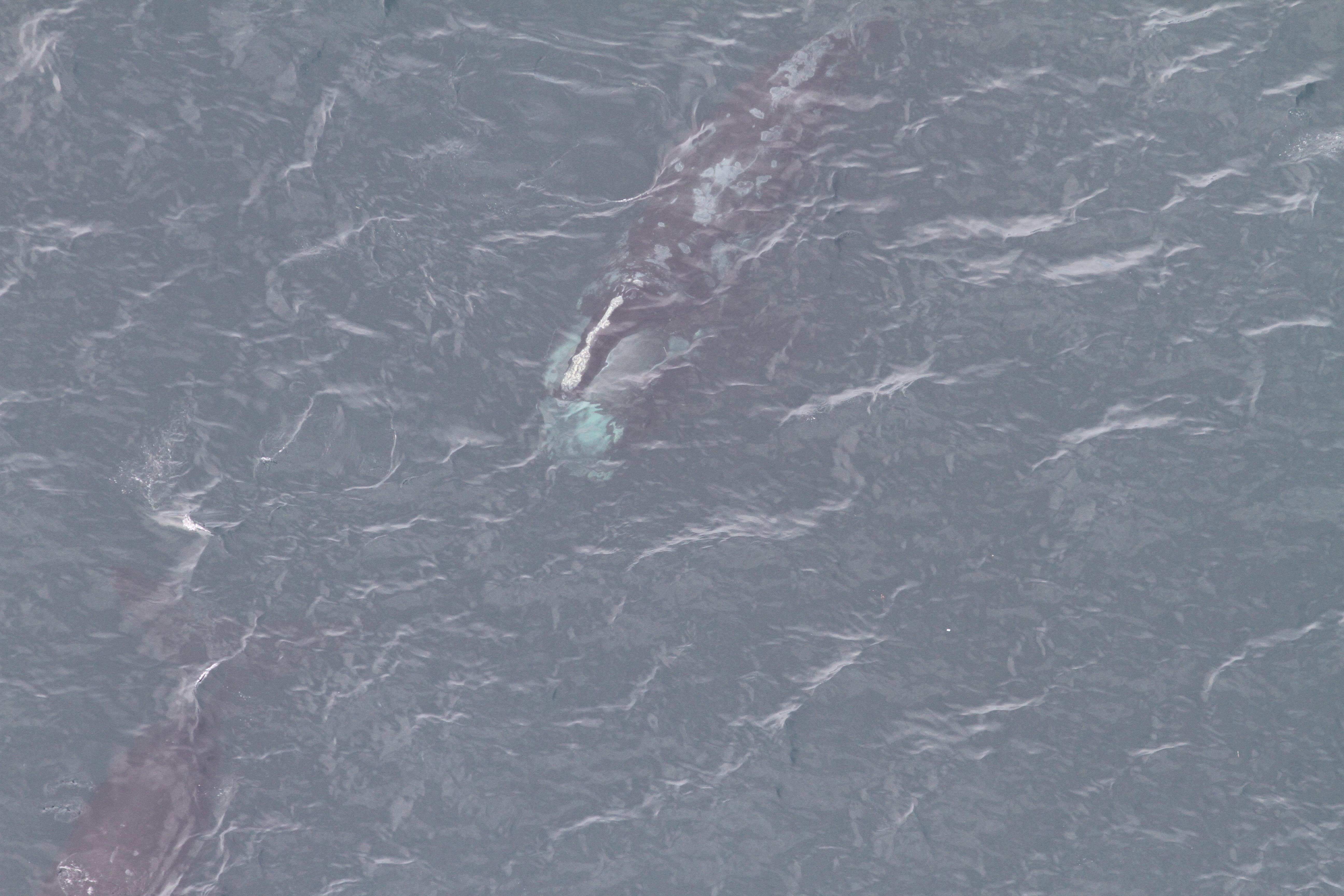
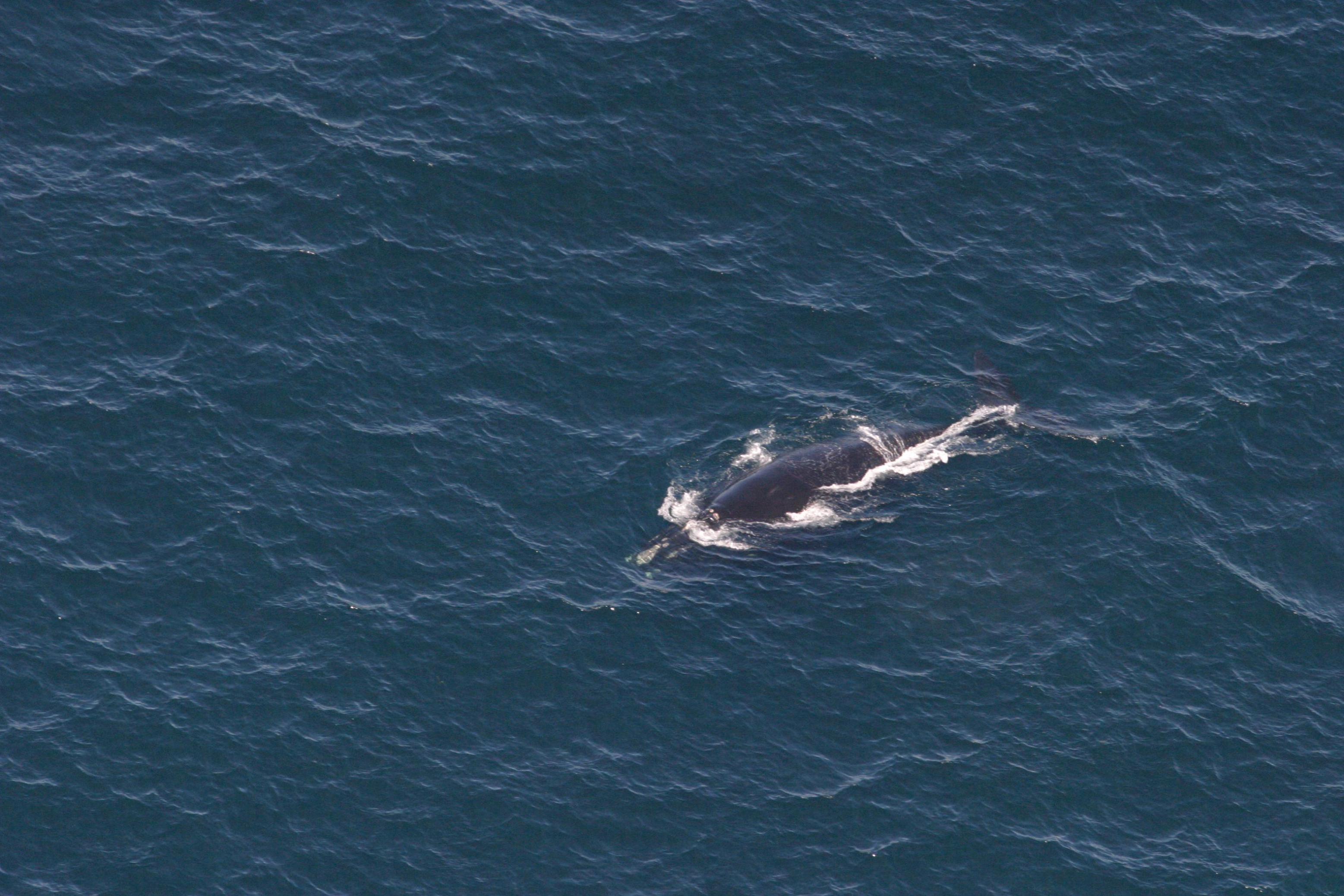
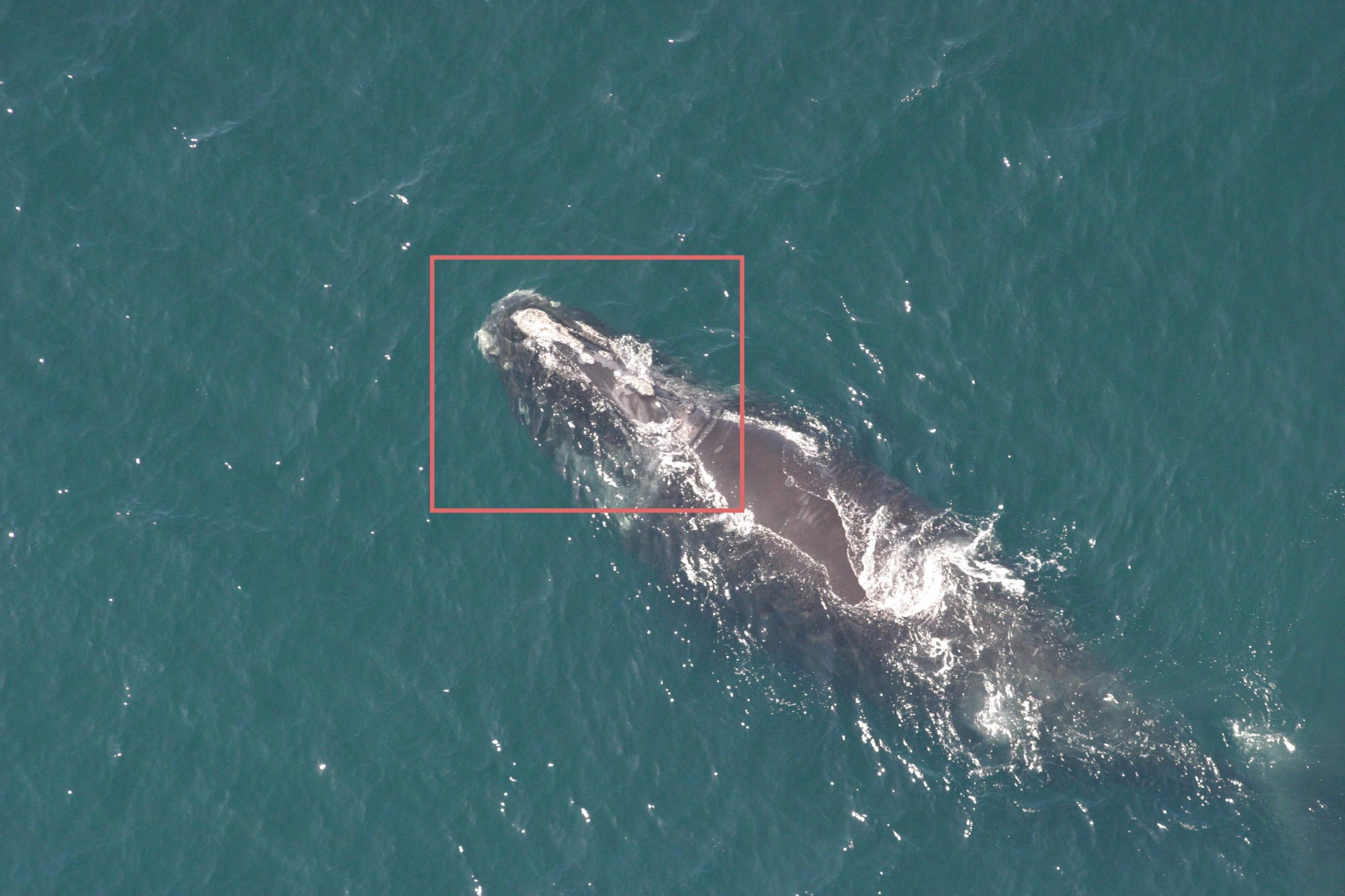
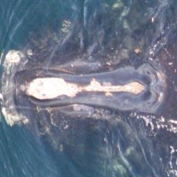
A non-random sample from the dataset
The teams were expected to build a model that recognizes which one of the 447 whales is captured in the photograph. More technically, for each photo, we were asked to provide a probability distribution over all 447 whales. The solutions were judged by multiclass log loss, also known as cross-entropy loss.
It is worth noting that the dataset was not balanced. The number of pictures per whale varied a lot: there were some “celebrities” having around forty, a great deal with over a dozen, and around twenty with just a single photo! Another challenge, is that images representing different classes (i.e. different whales) were very similar to each other. This is somewhat different than the situation where we try to discriminate between, say, dogs, cats, wombats and planes. This posed some difficulties for the neural networks that we had been training – the unique characteristics that make up an individual whale, or that set this particular whale apart from others, occupy only a small portion of an image and are not very apparent. Helping out our classifiers to focus on the correct features, i.e. the whale’s heads and their callosity patterns, turned out to be crucial.
Convolutional neural networks (CNNs) have proven to do extraordinarily well in image recognition tasks, so it was natural for us to base our solution on them. In fact, to our knowledge, all top contestants have used them almost at every step. Even though some say that those techniques require huge amounts of data (and we only had 4,544 training images available with some of the whales appearing only once in the whole training set), we were still able to produce a well-performing model, proving that CNNs are a powerful tool even on limited data.
In fact our solution consisted of multiple steps:
– head localizer (using CNNs),
– head aligner (using CNN),
– training several CNNs on passport-like photos of whales (obtained from previous steps),
– averaging and tuning the predictions (not using CNNs).
One additional trick that has served us well is providing the networks with some additional targets, even though those additional targets were not necessarily used afterwards or required in any way. If the additional targets depend on the part of image that is of particular interest for us (i.e. head and callosity pattern in this case), this trick should force the network to focus on this area. Also, the networks have more stimuli to learn on, and thus have to develop more robust features (sensible for more than one task) which should limit overfitting.
Software and hardware
We used Python, NumPy and Theano to implement our solution. To create manual annotations (and do not lose sanity during these long moments of questionable joy) we employed Sloth (a universal labeling tool), as well as an ad-hoc Julia script.
To train our models we used two types of Nvidia GPUs: Tesla K80 and GRID K520.
Domain knowledge
Even though it seems significantly harder for humans to identify whales than other people, neural networks do not suffer from such problem for obvious reasons. Even then, a bit of Wikipedia research on right whales reveals that “the most distinguishing feature of a right whale is the rough patches of skin on its head which appear white due to parasitism by whale lice.” Turns out that it not only distinguishes them from other species of whales, but also serves as an excellent way to differentiate between specimens. Our solution uses this fact to great lengths. Besides this somewhat trivial hint (provided by the organizers) about what to look at, we (sadly) posses no domain knowledge about right whales.
Preparing for the take-off
Before going further into the details, a disclaimer is needed. During a competition, one is (or should be) more tempted to test new approaches, than to fine tune and clean up existing ones. Hence, soon after an idea had proved to work well enough, we usually settled on it and left it “as is”. As a side-effect, we expect that some parts of the solution may possess unnecessary artifacts or complexity that could (and ought to) be eliminated. Nevertheless, we have not done so during the competition, and decided not to do so here either.
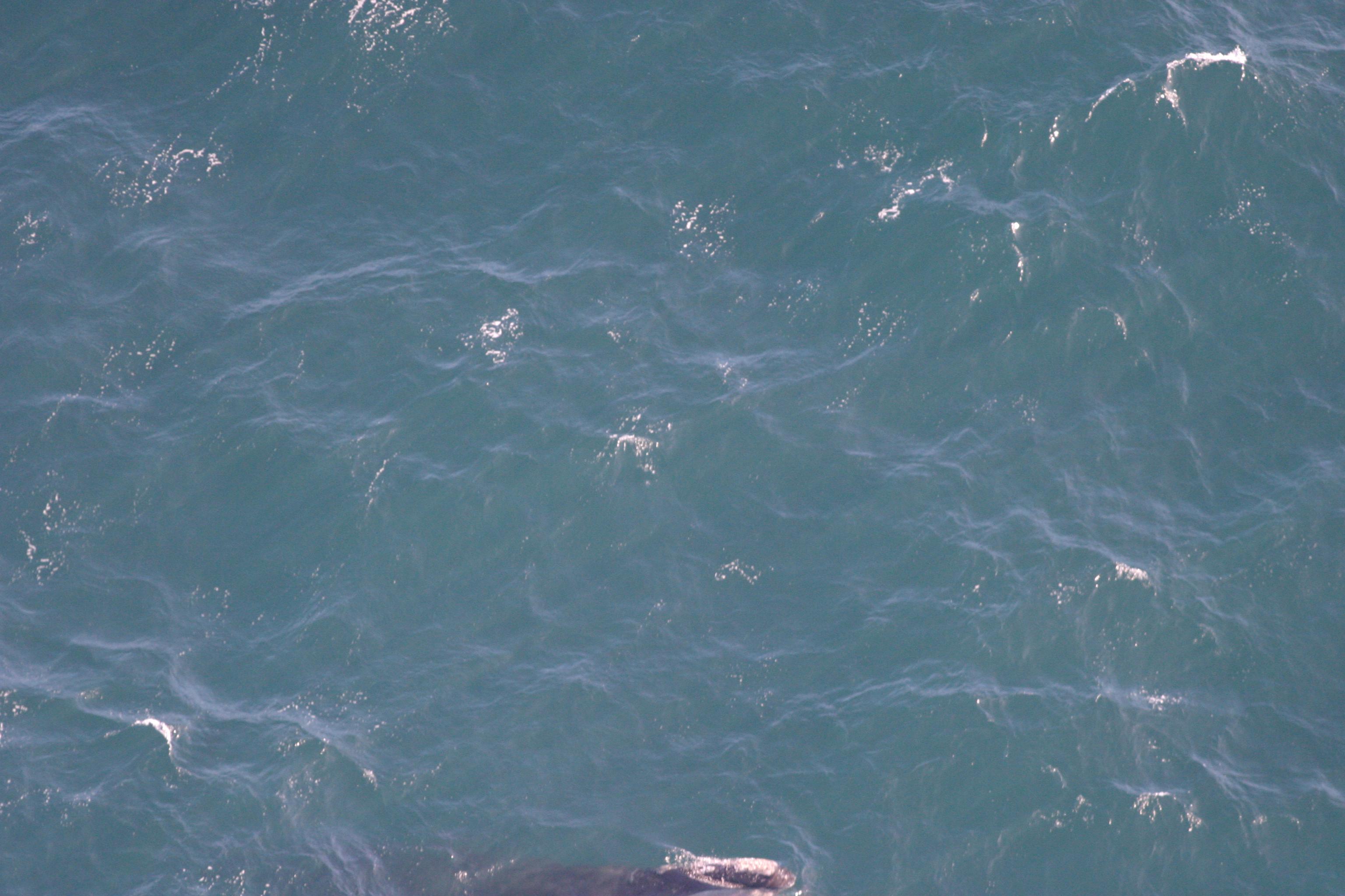
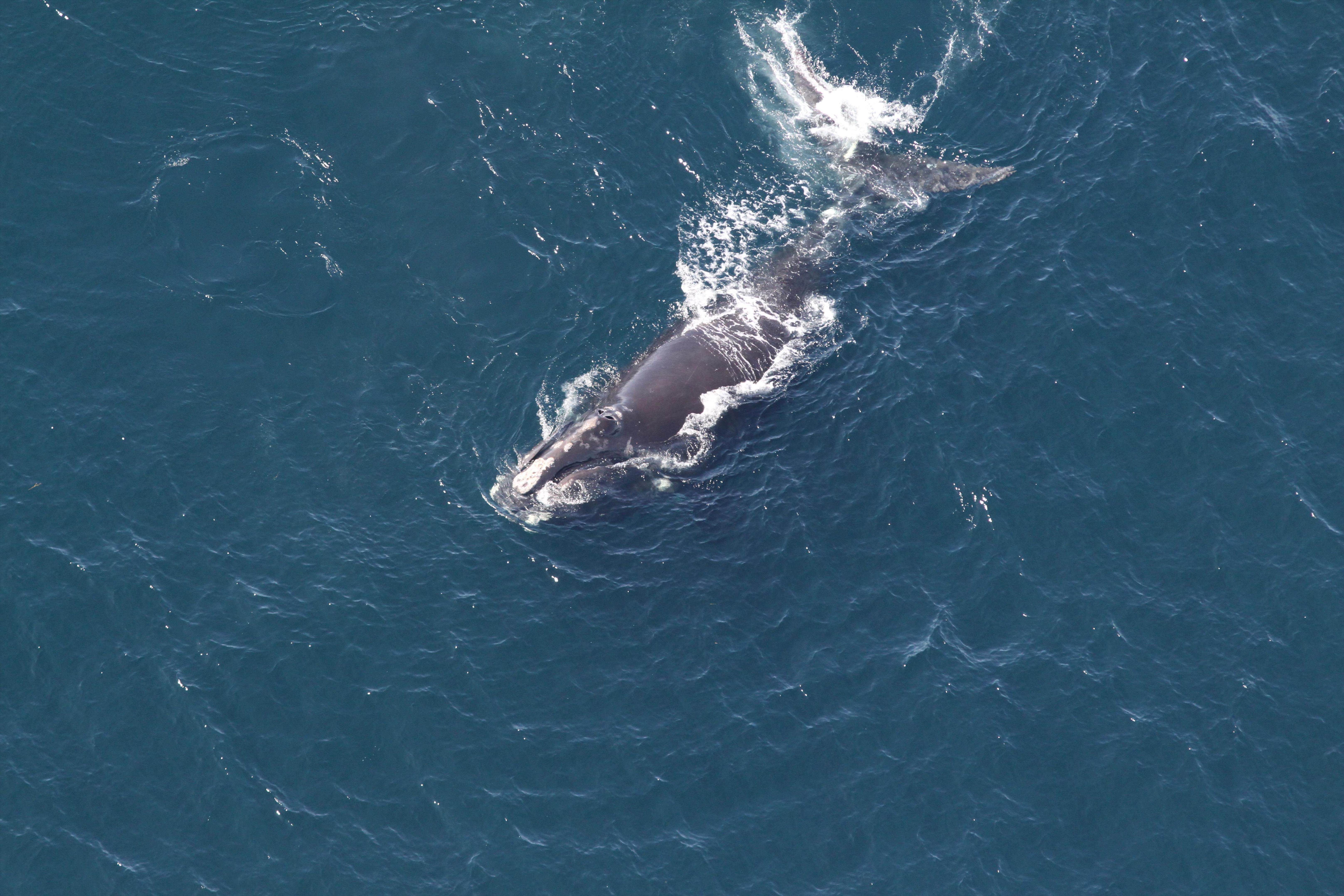
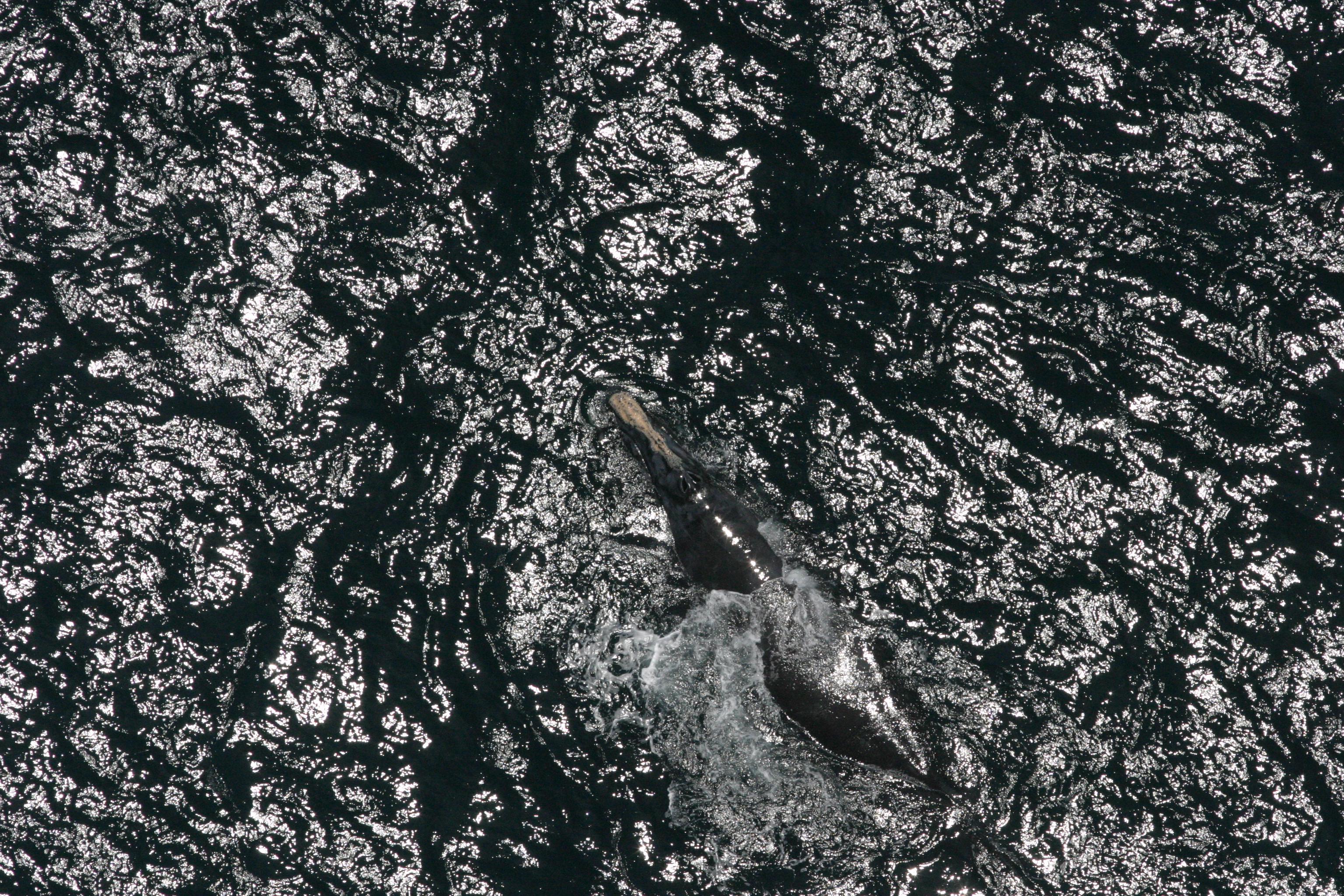
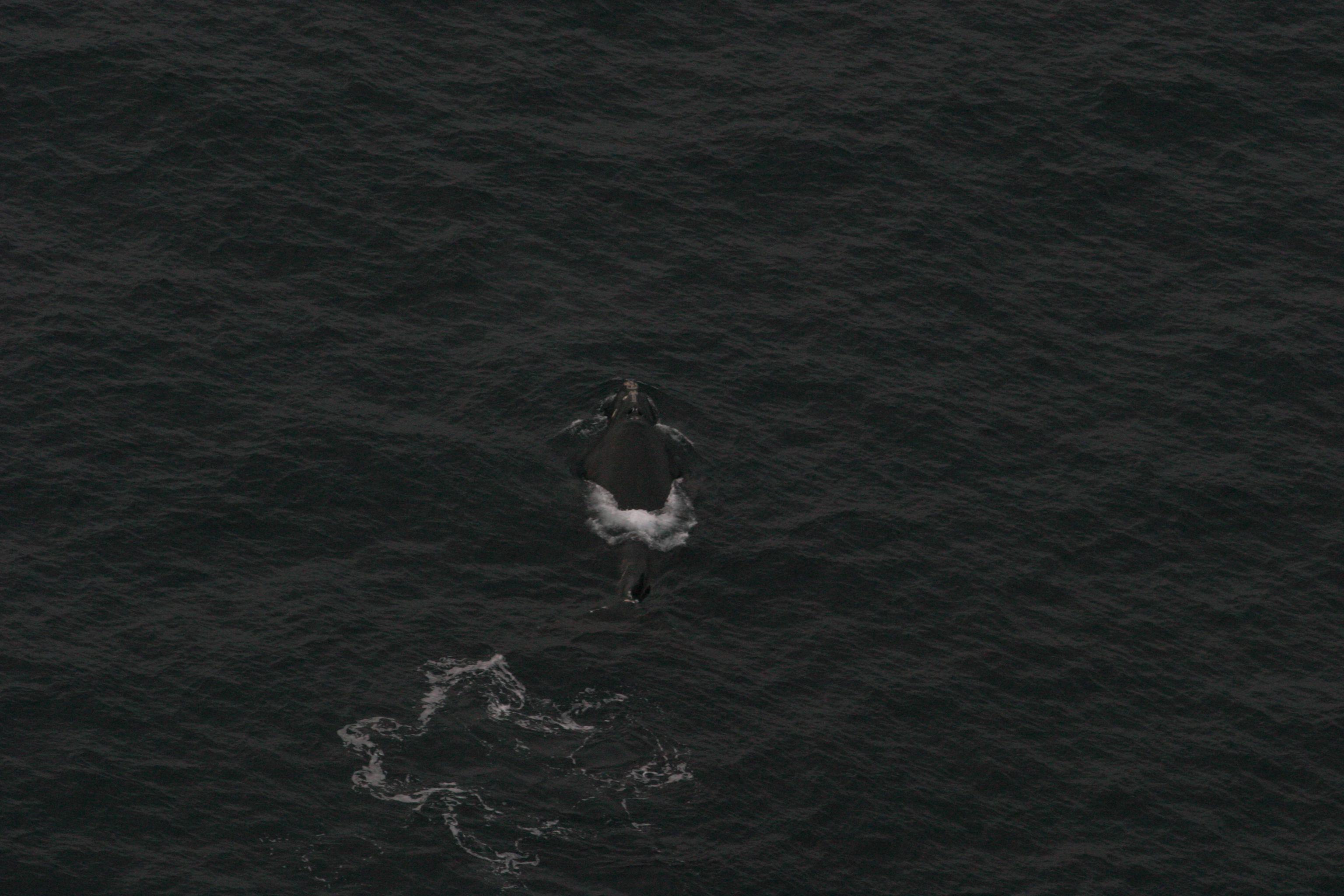
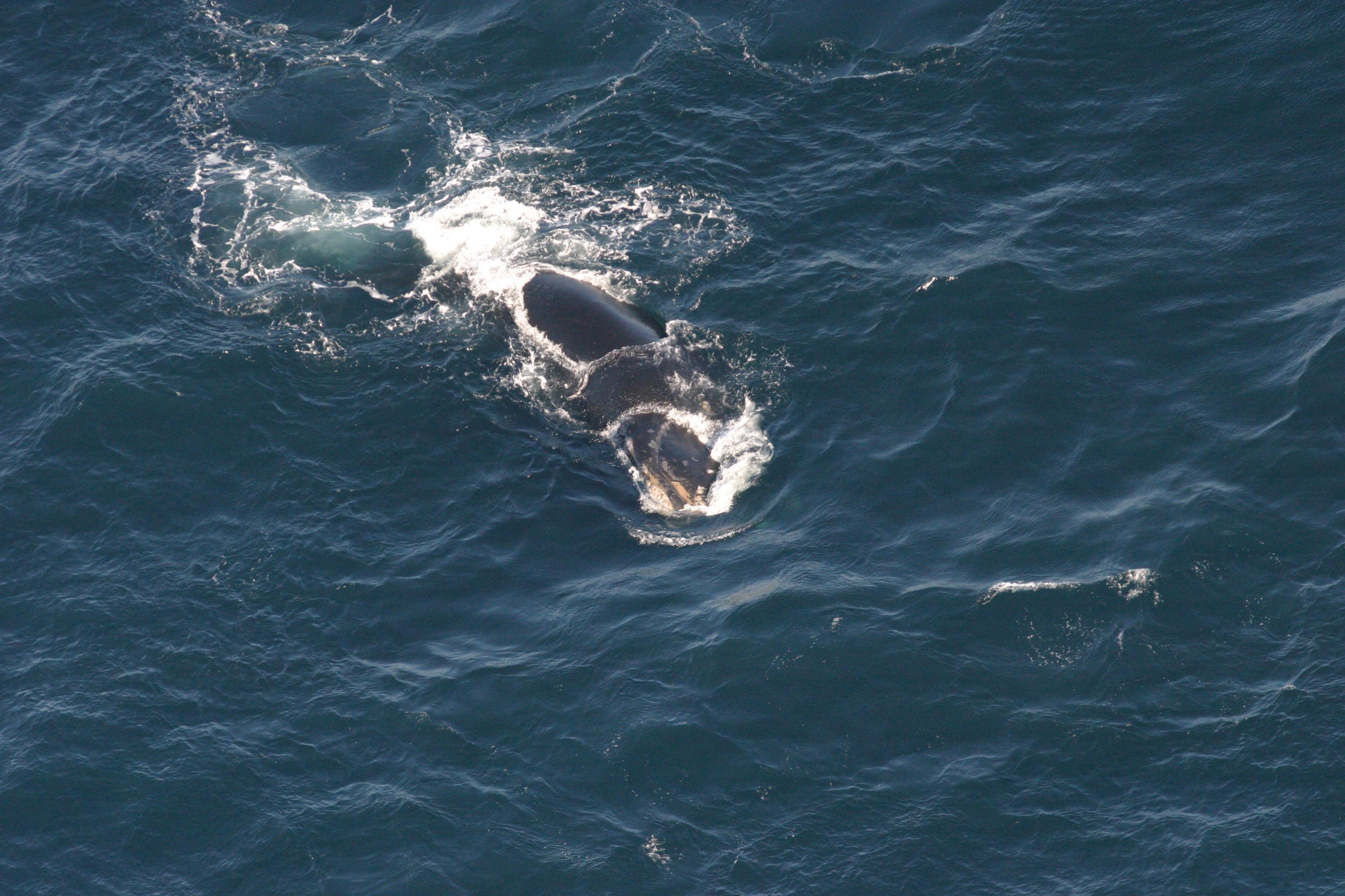
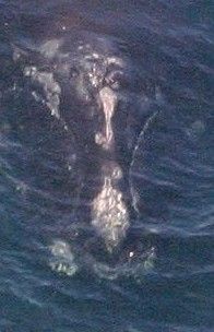
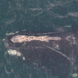
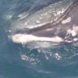
One does not need to see many images from the dataset in order to realize that whales do not pose very well (or at least were reluctant to do so in this particular case).
Not very cooperative whales
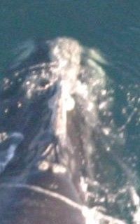
Therefore, before training final classifiers we spent some time (and energy) to account for this fact. The general idea of this approach can be thought of as obtaining a passport photo from a random picture where the subject is in some arbitrary position. This boiled down to training a head localizer and a head aligner. The first one takes a photo and produces a bounding box around the head, still the head may be arbitrarily rotated and not necessarily in the middle of the photo. The second one takes a photo of the head and aligns and rescales it, so that the blowhead and bonnet-tip are always in the same place, and the distance between them is constant. Both of these steps were done by training a neural network on manual annotations for the training data.
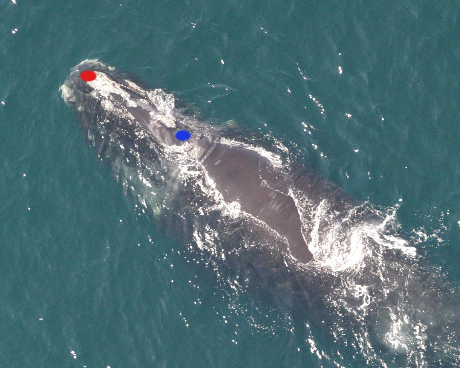
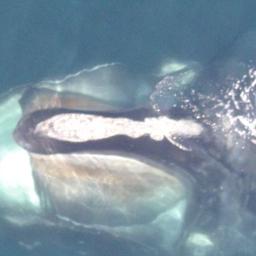
Bonnet-tip (red) and blowhead (blue)
Localizing the whale
This was the first step in order to achieve good quality, passport-like photos. In order to obtain the training data, we have manually annotated all the whales in the training data with bounding boxes around their heads (a special thanks goes to our HR department for helping out!).
Bounding box produced by the head localizer
These annotations amounted to providing four numbers for each image in the training set: coordinates of the bottom-left and the top-right points of the rectangle. We then proceeded to train a CNN which takes an original image (resized to 256×256) and outputs the two coordinates of the bounding box. Although this is clearly a regression task, instead of using L2 loss, we had more success with quantizing the output into bins and using Softmax together with cross-entropy loss. We have also tried several different approaches, including training a CNN to discriminate between head photos and non-head photos or even some unsupervised approaches. Nevertheless, their results were inferior.
In addition, the head localizing network also had to predict the coordinates of the blowhead and bonnet-tip (in the same, quantized manner), however it was less successful in this task, so we ignored this output.
We trained 5 different networks, all of them had almost the same architecture.
Head localizer’s architecture
Where they differed is the number of buckets used to quantize the coordinates. We have tried 20, 40, 60, 128, and also another (a little bit smaller) network using 20 buckets.
Before feeding the image into the network, we had used the following data augmentation (after resizing it to 256×256):
– rotation: up to 10° (note that if you allow bigger angles, it won’t be enough to simply rotate the points – you’ll have to implement some logic to recalculate the bounding box – we were too lazy to do this),
– rescaling: random ratio between 1/1.2 and 1.2,
– colour perturbation (as in Krizhevsky et al. 2012), with scale 0.01.
Although we have not used test-time augmentation here, we combined the outputs from all the 5 networks. Each time a crop was passed to the next step (head alignment), a random one from all 5 variants was chosen. As can be seen above, the crops provided by these networks were quite satisfactory. To be honest – we did not really “physically” crop the images (i.e. produce a bunch of smaller images). What we’ve done instead, and what turned out to be really handy, is producing a json file with the coordinates of bounding boxes. This may seem trivial, but doing so encouraged and allowed us to easily experiment with them.
The final step of this “make the classifier’s life easier” pipeline was to align the photos so that they all conform to the same standards. The idea was to train a CNN that estimates the coordinates of blowhead and bonnet-tip. Having them, one can easily come up with a transformation that maps the original image into one where these two points are always in the same position. Thanks to the annotations made by Anil Thomas, we had the coordinates for the training set. So, once again we proceeded to train CNN to predict quantized coordinates. Although we do not claim that it was impossible to pinpoint these points using the whole image (i.e. avoid the previous step), we now face a possibly easier task – we know the approximate location of the head.
In addition, the network had some additional tasks to solve! First of all it needed to predict which whale is on the image (i.e. solve the original task). Moreover, it needed to tell whether the callosity pattern on the whale’s head is continuous or not (training on manual annotations once again, although there was much less work this time since looking at 2-3 images per whale was enough).
Broken (left) and continuous (right) callosity patterns
We used the following architecture.
Head aligner’s architecture
As an input to head aligner we took the crops from the head localizer. This time we dared to use a more bold augmentation:
– translation: random up to 4 pixels,
– rotation: up to 360°,
– rescaling: random ratio between 1.0 and 1.5,
– random flip,
– colour perturbation with scale 0.01.
Also, we used test-time augmentation – the results were averaged over 5 random augmentations (not much, but still!). This network achieved surprisingly good results. To be more (or less) accurate – during manual inspection, the blowhead and bonnet-tip positions were predicted almost perfectly for almost all images. Besides, as a by-product (or was it the other way?), we started to see some promising results for the original task of identifying the whales. The (quite pessimistic) validation loss was around 2.2.
Putting everything together
When chaining multiple machine learning algorithms in the pipeline, some caution is needed. If we train a head localizer and head aligner on the training data and use them to produce “passport photos” for both the training and testing set, we may end up with photos that vastly differ in quality (and possibly some other properties). This can turn out to be a serious difficulty when training a classifier on top of these crops – if at test time it faces inputs that don’t bear any similarity to those it was accustomed to, it does not perform.
Although we were aware of this fact, when inspecting the crops we discovered that the quality did not differ much between training and testing data. Moreover, we’ve seen a huge improvement in the log loss. Following the mindset of “more ideas, less dwelling”, we decided to settle on this impure approach and press on.
“Passport photos” of whales
Final classifier
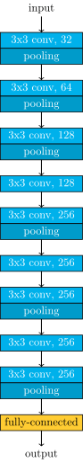
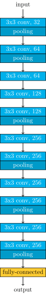
Network architecture
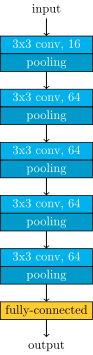
Almost all of our models worked on 256×256 images and shared the same architecture. All convolutional layers had 3×3 filters and did not change the size of the image, all pooling layers were 3×3 with 2 stride (they halved the size). In addition all convolutional layers were followed by batch normalization and ReLU nonlinearity.
Main net’s architecture
In the final blend, we have also used a few networks with an analogous architecture, but working on 512×512 images, and one network with a “double” version of this architecture (with an independent copy of the stacked convolutional layers, merged just before the fully-connected layer).
Once again, we’ve violated the networks’ comfort zone by adding an additional target – determining the continuity of the callosity pattern (same as in the head aligner case). We’ve also tried adding more targets coming from other manual annotations, one such target was “how much was the face symmetric”. Unfortunately, it did not improve the results any further.
Data augmentation
At this point data augmentation is a little bit trickier than usual. The reason behind this, is that you have to balance between enriching the dataset enough, and not ruining the alignment and normalization obtained from the previous step. We ended up using quite mild augmentation. Although the exact parameters were not constant among all models, the most common were:
– translation: random up to 4 pixels,
– rotation: up to 8°,
– rescaling: random ratio between 1.0 and 1.3,
– random flip,
– colour perturbation with scale 0.01.
We also used test-time augmentation, and averaged over 20+ random augmentations.
Initialization
We used a very simple initialization rule, a zero-centred normal distribution with std 0.01 for convolutional layers and std 0.001 for fully connected layers. This has worked well enough.
Regularization
For all models, we have used only L2 regularization. However, separate hyperparameters were used for convolutional and fully connected layers. For convolutional layers, we used a smaller regularization, around 0.0005, while for fully connected ones we preferred higher values, usually around 0.01 – 0.05.
One should also recall that we were adding supplementary targets to the networks. This imposes additional constraints on weights, enforces more focus on the head of the whale (instead of, say, some random patterns on the water), i.e. it works against overfitting.
Training
We trained almost all of our models with stochastic gradient descent (SGD) combined with 0.9 momentum. Usually we settled after around 500-1000 epochs (the exact moment didn’t really matter much, because the lack of overfitting). During the training process we used quite slow exponential decay on the learning rate (0.9955) and also manually adjusted the learning rate from time to time. After a rough kick – increasing the learning rate (yet still leaving the decay) the network’s error (on both: training and validation) went up a lot. Yet it tended to settle on a lower error after a few epochs to get back on a good track. Our best model also uses another idea – it was first trained with Nesterov momentum for over a hundred epochs, and then we switched to using Adam (adaptive moment estimation). We couldn’t achieve similar loss when using Adam all the way from the start. The initial learning rate may not have mattered much, but we used values around 0.0005.
Validation
We used a random 10% of the training data for validation. Thanks to our favourite seed 7300, we kept it the same for all models. Although, we were aware that this method caused some whales to be absent in the training set, it has worked good enough. The validation loss was quite pessimistic, and correlated well with the leaderboard.
Giving up 10% of a relatively small dataset is not something one would decide to do without any hesitation. Therefore, after we had decided that a model is good enough to use it, we proceeded to reuse the validation set for training (it was straightforward because we didn’t have any problems with overfitting). This was done either by a time-consuming process of rerunning everything from scratch on the whole training set (rarely), or (more often) adding the validation set to the training one and running 50-100 additional epochs. This was also meant to curate the issue of single-photo-whales appearing only in our validation set.
Combining the predictions
We have ended up with a number of models scoring in a range of 0.97 to 1.3 according to our validation (actual test scores were actually better). Thanks to keeping a consistent validation set we were able to test some blending techniques as well as basic transformations. We have concluded that using more complex ensembling methods would not be plausible due to the fact that our validation set did not include all the distinct whales, and was, in fact, quite small. Having no time left for some fancy cross-validation like ensembling, we settled on something ad-hoc and simple.
Even though simple weighted average of the predictions did not provide a better score than the best model alone (unless we increased the best model’s weight significantly), it performed better when combined with a simple transformation of raising the predictions to a moderate power (in the final solution we used 1.45). This translated into roughly ~0.1 improvement in the log loss. We have not scrutinized this enough, yet one may hypothesize that this trick worked because our fully connected layers were strongly regularized, and were reluctant to produce more extreme probabilities.
We also used some “safety” transformations, namely increasing all the predictions by a certain epsilon as well as slightly skewing them to the whale distribution found in the training set. They had not impacted our score much.
Loading images
At the latest, and middle stages of our solution the images we loaded from the disk were original ones. They are quite big. To efficiently use the gpu we had to load them in parallel. We thought the main cost was loading the images from the disk. It turned out not to be true. Conversely, it was decoding JPEG file to a numpy array. We did a quick and dirty benchmark, with 111 random original images from the dataset, 85Mb total. Reading them, when they are not cached in RAM takes ~420 ms. Whereas reading, and decoding to numpy arrays takes ~10 seconds. That’s a huge difference. The possible solutions to mitigate this, might be using other image formats, that offer better encoding speeds (at the cost of image sizes), decoding at GPU, etc.
What might have made it tick
Although, it’s hard to pinpoint a single trick or technique that overshadows everything else (and to do so, one needs a more careful analysis), we have hypothesized about the key tricks.
Producing good quality crops with well aligned heads
We have achieved this by doing this in two stages, and the results were vastly superior than what we observed with just a single stage.
Manual labour and providing the networks with additional targets
This was based on adding additional annotations to the original images. It required manual inspection of thousands of whales images, but we ended up using them in all stages (head localizing, head aligning, and classification).
Kicking the learning rate
Although it might have been the combination of a little bit careless initialization, poor learning rate decay schedule, and not fancy enough SGD, it turned out, that kicking (increasing) the learning rate did a great job.
Loss functions after kicking the learning rate
Calibrating the probabilities
Almost all our models, and blends of models benefitted from raising the predictions to a moderate power in the range [1.1 – 1.6]. This trick, discovered at the end of the competition, improved the score by ~0.1.
Reusing the validation set
Merging validation and training sets and running for additional 50-100 epochs gave us steady improvements on the score.
Overall, this was an amazing problem to tackle and an amazing competition to take part in. We have learned a lot during the process, and are actually quite amazed with the super-powers of deep learning!
A special thanks to Christin Khan and NOAA for presenting the data science community with this exceptional challenge. We hope that this will inspire others. Of course, all this would be much harder without Kaggle.com, which does a great job with their platform. We would also like to thank Nvidia for giving us access to Nvidia K80 GPUs – they’ve done a great job.
Robert Bogucki
Marek Cygan
Maciej Klimek
Jan Kanty Milczek
Marcin Mucha
https://deepsense.ai/wp-content/uploads/2016/01/deep-learning-right-whale-recognition-kaggle.jpg3371140Robert Boguckihttps://deepsense.ai/wp-content/uploads/2023/10/Logo_black_blue_CLEAN_rgb.pngRobert Bogucki2016-01-16 16:16:562021-01-05 16:51:52Which whale is it, anyway? Face recognition for right whales using deep learning
deepsense.io Wins Kaggle Machine Learning Competition to Automate Right Whale Recognition!
deepsense.io’s Machine Learning Team has won a major Kaggle competition, developing a machine learning algorithm to automatically identify individual right whales from aerial photographs. After 133 days during which 364 teams submitted 4,788 entries, our team of deep learning experts created the best performing “face recognizer” for right whales, winning by a large margin. The challenge was organised by the National Oceanic and Atmospheric Administration (NOAA), co-sponsored by MathWorks and the data set of 7,000 images (4,500 for training and 2,500 for testing) was provided by the right whale research team from NOAA Fisheries and curated by the New England Aquarium.
“Seeing deep learning techniques help out endangered right whales is uplifting. I hope to see more of such applications in the near future,” said Robert Bogucki, Team Captain and CSO at deepsense.io. “We enjoyed the competition immensely.”
Our data scientists’ winning algorithm used deep learning and convolutional neural networks
to localize, align, and finally identify individual right whales from aerial photographs. “Impressive indeed! I am so inspired by this community of data scientists!” said Christin B. Khan, fishery biologist at NOAA. deepsense.io’s contribution to automate whale identification could benefit researchers who currently have to go through a painstaking and lengthy process identifying individual whales.
“It was very exciting to have our Machine Learning Team participate and win this NOAA competition because the solution helps solve a real-world problem and empowers fishery biologists in protecting the critically endangered North Atlantic right whales. I’m very proud of this achievement,” said Piotr Niedzwiedz, deepsense.io’s Co-founder and CTO. “The right whale recognition challenge was a great opportunity to put our data scientists’ talents to the test
and to demonstrate that deep learning techniques, especially convolutional neural networks can provide immense benefits in big data applications.”
For scientists at NOAA Fisheries, the algorithms provide a new standard assisting activities such as: disentangling whales from fishing gear, collecting genetics samples, recording acoustic vocalizations, and assisting with satellite tagging efforts. When the algorithms developed for the Kaggle Right Whale Recognition contest are put to the test and applied in practice successfully, NOAA and other whale researchers could extend the identification technique and use of machine learning to protect other threatened and endangered marine species.
Read more about the competition HERE.
For more information on North Atlantic Right Whales, please visit THIS LINK.
###
About Kaggle
Kaggle is the leading platform for developing highly sophisticated predictive models and recruiting top data science talent. Through its competitions, Kaggle has built the world’s largest community of data scientists, with over 40,000 active participants. They compete with each other to solve complex data science problems, and the top competitors are invited to work on the most interesting and sensitive business problems from some of the world’s largest companies.
deepsense.io descripion
Brand Manager at deepsense.io
deepsense.io trademarks at boilerplate
https://deepsense.ai/wp-content/uploads/2019/02/deepsense-ios-data-scientists-help-to-save-endangered-right-whales-with-deep-learning.jpg3371140Barbara Rutkowskahttps://deepsense.ai/wp-content/uploads/2023/10/Logo_black_blue_CLEAN_rgb.pngBarbara Rutkowska2016-01-14 15:00:442020-03-09 11:48:40deepsense.io’s Data Scientists Help to Save Endangered Right Whales with Deep Learning
During the Christmas break I met my brother-in-law who is an ultimate gadgeteer (an excellent trait for brother). He told me that most iPhones have build-in motion coprocessor and by default they are counting steps. No need to turn on anything, it is working all the time (assuming that the phone is with you).
For phones 5s and up, if you have ‘Health’ application then you can easily check if your activity is being tracked.
Short googling and it turns our that the measurements are quite accurate (see wired magazine, the error is smaller than 1%). In some articles authors even proof that this method is more accurate that other fitness trackers.
As you can imagine, we spend rest of the evening trying to load this data to R and doing some data exploration. You can do this easily by yourself. To export the data from the phone just follow these instructions.
Data will be exported in a single xml file. Just send it by email and we can start our adventuRe.
First, let’s load the data to R
require(XML)
data <- xmlParse("export.xml")
xml_data <- xmlToList(data)
The app is measuring number of steps, distance, and some other parameters. Let’s extract only the number of steps.
Each row corresponds to number of steps per few minutes. For us it will be much easier to work with daily aggregates.
So some dplyr trick and we will have number of steps per day
dataDF <- xml_dataSelDF %>%
group_by(day) %>%
summarise(sum = sum(as.numeric(as.character(value))))
> head(dataDF)
# Source: local data frame [6 x 2]
#
# day sum
# (fctr) (dbl)
# 1 2015-02-18 90
# 2 2015-02-19 10683
# 3 2015-02-20 5465
# 4 2015-02-21 4212
# 5 2015-02-22 2085
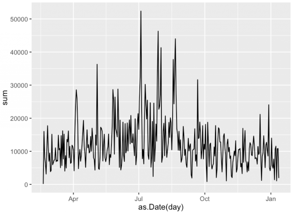
# 6 2015-02-23 7199
A very nice time series!
So it’s time for some decomposition.
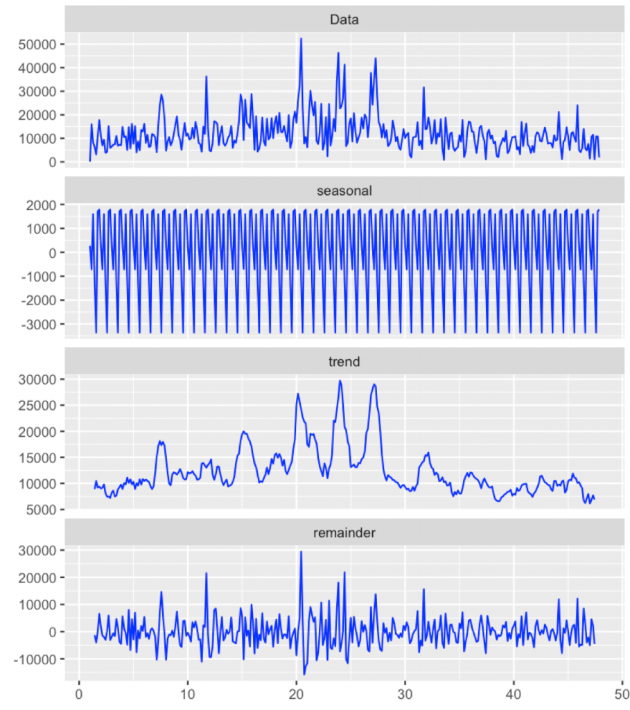
There is probably some periodicity related to weeks (I have different number of teaching hours in different days, for sure this will have some impact).
Let’s decompose the series into a seasonal component, trend and residuals.
Strong seasonal component. We will dig it deeper next time. The trend is around 10000 steps, not that bad.
Weeks between 20 and 25 are summer holidays. These larger bumps correspond to some hiking, sightseeing etc. Then around week 30 the winter semester has started. Teaching after longer break. This was not an active semester. Actually the November was a disaster in terms of activity. So you know my plans for the new year.
Next time I will show some more detailed exploration.
https://deepsense.ai/wp-content/uploads/2019/02/Exploration-of-data-from-iPhone-motion-coprocessor.jpg3371140Przemyslaw Biecekhttps://deepsense.ai/wp-content/uploads/2023/10/Logo_black_blue_CLEAN_rgb.pngPrzemyslaw Biecek2016-01-13 08:30:072021-01-05 16:51:57Exploration of data from iPhone motion coprocessor