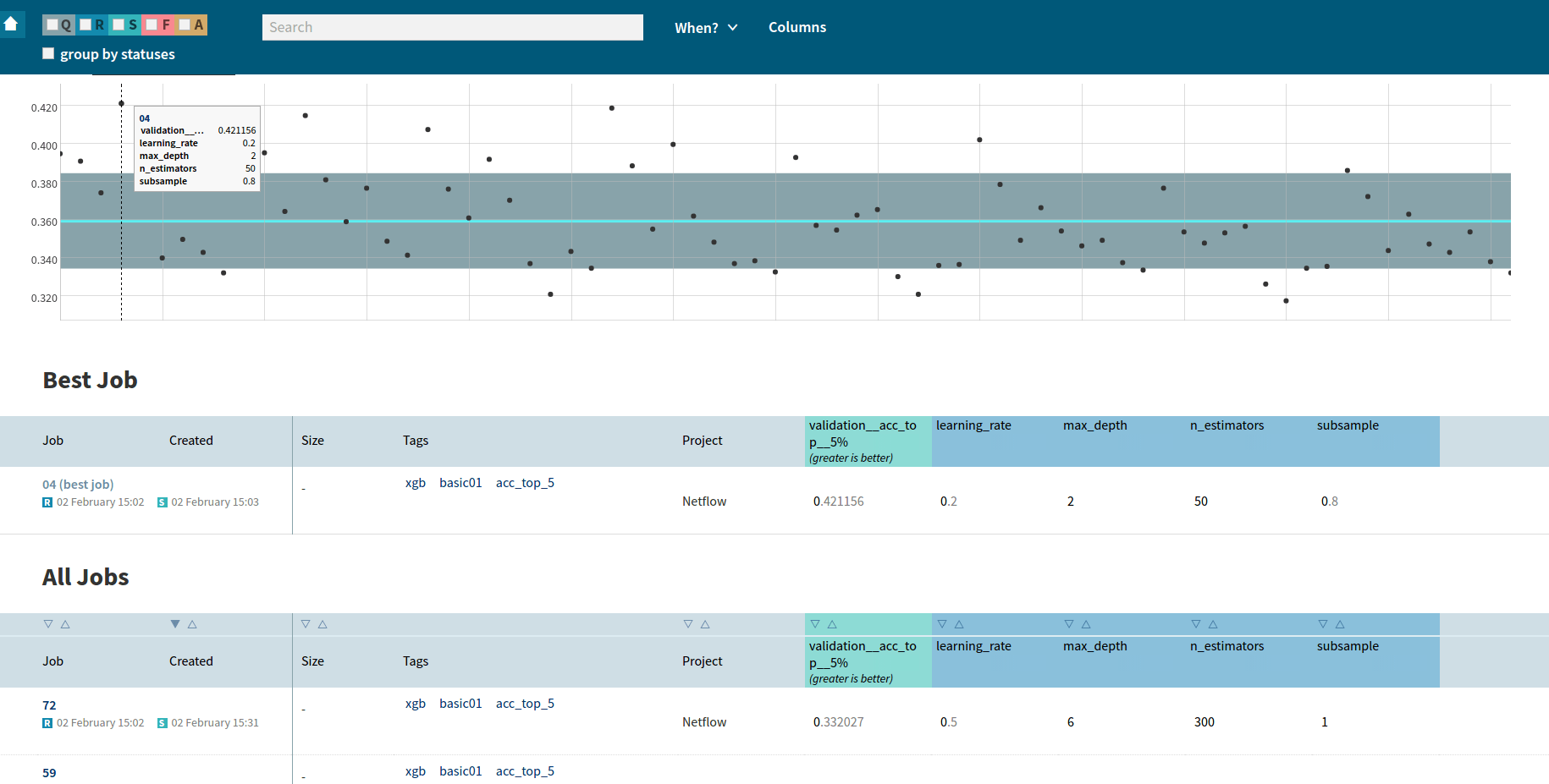
In February we released a new version of Neptune, our machine learning platform for data scientists, supporting them in more efficient experiment management and monitoring. The latest 1.4 release introduces new features, like grid search — a hyperparameter optimization method and support for R and Java programming languages.
Grid Search
The first major feature introduced in Neptune 1.4 is support for grid search, which is one of the most popular hyperparameter optimization method. You can read more about grid search here.
In version 1.4 in your Neptune experiment you can pass a list or a range of values instead of passing a specific value for the numeric parameter. Neptune will create a grid search experiment and run a job for every combination of parameters’ values. Neptune groups and helps you manage results within the grid search experiment. You can define custom metrics for evaluation. Neptune will automatically select the combination of hyperparameters’ values that give the best value of the metric. Read an example.
R Support and Java Support
Neptune exposes REST API, so it is completely language and platform agnostic. deepsense.ai provides high-level client libraries for the most popular programming languages among data scientists (according to the poll taken in the community — see the results). Thanks to client libraries, users don’t have to implement communication via REST API themselves but instead they can invoke high-level functions. Until version 1.4 we only supported client library for Python. In version 1.4 we introduced support for for R and Java (which also covers Scala users). Thanks to new client libraries you can run, monitor and manage your experiments written in R or Java in the Neptune machine learning platform. You can get client libraries for R and Java here.
Future Plans
We have already been working on the next version of Neptune, which will be released at the beginning of April 2017. Next release will contain:
Architectural and API changes that will improve user experience.
New approach for handling snapshots of the experiments’ code.
Neptune Offline Context — the user will be able to run the code that uses Neptune API offline.
I hope you will enjoy working with our machine learning platform, now with grid search support and client libraries for R and Java. If you’d like to give us feedback, feel free to use our forum at https://community.neptune.ml.
Do you want to check out Neptune? Visit NeptuneGo!, look around and run your first experiments.
https://deepsense.ai/wp-content/uploads/2019/02/neptune-machine-learning-platform-grid-search-r-java-support.jpg3371140Rafał Hryciukhttps://deepsense.ai/wp-content/uploads/2023/10/Logo_black_blue_CLEAN_rgb.pngRafał Hryciuk2017-03-06 12:57:132024-03-11 15:41:59Neptune machine learning platform: grid search, R & Java support
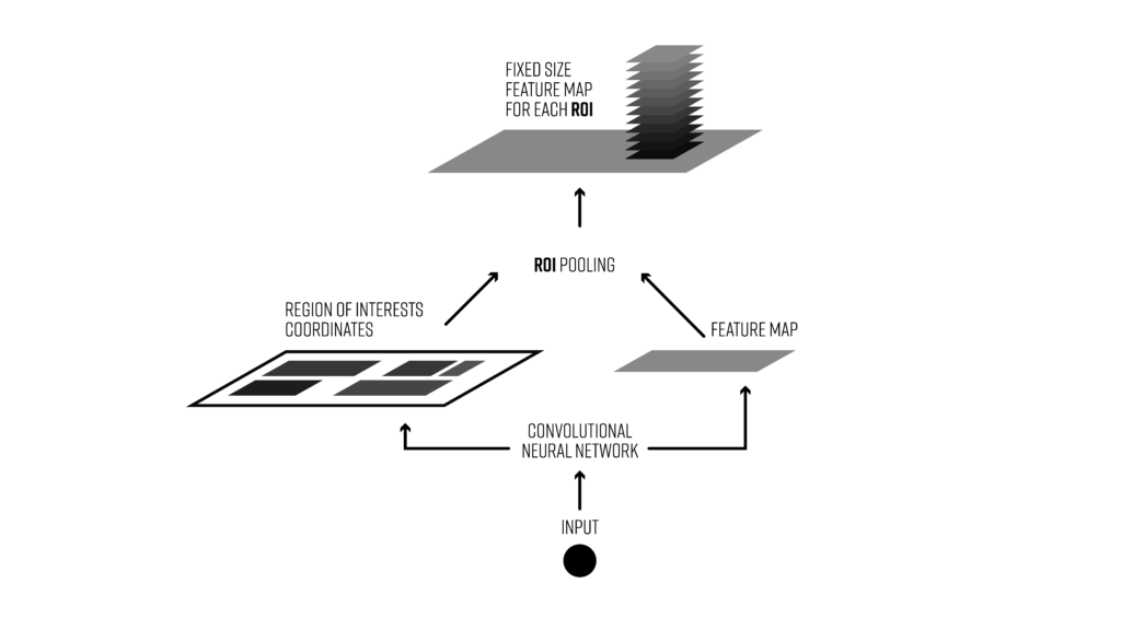
Region of interest pooling (also known as RoI pooling) is an operation widely used in object detection tasks using convolutional neural networks. For example, to detect multiple cars and pedestrians in a single image. Its purpose is to perform max pooling on inputs of nonuniform sizes to obtain fixed-size feature maps (e.g. 7×7).
We’ve just released an open-source implementation of RoI pooling layer for TensorFlow (you can find it here). In this post, we’re going to say a few words about this interesting neural network layer. But first, let’s start with some background.
Two major tasks in computer vision are object classification and object detection. In the first case the system is supposed to correctly label the dominant object in an image. In the second case it should provide correct labels and locations for all objects in an image. Of course there are other interesting areas of computer vision, such as image segmentation, but today we’re going to focus on detection. In this task we’re usually supposed to draw bounding boxes around any object from a previously specified set of categories and assign a class to each of them. For example, let’s say we’re developing an algorithm for self-driving cars and we’d like to use a camera to detect other cars, pedestrians, cyclists, etc. — our dataset might look like this.
In this case we’d have to draw a box around every significant object and assign a class to it. This task is more challenging than classification tasks such as MNIST or CIFAR. On each frame of the video, there might be multiple objects, some of them overlapping, some poorly visible or occluded. Moreover, for such an algorithm, performance can be a key issue. In particular for autonomous driving we have to process tens of frames per second.
So how do we solve this problem?
The object detection architecture we’re going to be talking about today is broken down in two stages:
Region proposal: Given an input image find all possible places where objects can be located. The output of this stage should be a list of bounding boxes of likely positions of objects. These are often called region proposals or regions of interest. There are quite a few methods for this task, but we’re not going to talk about them in this post.
Final classification: for every region proposal from the previous stage, decide whether it belongs to one of the target classes or to the background. Here we could use a deep convolutional network.
Object detection pipeline with region of interest pooling
Usually in the proposal phase we have to generate a lot of regions of interest. Why? If an object is not detected during the first stage (region proposal), there’s no way to correctly classify it in the second phase. That’s why it’s extremely important for the region proposals to have a high recall. And that’s achieved by generating very large numbers of proposals (e.g., a few thousands per frame). Most of them will be classified as background in the second stage of the detection algorithm.
Some problems with this architecture are:
Generating a large number of regions of interest can lead to performance problems. This would make real-time object detection difficult to implement.
It’s suboptimal in terms of processing speed. More on this later.
You can’t do end-to-end training, i.e., you can’t train all the components of the system in one run (which would yield much better results)
That’s where region of interest pooling comes into play.
Region of interest pooling is a neural-net layer used for object detection tasks. It was first proposed by Ross Girshick in April 2015 (the article can be found here) and it achieves a significant speedup of both training and testing. It also maintains a high detection accuracy. The layer takes two inputs:
A fixed-size feature map obtained from a deep convolutional network with several convolutions and max pooling layers.
An N x 5 matrix of representing a list of regions of interest, where N is a number of RoIs. The first column represents the image index and the remaining four are the coordinates of the top left and bottom right corners of the region.
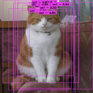
An image from the Pascal VOC dataset annotated with region proposals (the pink rectangles)
What does the RoI pooling actually do? For every region of interest from the input list, it takes a section of the input feature map that corresponds to it and scales it to some pre-defined size (e.g., 7×7). The scaling is done by:
Dividing the region proposal into equal-sized sections (the number of which is the same as the dimension of the output)
Finding the largest value in each section
Copying these max values to the output buffer
The result is that from a list of rectangles with different sizes we can quickly get a list of corresponding feature maps with a fixed size. Note that the dimension of the RoI pooling output doesn’t actually depend on the size of the input feature map nor on the size of the region proposals. It’s determined solely by the number of sections we divide the proposal into. What’s the benefit of RoI pooling? One of them is processing speed. If there are multiple object proposals on the frame (and usually there’ll be a lot of them), we can still use the same input feature map for all of them. Since computing the convolutions at early stages of processing is very expensive, this approach can save us a lot of time.
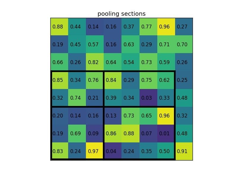
Let’s consider a small example to see how it works. We’re going to perform region of interest pooling on a single 8×8 feature map, one region of interest and an output size of 2×2. Our input feature map looks like this:
Let’s say we also have a region proposal (top left, bottom right coordinates): (0, 3), (7, 8). In the picture it would look like this: Normally, there’d be multiple feature maps and multiple proposals for each of them, but we’re keeping things simple for the example.
By dividing it into (2×2) sections (because the output size is 2×2) we get:
Notice that the size of the region of interest doesn’t have to be perfectly divisible by the number of pooling sections (in this case our RoI is 7×5 and we have 2×2 pooling sections).
The max values in each of the sections are:
And that’s the output from the Region of Interest pooling layer. Here’s our example presented in form of a nice animation:
What are the most important things to remember about RoI Pooling?
It’s used for object detection tasks
It allows us to reuse the feature map from the convolutional network
It can significantly speed up both train and test time
It allows to train object detection systems in an end-to-end manner
If you need an opensource implementation of RoI pooling in TensorFlow you can find our version here.
In the next post, we’re going to show you some examples on how to use region of interest pooling with Neptune and TensorFlow.
References
Girshick, Ross. “Fast r-cnn.” Proceedings of the IEEE International Conference on Computer Vision. 2015.
Girshick, Ross, et al. “Rich feature hierarchies for accurate object detection and semantic segmentation.” Proceedings of the IEEE conference on computer vision and pattern recognition. 2014.
Sermanet, Pierre, et al. “Overfeat: Integrated recognition, localization and detection using convolutional networks.” arXiv preprint arXiv:1312.6229. 2013.
https://deepsense.ai/wp-content/uploads/2019/02/region-of-interest-pooling-explained.jpg3371140Tomasz Grelhttps://deepsense.ai/wp-content/uploads/2023/10/Logo_black_blue_CLEAN_rgb.pngTomasz Grel2017-02-28 14:46:472023-11-06 15:03:15Region of interest pooling explained
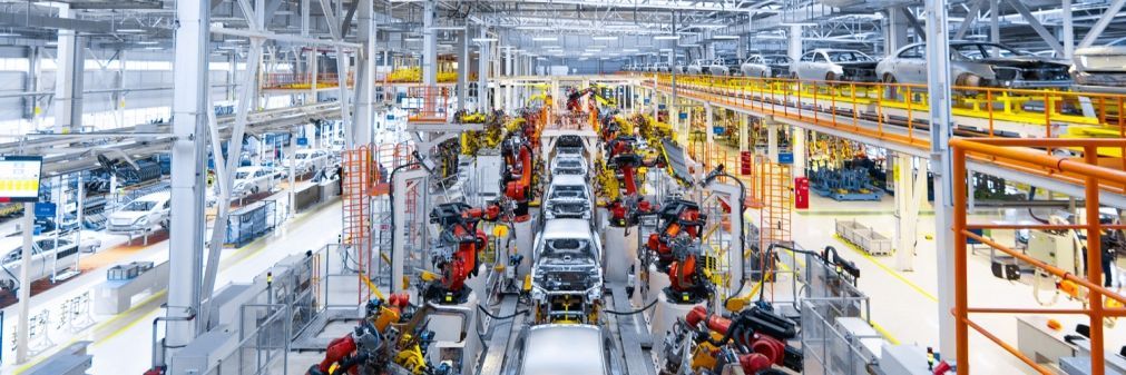
While modern manufacturing technology is starting to incorporate machine learning throughout the production process, predictive algorithms are being used to plan machine maintenance adaptively rather than on a fixed schedule. And these are only the tip of the iceberg.
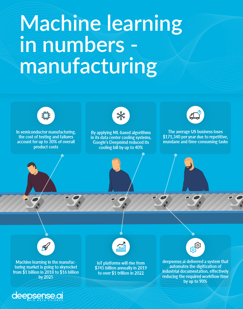
Machine learning models can enhance nearly every aspect of a business, from marketing to sales to maintenance. In manufacturing, the rise of IoT, and the unprecedented amounts of data it throws off, has ushered in numerous opportunities to utilize machine learning. The computerization of industrial machinery is also undergoing rapid computerization. IDC data indicates that spending on IoT platforms will rise from $745 billion annually in 2019 to over $1 trillion in 2022.
According to a Global Market Insights report, global machine learning in manufacturing is going to skyrocket from $1 billion in 2018 to $16 billion by 2025. Alongside this, there will be a continuous need to reduce costs and grow the adoption of industry 4.0 technologies, including the predictive maintenance and machine inspection done by AI.
Examples of ML-based predictive maintenance
Machine learning enables predictive monitoring, with machine learning algorithms forecasting equipment breakdowns before they occur and scheduling timely maintenance. With the work it did on predictive maintenance in medical devices, deepsense.ai reduced downtime by 15%.
But it isn’t just in straightforward failure prediction where Machine learning supports maintenance. In another recent application, our team delivered a system that automates industrial documentation digitization, effectively reducing workflow time by up to 90%.
An automotive plant implemented a predictive maintenance solution for a hydraulic press used in vehicle panel production. Detailed studies of the maintenance process showed that engineers were spending far too much time attending to breakdowns instead of allocating resources for planned maintenance. The new solution enabled them to predict equipment failure with an accuracy of 92%, plan maintenance more effectively and offer greater asset reliability and product quality. Overall equipment efficiency increased from 65% (the industry average) to 85%.
An automotive plant implemented a predictive maintenance solution for a hydraulic press used in vehicle panel production.
A beverage industry manufacturer of industrial equipment fit their machines with a monitoring and prediction system to help engineers plan better preventative maintenance. This solved the problem of inefficient, reactive customer service and helped to optimize equipment maintenance schedules, which had always been based on defined time intervals, rather than real needs. The application of machine learning increased business scalability and optimized the company’s cost structure.
Predictive maintenance is also expected to become an important technological component of autonomous vehicles. Self-driving cars are likely to follow the -as-a-service business model (rather than the ownership model of today’s car industry). That means cars will have to monitor their own condition rather than rely on their owner-driver to spot problems and take the vehicle to a service station.
Quality control
Artificial intelligence (AI) is also being adopted for product inspection and quality control. ML-based computer vision algorithms can learn from a set of samples to distinguish the “good” from the flawed. In particular, semi-supervised anomaly detection algorithms only require “good” samples in their training set, making a library of possible defects unnecessary. Alternatively, a solution can be developed that compares samples to typical cases of defects.
A manufacturer of agricultural product packing equipment has recently introduced a high-performance fruit sorting machine that uses computer vision and machine learning to classify skin defects. The operator can teach the sorting platform to distinguish between different types of defects and sort the fruit into sophisticated pack grades. The solution combines hardware, software and operational optimization to reduce the complexity of the sorting process.
Logistics and inventory management
It isn’t only on the assembly line and production plant where large strides have been made. Industry also requires an astonishing amount of logistics to power the entire production process. Employing machine learning-based solutions to handle logistics-related issues boosts efficiency and slashes costs.
According to Material, Handling and Logistics Magazine, the average US business loses $171,340 per year due to repetitive, mundane and time-wasting tasks like searching for order numbers, processing papers and calculating the value of orders. In any manufacturing company, logistics and production-related paperwork sap thousands of man-hours annually.
Resource management is another strength of machine learning-based algorithms. To see just how strong it can be, look no further than the power-consumption optimization algorithm Google applied in its data center cooling systems to reduce its electric bills–by up to 40%. That it was done without any infrastructure modernization or modification – the big data flowing through the system itself was enough – makes the feat all the more impressive.
Rising interest in machine learning applications in the manufacturing industry
Manufacturing companies now sponsor competitions for data scientists to see how well their specific problems can be solved with machine learning. A recent one, hosted by Kaggle, the most popular global platform for data science contests, challenged competitors to predict which manufactured parts would fail quality control. The participants needed to base their predictions on thousands of measurements and tests that had been done earlier on each component along the assembly line.
The competition was sponsored by Bosch, which is striving to trace causes of manufacturing defects back to specific steps in the production process, as well as support waste reduction by rejecting faulty components at early stages. The results of the competition are expected to improve product quality and lower costs.
The near future – robotics-powered manufacturing
Modern manufacturing, despite being largely automated, is still heavily reliant on the human workforce. Machines perform tasks to perfection–when they are in a closed environment–but performing a precise job in a more changing environment requires a human specialist.
In the near future, a large part of manufacturing could be taken over by robots that are flexible enough to cooperate with humans
In the near future, a large part of manufacturing could be taken over by robots that are flexible enough to cooperate with humans and perform tasks in a more human way. They will be able to adapt to both the changing environment and the object being produced. Democratization and productization are among today’s leading AI trends.
Robotics provides a great opportunity for reinforcement learning. This machine learning technique is currently the only way for machines to adapt to a changing environment and build more complex strategies for achieving their goals, which are unachievable with explicitly programmed solutions.
https://deepsense.ai/wp-content/uploads/2017/02/Machine-Learning-Applications-Manufacturing.jpg3371140Michal Romaniukhttps://deepsense.ai/wp-content/uploads/2023/10/Logo_black_blue_CLEAN_rgb.pngMichal Romaniuk2019-06-22 14:01:542024-03-11 15:38:37Machine Learning for Applications in Manufacturing
Internal validation is a useful tool for comparing results of experiments performed by team members in any business or research task. It can also be a valuable complement of public leaderboards attached to machine learning competitions on platforms like Kaggle.
In this post, we present how to build an internal validation leaderboard using Python scripts and the Neptune environment. As an example of a use case, we will take the well known classification dataset CIFAR-10. We study it using a deep convolutional neural network provided in the TensorFlow tutorial.
Why internal leaderboard?
Whenever we solve the same problem in many ways, we want to know which way is the best. Therefore we validate, compare and order the solutions. In this way, we naturally create the ranking of our solutions – the leaderboard.
We usually care about the privacy of our work. We want to keep the techniques used and the results of our experiments confidential. Hence, our validation should remain undisclosed as well – it should be internal.
If we keep improving the models and produce new solutions at a fast pace, at some point we are no longer able to manage the internal validation leaderboard manually. Then we need a tool which will do that for us automatically and will present the results to us in a readable form.
Business and research projects
In any business or research project you are probably interested in the productivity of team members. You would like to know who and when submits his or her solution to the problem, what kind of model they use and how good the solution is.
A good internal leaderboard stores all that information. It also allows you to search for submissions sent by specific user, defined in some time window or using a particular model. Finally, you can sort the submissions with respect to the accuracy metric to find the best one.
Machine learning competitions
The popular machine learning platform, Kaggle, offers a readable public leaderboard for every competition. Each contestant can follow his position in the ranking and try to improve several times a day.
However, an internal validation would be very useful for every competing team. A good internal leaderboard has many advantages over a public one:
the results remain exclusive,
there is no limit on the number of daily submissions,
metrics other than those chosen by the competition organizers can be evaluated as well,
the submissions can be tagged, for example to indicate the used model.
Note that in every official competition the ground truth labels for the test data are not provided. Hence, to produce the internal validation we are forced to split the available public training data. One part is used to tune the model, the other is needed to evaluate it internally. This division can be an origin of unexpected problems (e.g., data leaks) so perform it carefully!
Why Neptune?
Neptune was designed to manage multiple experiments. Among many features, it supports storing parameters, logs and metric values from various experiment executions. The results are accessible through an aesthetic Web UI.
In Neptune you can:
gather experiments from various projects in groups,
add tags to experiments and filter by them,
sort experiments by users, date of creation, or – most importantly for us – by metric values.
Due to that, Neptune is a handy tool for creating an internal validation leaderboard for your team.
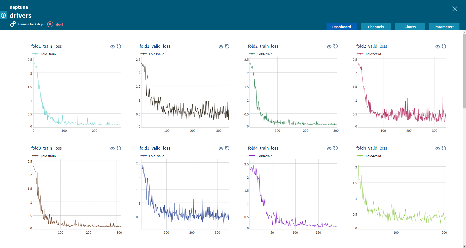
Tracking a TensorFlow experiment in Neptune
Let’s do it!
Let’s build an exemplary internal validation leaderboard in Neptune.
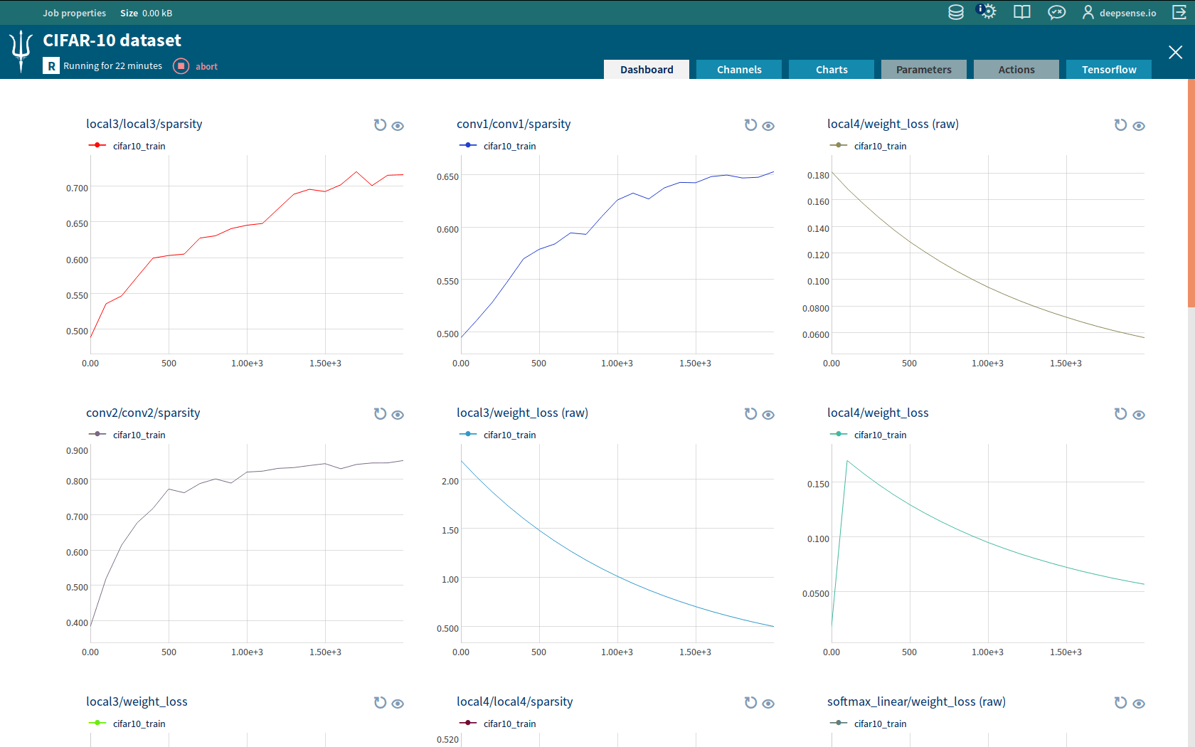
CIFAR-10 dataset
We use the well-known classification dataset CIFAR-10. Every image in this dataset is a member of one of 10 classes, labeled by numbers from 0 to 9. Using the train data we build a model which allows us to predict the labels of images from test data. CIFAR-10 is designed for educational purposes, therefore the ground truth labels for test data are provided.
Evaluating functions
Let’s fix the notation:
\(N\) – number of images we have to classify.
\(c_i\) – class to which the \(i\)th image belongs; \(iin{0,ldots,N-1}\), \(c_iin{0,ldots,9}\).
\(p_{ij}\) – estimated probability that the \(i\)th image belongs to the class \(j\); \(iin{0,ldots,N-1}\), \(jin{0,ldots,9}\), \(p_{ij}in[0,1]\).
We evaluate our submission with two metrics. The first metric is the classification accuracy given by
\(frac 1Nsum_{i=0}^{N-1}mathbb{1}Big(argmax_j p_{ij}=c_iBig)\)
This is the percentage of labels that are predicted correctly. We would like to maximize it, the optimal value is 1. The second metric is the average cross entropy given by
\(-frac 1Nsum_{i=0}^{N-1}log p_{ic_i}\)
This formula is simpler than the principal entropy since the classes are completely mutually exclusive. We would like to minimize it, preferably to 0.
Implementation details
Prerequisites
To run the code we provide you need the following software:
The code we use is based on that available in the TensorFlow convolutional neural networks tutorial. You can download our code from our GitHub repository. It consists of the following files:
File
Purpose
main.py
The script to execute.
cifar10_submission.py
Computes submission for a CIFAR-10 model.
evaluation.py
Contains functions required to create the leaderboard in Neptune.
config.yaml
Neptune configuration file.
Description
When you run main.py, you first train a neural network using function cifar10_train provided by TensorFlow. We hard-coded the number of training steps. This could be enhanced to dynamic using Neptune action, but for the sake of brevity we skip this topic in the blog post. Due to TensorFlow Integration you can track the tuning of the network in Neptune. Moreover, the parameters of the tuned network are stored in a file manageable by TensorFlow saver objects.
Then function cifar10_submission is called. It restores parameters of the network from the file created by cifar10_train. Next, it forward-propagates the images from the test set through the network to obtain a submission. The submission is stored as a Python Numpy arraysubmission of the shape \(Ntimes 10\), the \(i\)th row contains estimated probabilities \(p_{i0},ldots,p_{i9}\). The ground truth labels forms a Python Numpy array true_labels of the shape \(Ntimes 1\), the \(i\)th row contains label \(c_i\).
Ultimately, for given submission and true_labels arrays function evaluate_and_send_to_neptune from script evaluation.py computes metric values and sends them to Neptune.
File config.yaml is a Neptune job configuration file, essential for running Neptune jobs. Please download all the files and place them in the same folder.
Step by step
We create a validation leaderboard in Neptune in 4 easy steps:
Creating a Neptune group
Creating an evaluation module
Sending submissions to Neptune
Customizing a view in Neptune’s Web UI
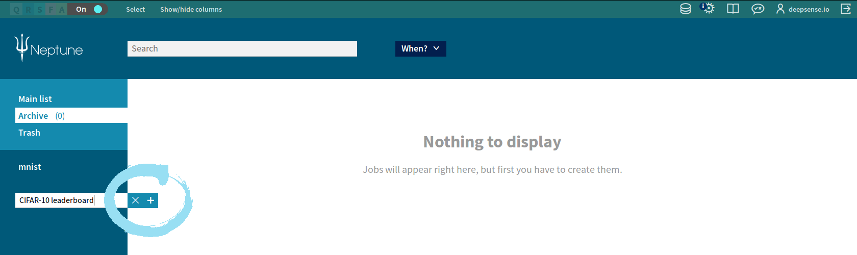
1. Creating a Neptune group
We create the Neptune group where all the submissions will be stored. We do this as follows:
Enter the Neptune home screen.
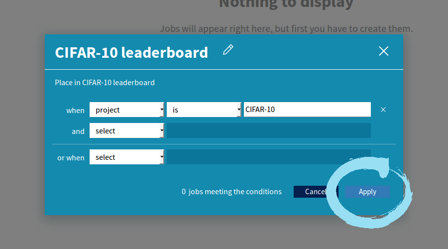
Click in the lower left corner, enter the name “CIFAR-10 leaderboard”, click again.
Choose “project” “is” and type “CIFAR-10”, click “Apply”.
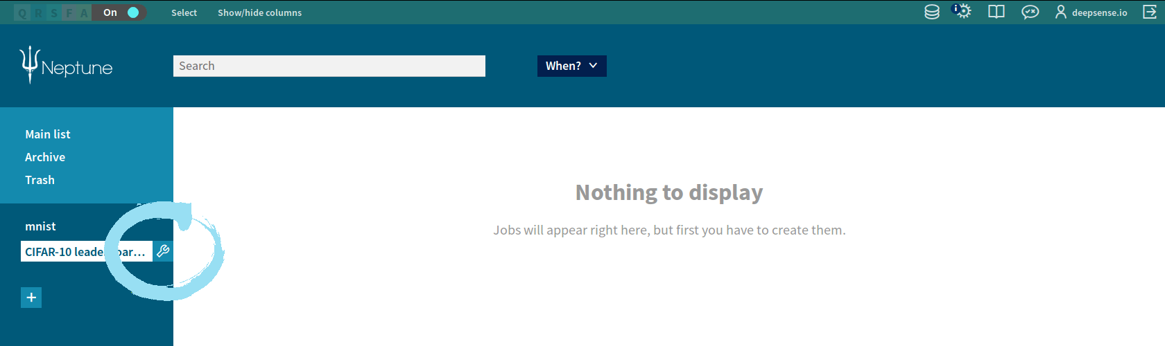
Our new group appears in the left column. We can edit or delete it by clicking the icon next to the group name.
2. Creating an evaluation module
We created the module evaluation.py consisting of 5 functions:
_evaluate_accuracy and _evaluate_cross_entropy compute the respective metrics,
_prepare_neptune adds tags to the Neptune job (if specified – see Step 4) and create Neptune channels to send evaluated metrics,
_send_to_neptune sends metrics to channels,
evaluate_and_send_to_neptune calls the above functions.
You can easily adapt this script to evaluate and send any other metrics.
3. Sending submissions to Neptune
To place our submissions in the Neptune group, we need to specify project: CIFAR-10 in a Neptune config file config.yaml . This is a three-line-long file, it also contains project name and a description.
Assume that the files from our repository are placed in the folder named leaderboard . The last preparation step we have to do is clone CIFAR-10 scripts from the TensorFlow repository. To do it, we go to the folder above folder leaderboard and type:
Now we are ready to send our results to the leaderboard created in Neptune! We run the script main.py from the folder above folder leaderboard by typing
neptune run leaderboard/main.py --config leaderboard/config.yaml --dump-dir-url leaderboard/dump --paths-to-dump leaderboard
using Neptune CLI. The script executes for about half an hour on a modern laptop. Training would be significantly faster on a GPU.
There are only 5 lines related to Neptune in the main.py script. First we load the library:
we evaluate our submission and send metric values to dedicated Neptune channels. tags is a list of tags which we can add to the Neptune job. In this way, we attach some keywords to the Neptune job. We can easily filter jobs by tags in the Neptune Web UI.
4. Customizing a view in Neptune’s Web UI
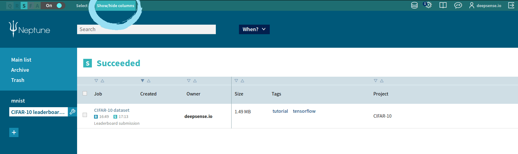
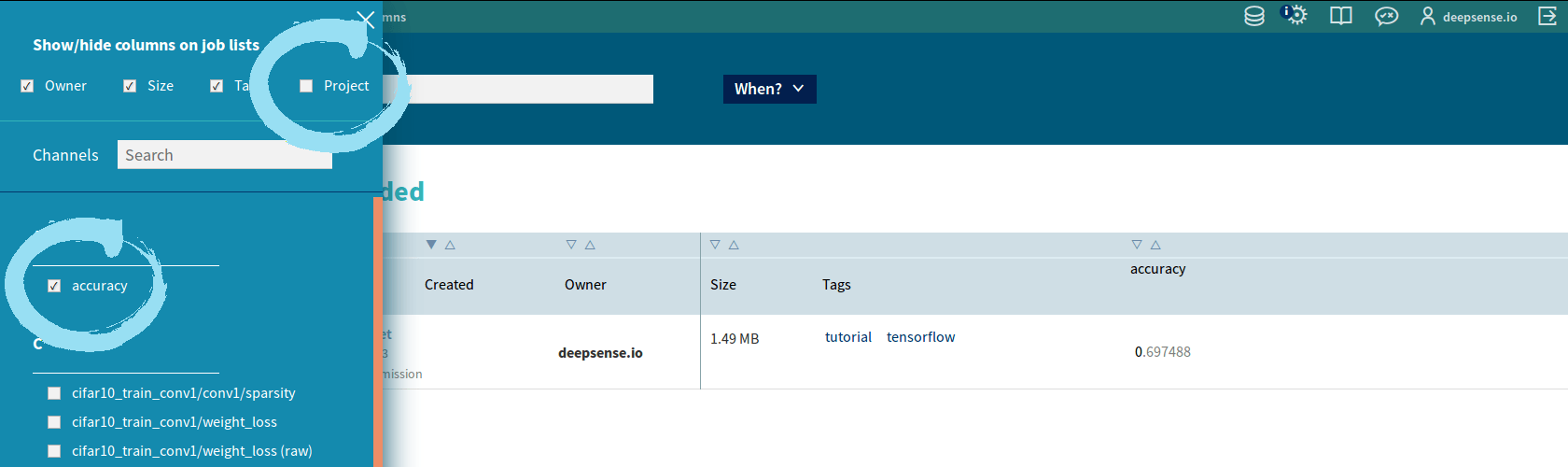
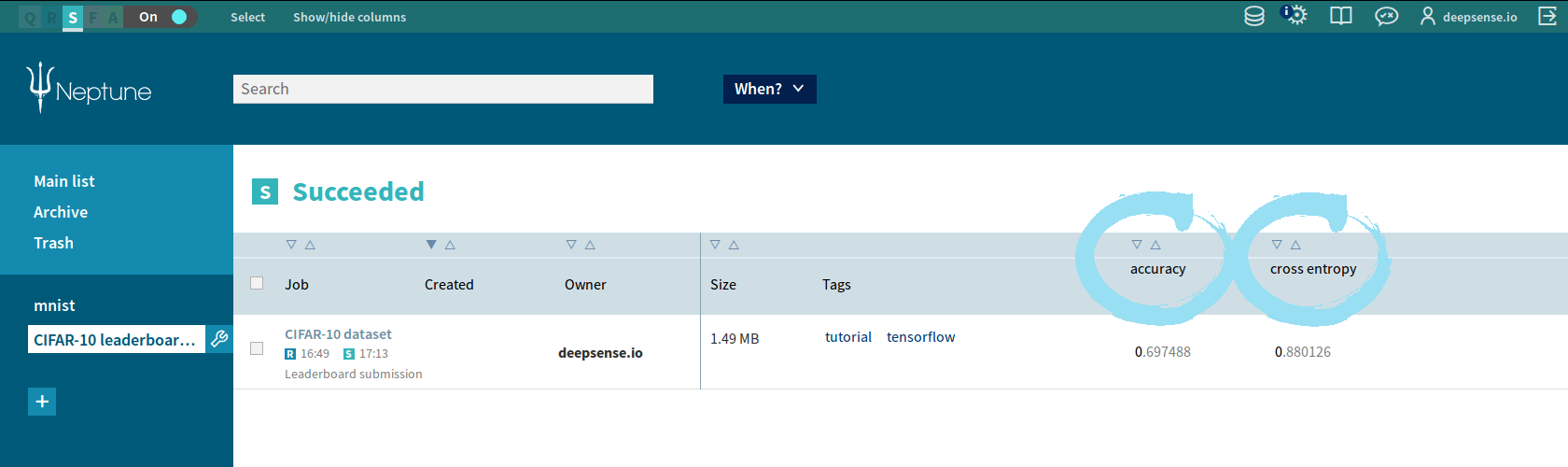
If the job has been successfully executed, we can see our submission in the Neptune group we created. One more thing worth doing is setting up the view of columns.
Click “Show/hide columns” in the upper part of the Neptune Web UI.
Check/uncheck the names. You should:
uncheck “Project” since all the submissions in this group come from the same project CIFAR-10,
check channel names “accuracy” and “cross entropy” because you want to sort with respect to them.
You can sort submissions by accuracy or cross entropy value by clicking the triangle over the respective column.
Summary
That’s all! Now your internal validation leaderboard in Neptune is all set up. You and your team members can compare your models tuned up to the CIFAR-10 dataset. You can also filter your results by dates, users or custom tags.
Of course, CIFAR-10 is not the only possible application of the provided code. You can easily adapt it for other applications like: contests, research or business intelligence. Feel free to use an internal validation leaderboard in Neptune wherever and whenever you need.
https://deepsense.ai/wp-content/uploads/2019/02/creating-internal-leaderboard-in-neptune-updated-logo.jpg3371140Patryk Miziułahttps://deepsense.ai/wp-content/uploads/2023/10/Logo_black_blue_CLEAN_rgb.pngPatryk Miziuła2017-01-19 16:36:352024-03-11 16:18:20An internal validation leaderboard in Neptune
We’re happy to announce that a new version of Neptune became available this month. The latest 1.3 release of deepsense.ai’s machine learning platform introduces powerful new features and improvements. This release’s key added features are: integration with TensorFlow and running Neptune experiments in Docker containers (see complete release notes).
TensorFlow Integration
The first major feature introduced in Neptune 1.3 is TensorFlow integration. We think that TensorFlow will become a leading technology for deep learning problems. TensorFlow comes with its own monitoring tool: TensorBoard. We don’t want to compete with TensorBoard, instead we want to incorporate TensorBoard’s well known functionalities into Neptune. Starting with Neptune 1.3, data scientist can see all available TensorBoard metrics and graphs in Neptune. Read more.
Running Neptune Experiments in Docker Containers
Neptune creates a snapshot of code for every experiment execution. Thanks to this users can easily recreate the results of every experiment. The problem is that the technology world is changing very quickly and saving the source code is often not enough. We also need to save our execution environment because the source code depends on specific versions of libraries. Neptune 1.3 gives users the option to run a Neptune experiment in a Docker container. A Docker container is an encapsulation of the execution environment. Thanks to this the user can have containers with different versions of the libraries and use them on the same host to recreate the experiment’s results.
Running Neptune experiments in Docker containers is also important for Windows users. The suggested way of running TensorFlow experiments on Windows is to run them in Docker containers. Now, a data scientist can use TensorFlow with Neptune on Windows.
Follow the link to read more about running Neptune experiments in docker containers.
Future Plans
We are already working on the next version of Neptune which will be released at the end of January 2017. The next release will contain:
We hope you will enjoy working with our machine learning platform, which now features TensorFlow integration and enables running experiments in Docker containers. If you’d like to provide us with any feedback, feel free to use our forum at https://community.neptune.ml/.
Don’t have Neptune yet? Join our Early Adopters Program and get free access.
https://deepsense.ai/wp-content/uploads/2019/02/neptune-1-3-with-tensorflow-integration-and-experiments-in-docker.jpg3371140Rafał Hryciukhttps://deepsense.ai/wp-content/uploads/2023/10/Logo_black_blue_CLEAN_rgb.pngRafał Hryciuk2016-12-30 10:33:302024-03-11 15:39:42Neptune 1.3 with TensorFlow integration and experiments in Docker
Underground mining poses a number of threats including fires, methane outbreaks or seismic tremors and bumps. An automatic system for predicting and alerting against such dangerous events is of utmost importance – and also a great challenge for data scientists and their machine learning models. This was the inspiration for the organizers of AAIA’16 Data Mining Challenge: Predicting Dangerous Seismic Events in Active Coal Mines.
Our solutions topped the final leaderboard by taking the first two places. In this post, we present the competition and describe our winning approach. For a more detailed description please see our publication.
The Challenge
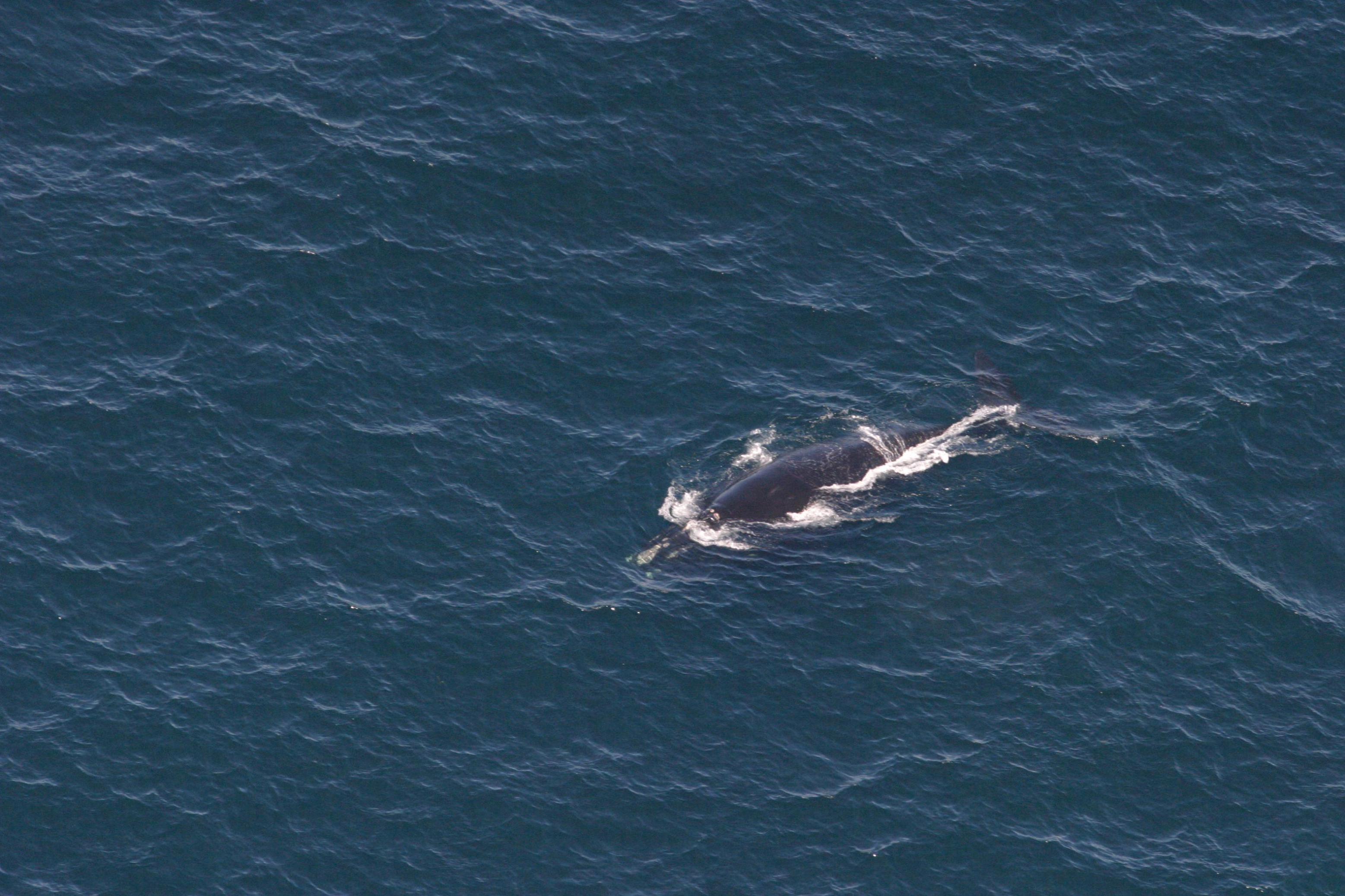
The datasets provided by organizers comprised of seismic activity records from Polish coal mines (24 working sites) collected throughout a period of several months. The goal was to develop a prediction model that, based on recordings from a 24-hour period, would predict whether an energy warning level (50k Joules) was going to be exceeded in the following 8 hours.
The participants were presented with two datasets: one for training and the other for testing purposes. The training set consisted of 133,151 observations accompanied by labels – binary values indicating warning level excess. The test set was of a moderate size of 3,860 observations. The prediction model should automatically assess the danger for each event, i.e. evaluate the likelihood of exceeding the energy warning level for each observation.
The model’s quality was to be judged by the accuracy of the likelihoods measured with respect to the Area Under ROC curve (AUC) metric. This is a common metric for evaluating binary predictions, particularly when the classes are imbalanced (only about 2% of events in the training dataset were labeled as dangerous). The AUC measure can be interpreted as the probability that a randomly drawn observation from the danger class will have a higher likelihood assigned to it than a randomly drawn observation from the safe class. Knowing the interpretation it is easy to assess the quality of the results: a score of 1.0 means perfect prediction and 0.5 is the equivalent of random guessing. (Bonus question for the readers: what would a score of 0 mean?).
Overview of the data
What constitutes an observation in this dataset? An observation is not a single number but a list of 541 values. There are 13 general features describing the entire 24 hour-long period, such as:
ID of the working site;
Overall energies of bumps, tremors, destressing blasts and total seismic energy;
Latest experts’ hazard assessments.
The remaining features are 24 hour-long time series of the number of seismic events and their energies.
Apart from the above data, the participants were provided with metadata about each working site. This was mostly information specific to a given working site, e.g. its name.
Our insights
The very first and one of the major tasks facing a data scientist is getting familiar with the dataset. One should assess its coherence, check for missing values and, in many cases, modify it to obtain a more meaningful representation of underlying phenomena. In other words, one would perform feature engineering. Below we present insights which we found interesting from a machine learning perspective.
Sparse information
The majority of the values in the training set were just zeros – around 66 percent! A sensible approach is to aggregate related sparse features to produce denser representations. An example could be to sum hourly counts of seismic events. By summing values in all 24 hours, the last 5 hours and in the very last hour, we would end up with 3 features instead of 24 – eight times less. We would not only reduce the size of the dataset – we would also have a greater chance that our models would see some interesting patterns more easily. At the same time, we would prevent the models from getting fooled by temporary artifacts – their impact will fade down after aggregation.
Multiple locations
An interesting difficulty – or rather a challenge – are the observations’ origins. The seismic records were collected at different coal mines with varying seismic activity. In some of them dangerous events were much more frequent than in others, ranging from 0 to 17% of observations. Ideally, we would produce a single specialized model for each working site. However, there is a high probability that these models would be useless when confronted with a new location. They would also be useless in this data mining challenge – the table below presents coal mines along with the number of available observations – notice that not all of them appear in both training and test sets and that the number of observations vary considerably between the sites. Thus, there was a need to build a location-agnostic model that would learn from general seismic activity phenomena.
Working site ID
Training observations
Test observations
Warnings frequency
373
31236
–
1.1%
264
20533
–
0.4%
725
14777
330
9.4%
777
13437
330
0.0%
437
11682
–
0.4%
541
6429
5
0.9%
146
5591
98
0.1%
575
4891
253
0.5%
765
4578
329
0.0%
149
4248
98
7.3%
155
3839
98
17.2%
583
3552
215
0.2%
479
2488
35
0.0%
793
2346
330
0.0%
607
2328
209
0.0%
599
1196
363
1.9%
799
–
317
–
470
–
258
–
490
–
160
–
703
–
145
–
641
–
97
–
689
–
83
–
508
–
58
–
171
–
49
–
Working site proxies
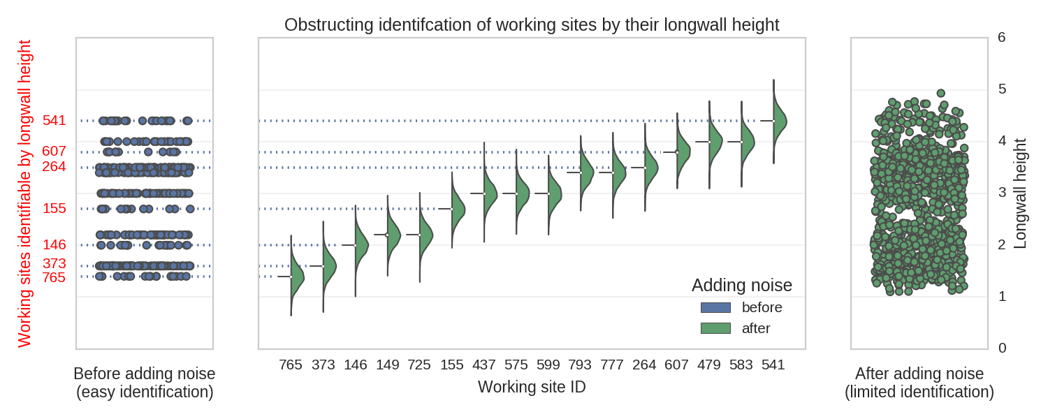
As mentioned above, our goal was to build a model which generalizes well and is able to infer predictions from a broad variety of clues (the features we extracted) without getting biased toward particular locations. Therefore, a necessary step is to exclude the mine IDs from the features set. We have to be careful though, as the information identifying a particular site can leak through other features, turning them into working site proxies. We have already mentioned them – these were the coal mines’ metadata and the majority of them were excluded straight away (various names specific only to particular locations). We only kept the main working height, as this information was valuable. However, as you can see in the figure below, some of the mines can be exactly identified by their main working height values. To obstruct the identification, we added some Gaussian noise:
After injecting some randomness, it is no longer possible to exactly identify location based on a longwall’s height. However, the essential information is still conveyed.
Features
The above insights allowed us to significantly reduce the number of features. We ended up with 133 features – 4 times less than the original set.
This was not the end of feature extraction. Often some valuable information is not stored directly in the features, but rather in the interactions between them (e.g. pairwise multiplications). We selected around 1,000 of the most promising interactions and treated them as additional features.
Validation
The condition – that the model has to generalize well – sets particular requirements on the validation procedure. It has to favor the models that make accurate predictions for the known working sites, as well as for previously unseen sites. One possible validation procedure which satisfies these conditions is to, for every train-test split, divide the working sites into three groups: first group will be used solely for training, second only for testing, in the third the observations will be split. For the sake of the results’ stability, we would generate many of these configurations (25 worked well in our case) and average the outcomes.
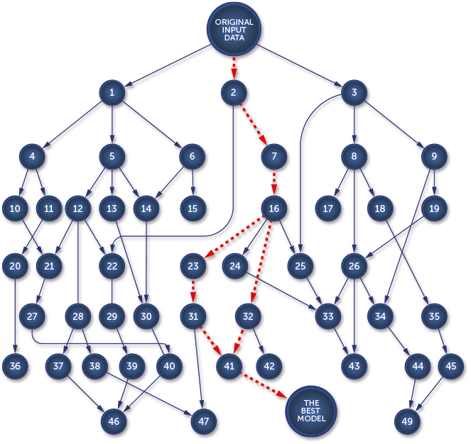
Model selection
Having settled on the features set and the validation procedure we focused on model selection. The process was quite complex, so let’s go through it step-by-step:
We decided to use tree-based classifiers as they work particularly well with unbalanced classes and possibly correlated features. Namely, we used ExtraTreesClassifier (ETC) from scikit-learn and XGBoost (XGB) classifier from xgboost;
We ran a preliminary grid search to find well-performing meta-parameters;
The models were used to select promising features subsets. We ran hundreds of evaluations, where in each run we made use of a random selection of features (between 20 and 40) and interactions (up to 10).
Model ensembling
The above procedure was meant to reveal relatively small feature subspaces. All of them were reasonably accurate. Moreover, they were also (to some extent) independent. The models based on them could see only a small part of the entire features space, therefore they were inferring their predictions based on diverse clues. And what can one do with a number of varied models? Let them vote! The final submission to the contest was a blend of predictions generated by multiple models (2 major ones which saw all features and 40 minor ones, which saw only subspaces).
Final results
The final submission reached 0.94 AUC and turned out to be the best in the competition, outperforming 200 other machine learning teams. This meant that deepsense.ai retained its top position in the AAIA Data Mining Challenges (you can read about our success last year here).
I would like to thank all the competition participants for a challenging environment, as well as the organizers from the University of Warsaw and the Institute of Innovative Technologies EMAG for preparing such an interesting and meaningful dataset. I would also like to thank my colleagues from the deepsense.ai Machine Learning Team: Robert Bogucki, Jan Kanty Milczek and Jan Lasek for the great time we had tackling the problem.
In 2013 the Deepmind team invented an algorithm called deep Q-learning. It learns to play Atari 2600 games using only the input from the screen. Following a call by OpenAI, we adapted this method to deal with a situation where the playing agent is given not the screen, but rather the RAM state of the Atari machine. Our work was accepted to the Computer Games Workshop accompanying the IJCAI 2016 conference. This post describes the original DQN method and the changes we made to it. You can re-create our experiments using a publicly available code.
Atari games
Atari 2600 is a game console released in the late 1970s. If you were a lucky teenager at that time, you would connect the console to the TV-set, insert a cartridge containing a ROM with a game and play using the joystick. Even though the graphics were not particularly magnificent, the Atari platform was popular and there are currently around \(400\) games available for it. This collection includes immortal hits such as Boxing, Breakout, Seaquest and Space Invaders.
agent (which sees states and rewards and decides on actions) and
environment (which sees actions, changes states and gives rewards).
R. Sutton and A. Barto: Reinforcement Learning: An Introduction
In our case, the environment is the Atari machine, the agent is the player and the states are either the game screens or the machine’s RAM states. The agent’s goal is to maximize the discounted sum of rewards during the game. In our context, “discounted” means that rewards received earlier carry more weight: the first reward has a weight of \(1\), the second some \(gamma\) (close to \(1\)), the third \(gamma^2\) and so on.
Q-values
Q-value (also called action-value) measures how attractive a given action is in a given state. Let’s assume that the agent’s strategy (the choice of the action in a given state) is fixed. Then a Q-value of a state-action pair \((s, a)\) is the cumulative discounted reward the agent will get if it is in a state \(s\), executes the action \(a\) and follows his strategy from there on.
The Q-value function has an interesting property – if a strategy is optimal, the following holds:
$$
Q(s_t, a_t) = r_t + gamma max_a Q(s_{t+1}, a)
$$
One can mathematically prove that the reverse is also true. Namely, any strategy which satisfies the property for all state-action pairs is optimal. This fact is not restricted to deterministic strategies. For stochastic strategies, you have to add some expectation value signs and all the results still hold.
Q-learning
The above concept of Q-value leads to an algorithm learning a strategy in a game. Let’s slowly update the estimates of the state-action pairs to the ones that locally satisfy the property and change the strategy, so that in each state it will choose an action with the highest sum of expected reward (estimated as an average reward received in a given state after following given action) and biggest Q-value of the subsequent state.
for all (s,a):
    Q[s, a] = 0 #initialize q-values of all state-action pairs
for all s:
    P[s] = random_action() #initialize strategy
# assume we know expected rewards for state-action pairs R[s, a] and
# after making action a in state s the environment moves to the state next_state(s, a)
# alpha : the learning rate - determines how quickly the algorithm learns;
#                             low values mean more conservative learning behaviors,
#                             typically close to 0, in our experiments 0.0002
# gamma : the discount factor - determines how we value immediate reward;
#                               higher gamma means more attention given to far-away goals
#                               between 0 and 1, typically close to 1, in our experiments 0.95
repeat until convergence:
  1. for all s:
         P[s] = argmax_a (R[s, a] + gamma * max_b(Q[next_state(s, a), b]))
  2. for all (s, a):
         Q[s, a] = alpha*(R[s, a] + gamma * max_b Q[next_state(s, a), b]) + (1 - alpha)Q[s, a]
This algorithm is called Q-learning. It converges in the limit to an optimal strategy. For simple games like Tic-Tac-Toe, this algorithm, without any further modifications, solves them completely not only in theory but also in practice.
Deep Q-learning
Q-learning is a correct algorithm, but not an efficient one. The number of states which need to be visited multiple times to learn their action-values is too big. We need some form of generalization: when we learn about the value of one state-action pair, we can also improve our knowledge about other similar state-actions.
The deep Q-learning algorithm uses the convolutional neural network as a function approximating the Q-value function. It accepts the screen (after some transformations) as an input. The algorithm transforms the input with a couple of layers of nonlinear functions. Then it returns an up to \(18\) dimensional vector. Entries of the vector denote the approximated Q-values of the current state and each of the possible actions. The action to choose is the one with the highest Q-value.
Training consists of playing the episodes of the game, observing transitions from state to state (doing the currently best actions) and rewards. Having all this information, we can estimate the error, which is the square of the difference between the left- and right-hand side of the Q-learning property above:
$$
error = (Q(s_t, a_t) – (r_t + gamma max_a Q(s_{t+1}, a)))^2
$$
We can calculate the gradient of this error according to the network parameters and update them to decrease the error using one of the many gradient descent optimization algorithms (we used RMSProp).
DQN+RAM
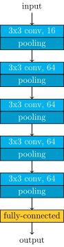
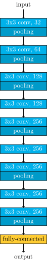
In our work, we adapted the deep Q-learning algorithm so that its input are not game screens, but the RAM states of the Atari machine. Atari 2600 has only \(128\) bytes of RAM. On one hand, this makes our task easier, as our input is much smaller than the full screen of the console. On the other hand, the information about the game may be hard to retrieve. We tried two network architectures. One with \(2\) hidden ReLU layers, \(128\) nodes each, and the other with \(4\) such layers. We obtained results comparable (in two games higher, in one lower) to those achieved with the screen input in the original DQN paper. Admittedly, higher scores can be achieved using more computational resources and some additional tricks.
Tricks
The method of learning Atari games, as presented above and even with neural networks employed to approximate the Q-values, would not yield good results. To make it work, the original DQN paper’s authors and we in our experiments, employed a few improvements to the basic algorithm. In this section, we discuss some of them.
Epsilon-greedy strategy
When we begin our agent’s training, it has little information about the value of particular game states. If we were to completely follow the learned strategy at the start of the training we’d be nearly randomly choosing some actions to follow in the first game states. As the training continues, we’d stick to these actions for the first states, as their value estimation would be positive (and for the other actions would be nearly zero). The value of the first-chosen action would improve and we’d only pick these, without even testing the other possibilities. The first decisions, made with little information, would be reinforced and followed in the future.
We say that such a policy doesn’t have a good exploration-exploitation tradeoff. On one hand, we’d like to focus on the actions that led to reasonable results in the past, but on the other ahnd, we prefer our policies to extensively explore the state-action space.
The solution to this problem used in DQN is using an epsilon-greedy strategy during training. This means that at any time with some small probability \(varepsilon\) the agent chooses a random action, instead of always choosing the action with the best Q-value in the given state. Then, every action will get some attention and its state-action value estimation will be based on some (possibly limited) experience and not the initialization values.
We join this method with epsilon decay — at the beginning of training we set \(varepsilon\) to a high value (\(1.0\)), meaning that we prefer to explore the various actions and gradually decrease \(varepsilon\) to a small value, that indicate the preference to exploit the well-learned action-values.
Experience replay
Another trick used in DQN is called experience replay. The process of training a neural network consist of training epochs; in each epoch we pass all the training data, in batches, as the network input and update the parameters based on the calculated gradients.
When training reinforcement learning models, we don’t have an explicit dataset. Instead, we experience some states, actions, and rewards. We pass them to the network, so that our statistical model can learn what to do in similar game states. As we want to pass a particular state/action/reward tuple multiple times to the network, we save them in memory when they are seen. To fit this data to the RAM of our GPU, we store at most \(100 000\) recently observed state/action/reward/next state tuples.
When the dataset is queried for a batch of training data, we don’t return consecutive states, but a set of random tuples. This reduces correlation between states processed in a given step of learning. As a result, this improves the statistical properties of the learning process.
For more details about experience replay you can see Section 3.5 of Lin’s thesis. As quite a few other tricks in reinforcement learning, this method was invented back in 1993 – significantly before the current deep learning boom.
Frameskip
Atari 2600 was designed to use an analog TV as the output device. The console generated \(60\) new frames appearing on the screen every second. To simplify the search space we imposed a rule that one action is repeated over a fixed number of frames. This fixed number is called the frame skip. The standard frame skip used in the original work on DQN is \(4\). For this frame skip the agent makes a decision about the next move every \( 4cdot frac{1}{60} = frac{1}{15}\) of a second. Once a decision is made, it remains unchanged during the next \(4\) frames. A low frame skip allows the network to learn strategies based on a super-human reflex. A high frame skip will limit the complexity of a strategy. Hence learning may be faster and more successful whenever strategy matters over tactic. In our work , we tested frame skips equal to \(4,8\) and \(30\).
https://deepsense.ai/wp-content/uploads/2019/02/Playing-Atari-games-using-RAM-state.jpg3371140Henryk Michalewskihttps://deepsense.ai/wp-content/uploads/2023/10/Logo_black_blue_CLEAN_rgb.pngHenryk Michalewski2016-09-27 12:00:342023-02-28 21:57:21Playing Atari on RAM with Deep Q-learning
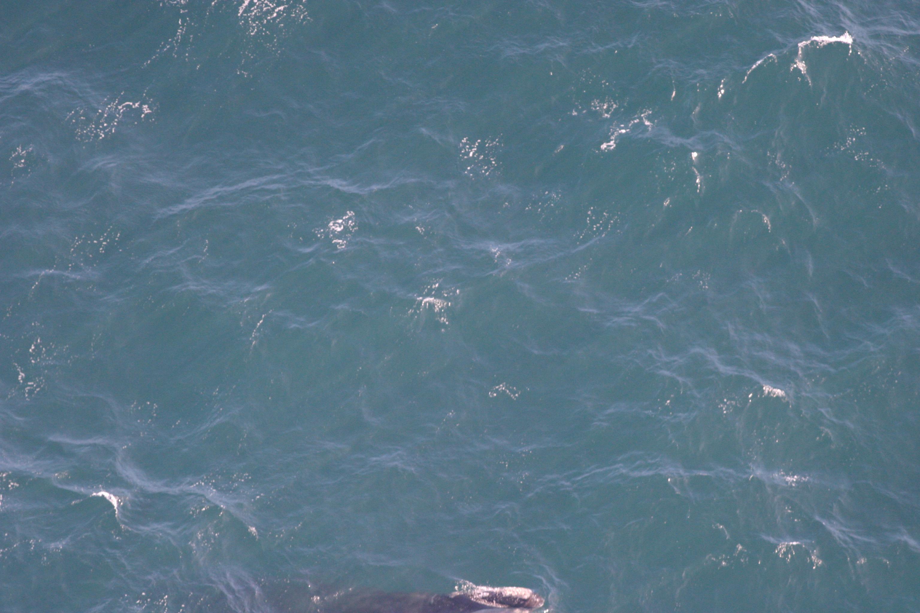
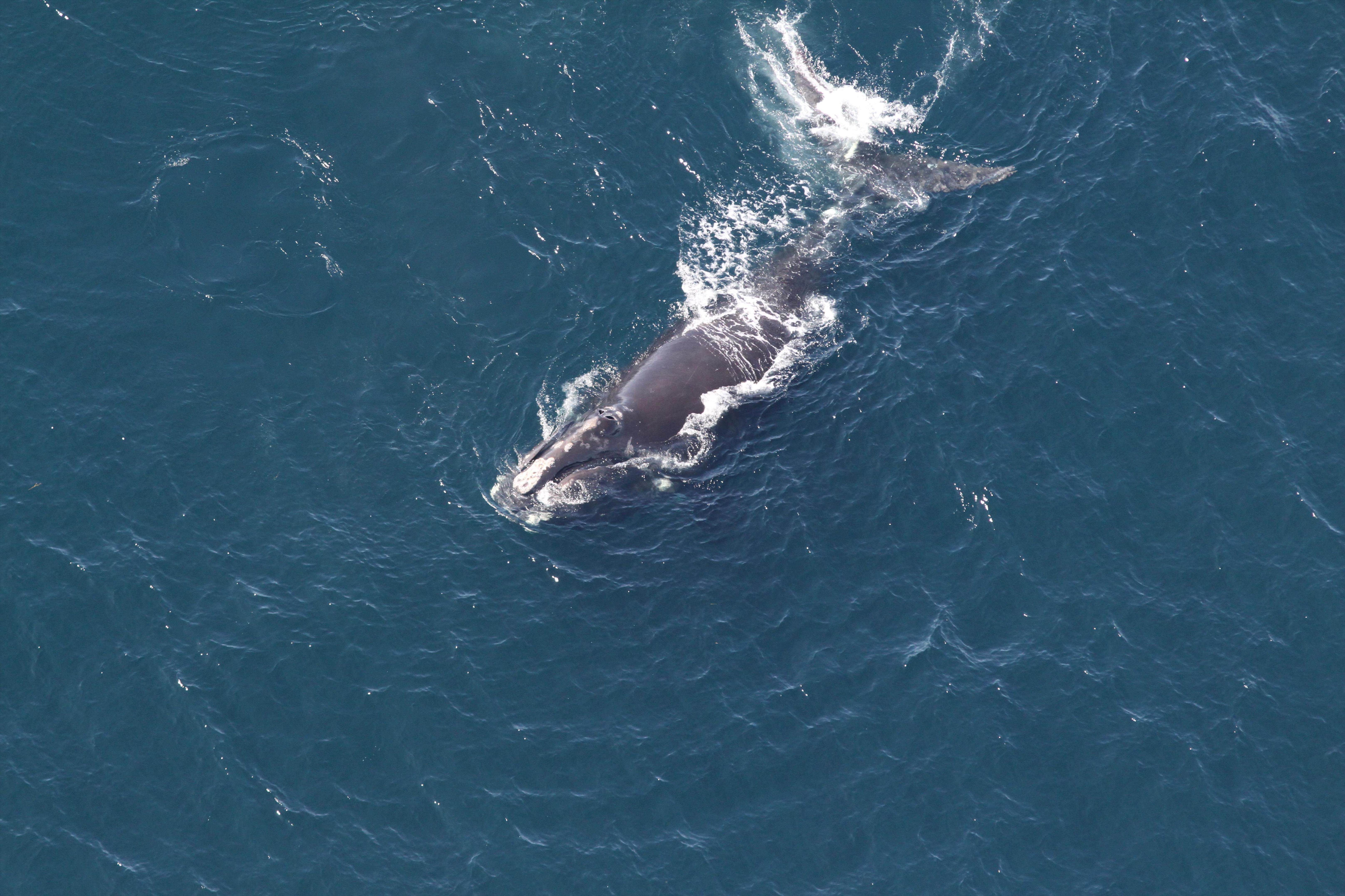
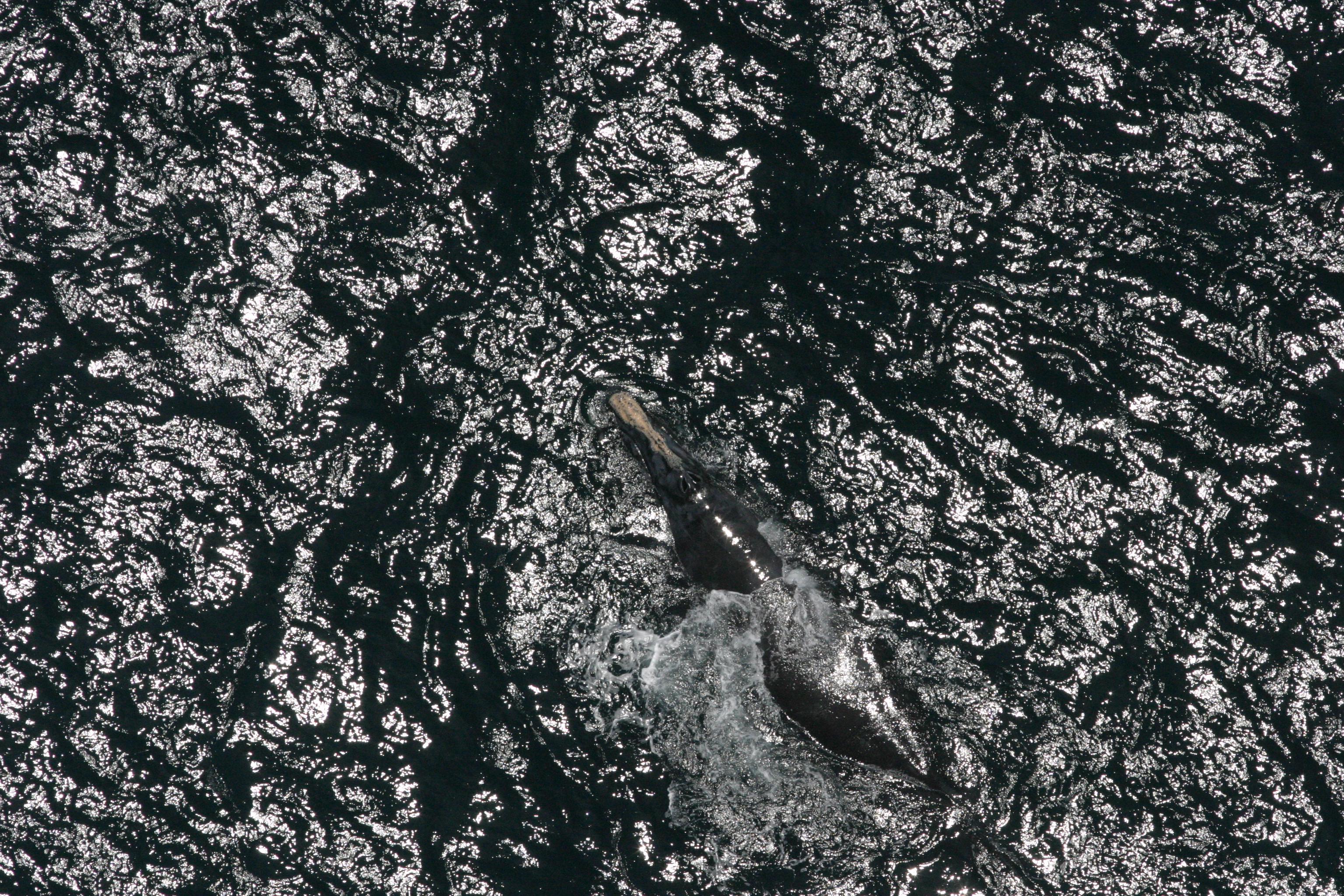
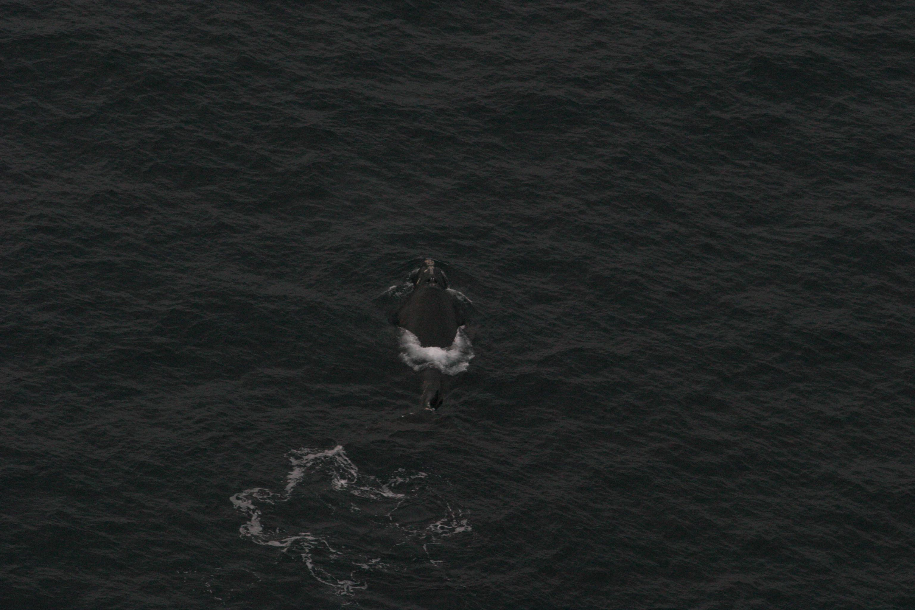
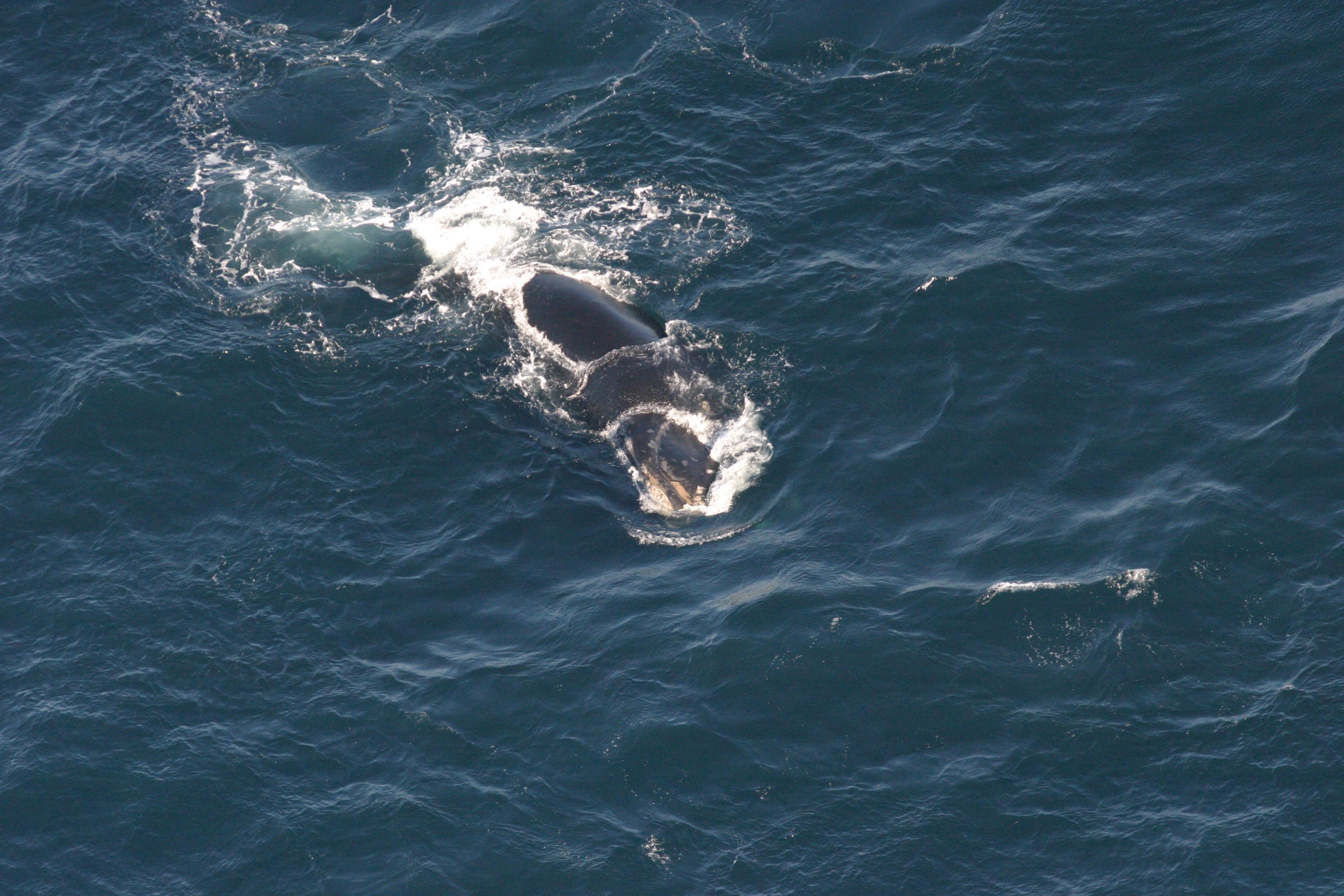
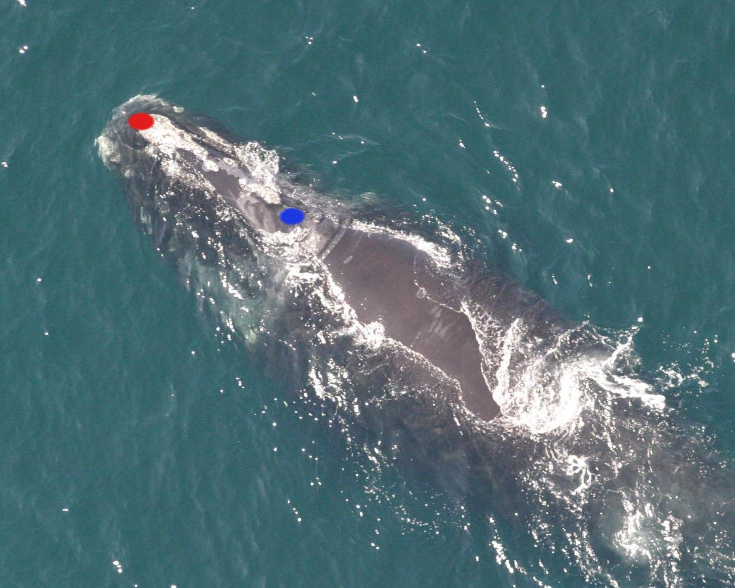
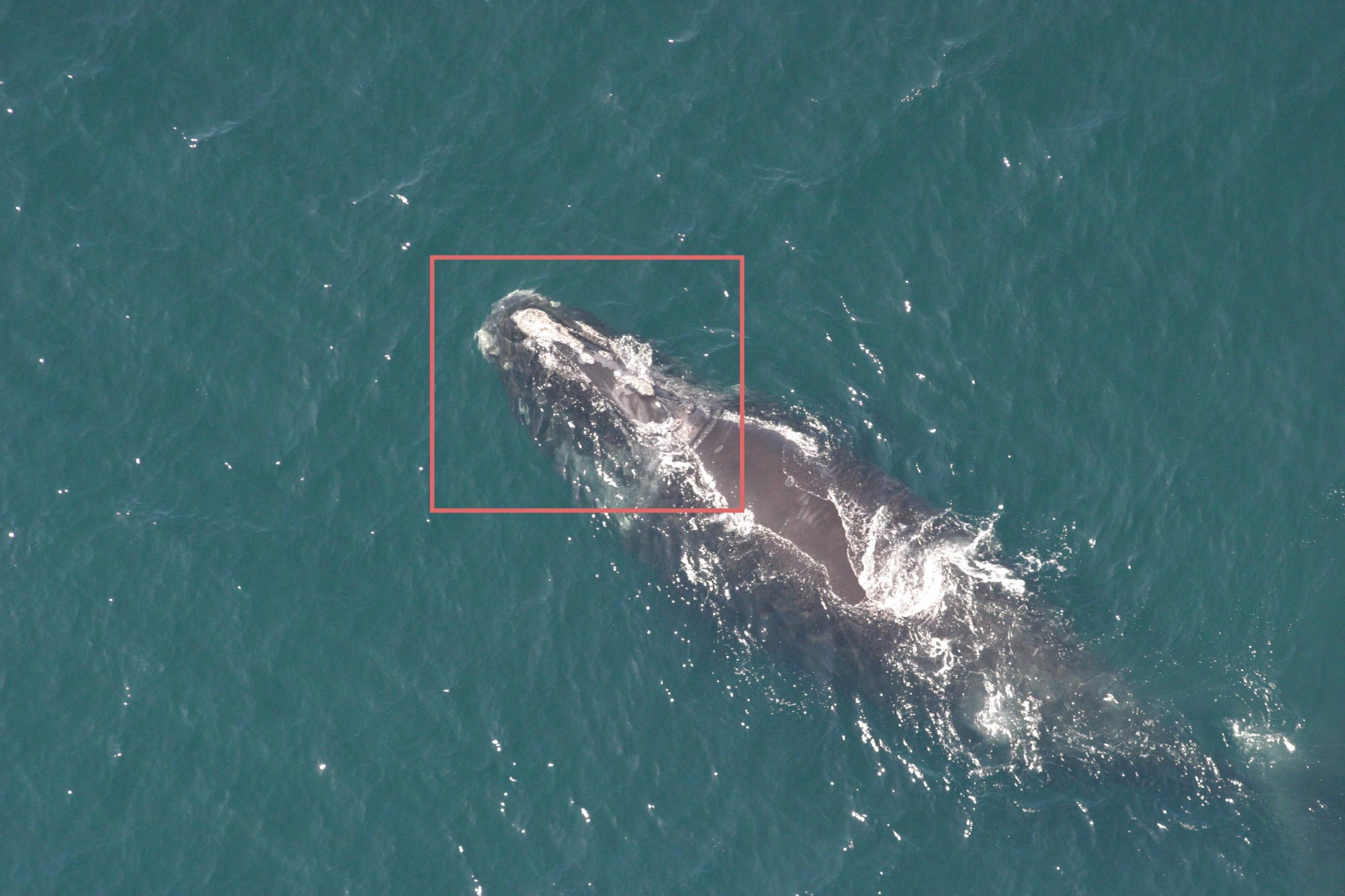
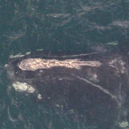
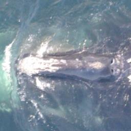
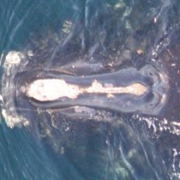
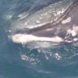
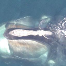
In January 2016, deepsense.ai won the Right Whale Recognition contest on Kaggle. The competition’s goal was to automate the right whale recognition process using a dataset of aerial photographs of individual whales. The terms and conditions for the competition stated that to collect the prize, the winning team had to provide source code and a description of how to recreate the winning solution. A fair request, but as it turned out, the winning solution’s authors spent about three weeks recreating all of the steps that led them to the winning machine learning model.
When data scientists work on a problem, they need to test many different approaches – various algorithms, neural network structures, numerous hyperparameter values that can be optimized etc. The process of validating one approach can be called an experiment. The inputs for every experiment include: source code, data sets, hyperparameter values and configuration files. The outputs of every experiment are: output model weights (definition of the model), metric values (used for comparing different experiments), generated data and execution logs. As we can see, that’s a lot of different artifacts for each experiment. It is crucial to save all of these artifacts to keep track of the project – comparing different models, determining which approaches were already tested, expanding research from some experiment from the past etc. Managing the process of experiment executions is a very hard task and it is easy to make a mistake and lose an important artifact.
To make the situation even more complicated, experiments can depend on each other. For example, we can have two different experiments training two different models and a third experiment that takes these two models and creates a hybrid to generate predictions. Recreating the best solution means finding the path from the original data set to the model that gives the best results.
Recreating the path that led to the best model
The deepsense.ai research team performed around 1000 experiments to find the competition-winning solution. Knowing all that, it becomes clear why recreating the solution was such a difficult and time consuming task.
The problem of recreating a machine learning solution is present not only in an academic environment. Businesses struggle with the same problem. The common scenario is that the research team works to find the best machine learning model to solve a business problem, but then the software engineering team has to put the model into a production environment. The software engineering team needs a detailed description of how to recreate the model.
Our research team needed a platform that would help them with these common problems. They defined the properties of such a platform as:
Every experiment and the related artifacts are registered in the system and accessible for browsing and comparing;
Experiment execution can be monitored via real-time metrics;
Experiment execution can be aborted at any time;
Data scientists should not be concerned with the infrastructure for the experiment execution.
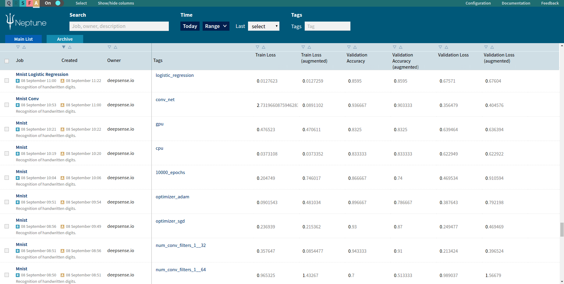
deepsense.ai decided to build Neptune – a brand new machine learning platform that organizes data science processes. This platform relieves data scientists of the manual tasks related to managing their experiments. It helps with monitoring long-running experiments and supports team collaboration. All these features are accessible through the powerful Neptune Web UI and useful for scripting CLI.
Neptune is already used in all machine learning projects at deepsense.ai. Every week, our data scientists execute around 1000 experiments using this machine learning platform. Thanks to that, the machine learning team can focus on data science and stop worrying about process management.
Experiment Execution in Neptune
Main Concepts of the Machine Learning Platform
Job
A job is an experiment registered in Neptune. It can be registered for immediate execution or added to a queue. The job is the main concept in Neptune and contains a complete set of artifacts related with the experiment:
source code snapshot: Neptune creates a snapshot of the source code for every job. This allows a user to revert to any job from the past and get the exact version of the code that was executed;
parameters: customly defined by a user. Neptune supports boolean, numeric and string types of parameters;
data and logs generated by the job;
metric values represented as channels.
Neptune is library and framework agnostic. Users can leverage their favorite libraries and frameworks with Neptune. At deepsense.ai we currently execute Neptune jobs that use: TensorFlow, Theano, Caffe, Keras, Lasagne or scikit-learn.
Channel
A channel is a mechanism for real-time job monitoring. In the source code, a user can create channels, send values through them and then monitor these values live using the Neptune Web UI. During job execution, a user can see how his or her experiment is performing. The Neptune machine learning platform supports three types of channels:
Numeric: used for monitoring any custom-defined metric. Numeric channels can be displayed as charts. Neptune supports dynamic chart creation from the Neptune Web UI with multiple channels displayed in one chart. This is particularly useful for comparing various metrics;
Text: used for logs;
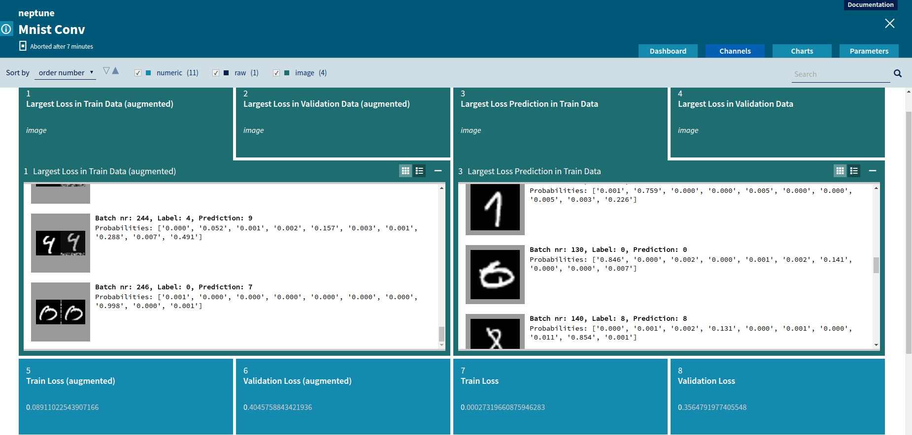
Image: used for sending images. A common use case for this type of channel is checking the behavior of an applied augmentation when working with images.
Comparing two Neptune image channels
Queue
A queue is a very simple mechanism that allows a user to execute his or her job on remote infrastructure. A common setup for many research teams is that data scientists develop their code on local machines (laptops), but due to hardware requirements (powerful GPU, large amount of RAM, etc) code has to be executed on a remote server or in a cloud. For every experiment, data scientists have to move source code between the two machines and then log into the remote server to execute the code and monitor logs. Thanks to our machine learning platform, a user can enqueue a job from a local machine (the job is created in Neptune, all metadata and parameters are saved, source code copied to users’ shared storage). Then, on a remote host that meets the job requirements the user can execute the job with a single command. Neptune takes care of copying the source code, setting parameters etc.
The queue mechanism can be used to write a simple script that queries Neptune for enqueued jobs and execute the first job from the queue. If we run this script on a remote server in an infinite loop, we don’t have to log to the server ever again because the script executes all the jobs from the queue and reports the results to the machine learning platform.
Creating a Job
Neptune is language and framework agnostic. A user can communicate with Neptune using REST API and Web Sockets from his or her source code written in any language. To make the communication easier, we provide a high-level client library for Python (other languages are going to be supported soon).
Let’s examine a simple job that provided with amplitude and sampling_rate generates sine and cosine as functions of time (in seconds).
import math
import time
from deepsense import neptune
ctx = neptune.Context()
amplitude = ctx.params.amplitude
sampling_rate = ctx.params.sampling_rate
sin_channel = ctx.job.create_channel(name='sin', channel_type=neptune.ChannelType.NUMERIC)
cos_channel = ctx.job.create_channel(name='cos', channel_type=neptune.ChannelType.NUMERIC)
logging_channel = ctx.job.create_channel(name='logging', channel_type=neptune.ChannelType.TEXT)
ctx.job.create_chart(name='sin & cos chart', series={'sin': sin_channel, 'cos': cos_channel})
ctx.job.finalize_preparation()
# The time interval between samples.
period = 1.0 / sampling_rate
# The initial timestamp, corresponding to x = 0 in the coordinate axis.
zero_x = time.time()
iteration = 0
while True:
    iteration += 1
    # Computes the values of sine and cosine.
    now = time.time()
    x = now - zero_x
    sin_y = amplitude * math.sin(x)
    cos_y = amplitude * math.cos(x)
    # Sends the computed values to the defined numeric channels.
    sin_channel.send(x=x, y=sin_y)
    cos_channel.send(x=x, y=cos_y)
    # Formats a logging entry.
    logging_entry = "sin({x})={sin_y}; cos({x})={cos_y}".format(x=x, sin_y=sin_y, cos_y=cos_y)
    # Sends a logging entry.
    logging_channel.send(x=iteration, y=logging_entry)
    time.sleep(period)
The first thing that we can see is that we need to import Neptune library and create a neptune.Context object. The Context object is an entrypoint for Neptune integration. Afterwards, using the context we obtain values for job parameters: amplitude and sampling_rate.
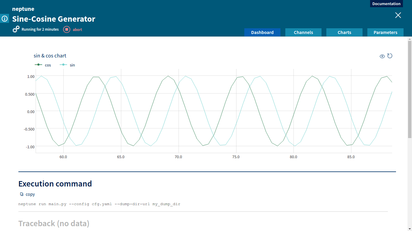
Then, using neptune.Context.job we create numeric channels for sending sine and cosine values and a text channel for sending logs. We want to display sin_channel and cos_channel on a chart, so we use neptune.Context.job.create_chart to define a chart with two series named sin and cos. After that, we need to tell Neptune that the preparation phase is over and we are starting the proper computation. That is what: ctx.job.finalize_preparation() does.
In an infinite loop we calculate sine and cosine functions values and send these values to Neptune using the channel.send method. We also create a human-readable log and send it through logging_channel.
To run main.py as a Neptune job we need to create a configurtion file – a descriptor file with basic metadata for the job.
config.yaml contains basic information about the job: name, project, owner and parameter definitions. For our simple Sine-Cosine Generator we need two parameters of double type: amplitude and sampling_rate (we already saw in the main.py how to obtain parameter values in the code).
To run the job we need to use the Neptune CLI command: neptune run main.py –config config.yaml –dump-dir-url my_dump_dir — –amplitude 5 –sampling_rate 2.5
For neptune run we specify: the script that we want to execute, the configuration for the job and a path to a directory where snapshot of the code will be copied to. We also pass values of the custom-defined parameters.
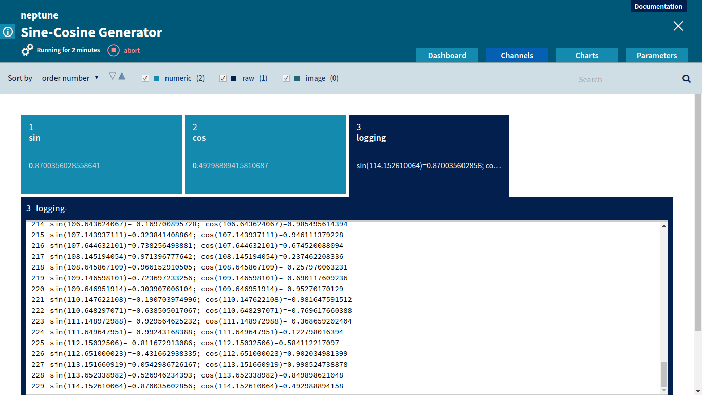
Job Monitoring
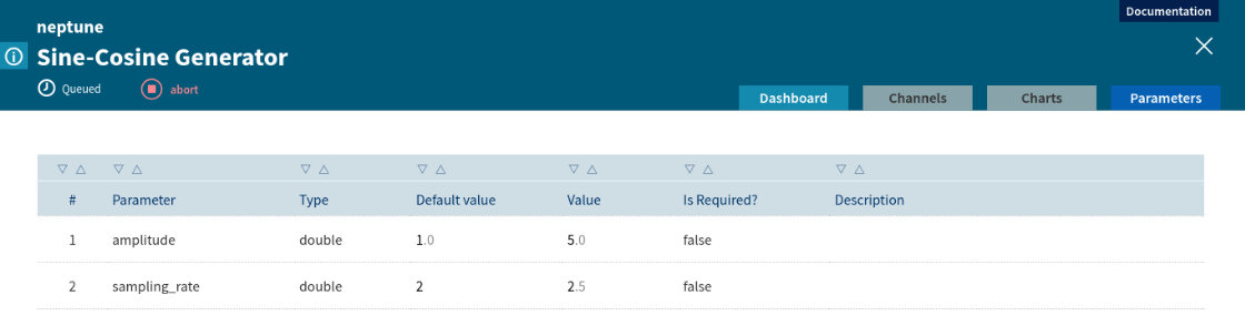
Every job executed in the machine learning platform can be monitored in the Neptune Web UI. A user can see all useful information related to the job:
metadata (name, description, project, owner);
job status (queued, running, failed, aborted, succeeded);
location of the job source code snapshot;
location of the job execution logs;
parameter schema and values.
Parameters for Sine-Cosine Generator
A data scientist can monitor custom metrics sent to Neptune through the channel mechanism. Values of the incoming channels are displayed in the Neptune Web UI in real time. If the metrics are not satisfactory, the user can decide to abort the job. Aborting the job can also be done from the Neptune Web UI.
Channels for Sine-Cosine GeneratorComparing values of multiple metrics using Neptune channels
Numeric channels can be displayed graphically as charts. A chart representation is very useful to compare various metrics and to track changes of metrics during job execution.
Chart for Sine-Cosine GeneratorCharts displaying custom metrics
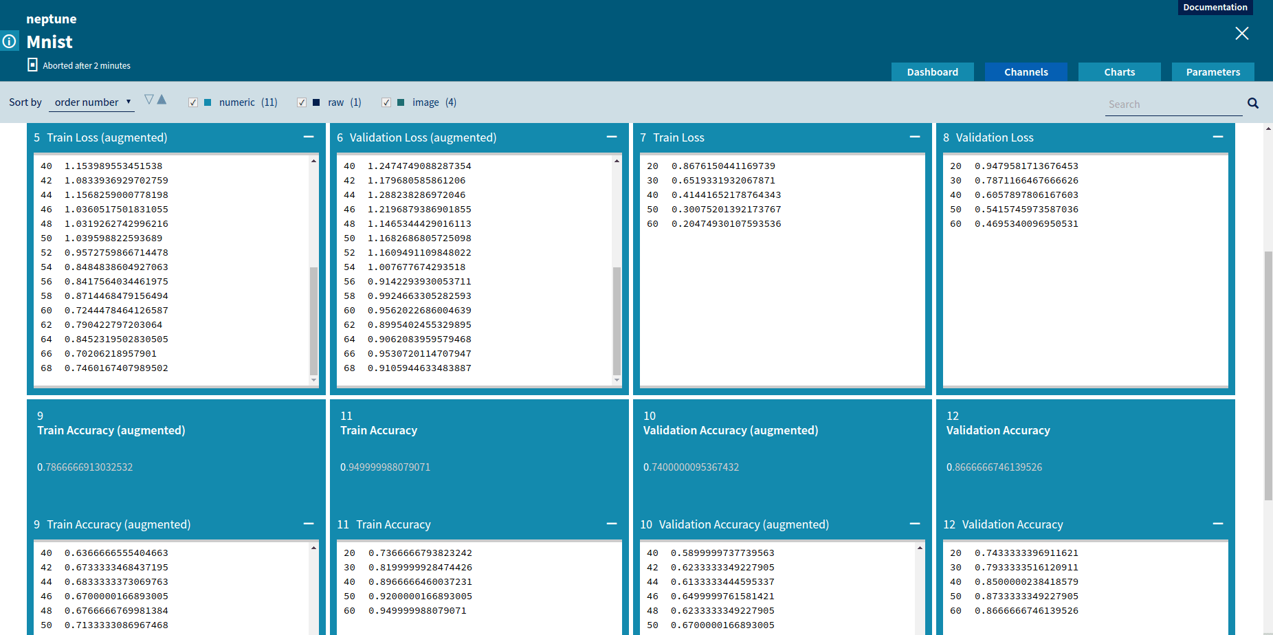
For every job a user can define a set of tags. Tags are useful for marking significant differences between jobs and milestones in the project (i.e if we are doing a MINST project, we can start our research by running the job with a well known and publicly available algorithm and tag it ‘benchmark’).
Comparing Results and Collaboration
Every job executed in the Neptune machine learning platform is registered and available for browsing. Neptune’s main screen shows a list of all executed jobs. User can filter jobs using job metadata, execution time and tags.
Neptune jobs list
A user can select custom-defined metrics to show as columns on the list. The job list can be sorted using values from every column. That way, a user can select which metric he or she wants to use for comparison, sort all jobs using this metric and then find the job with the best score.
Thanks to a complete history of job executions, data scientists can compare their jobs with jobs executed by their teammates. They can compare results, metrics values, charts and even get access to the snapshot of code of a job they’re interested in.
Thanks to Neptune, the machine learning team at deepsense.ai was able to:
get rid off spreadsheets for keeping history of executed experiments and their metrics values;
eliminate sharing source code across the team as an email attachment or other innovative tricks;
limit communication required to keep track of project progress and achieved milestones;
unify visualisation for metrics and generated data.
The 2016 UEFA European Championship is about to kick-off in a few hours in France with 24 national teams looking to claim the title. In this post, we’ll explain how to utilize various football team rating systems in order to make Euro 2016 predictions.
Rating systems for football teams
Have you ever wondered how to predict the outcome of a football match? One of the basic techniques for doing so is to use a rating system. Usually, a rating system assigns each team a single parameter – its rating – based on its performance in previous games. These ratings can then be used to generate predictions for future matches. There are many rating systems to choose from. In this post, we will review several methods used for rating football a.k.a. soccer teams (of course, these methods can also be applied to other sports). Next, we will use these rating systems to generate our Euro 2016 predictions.
Elo rating system
However, before getting started with football, we’ll have to briefly discuss… chess. In the previous century, Arpad Elo, a Hungarian-American physicist, proposed a rating system to assess chess players’ performance. Since its development, the system has been widely adapted for other sports and online gaming. It also serves as the foundation for other rating systems, such as: Glicko or TrueSkill. The Elo model’s appealing formulation, elegance and, most importantly, accuracy, contributed to its popularity.
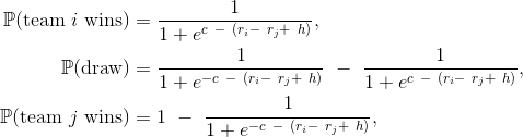
Let’s briefly introduce the Elo model. The general idea is that the Elo model updates its ratings based on what result it expects prior to the game and its actual outcome. There are two steps in compiling team ratings. First of all, given two team ratings ri and rj, one can derive the expected outcome of their match by using the so-called sigmoid function applied to the difference in their ratings. This function takes values from 0 to 1 and has a direct interpretation as a probability estimate. The exact formula is
where a is a scaling factor and h is an extra points parameter for the home team, which has a slight advantage over the visiting team (in chess, a parallel advantage is given to the ‘White’ player who always makes the first move). Given the predicted outcome pij and actual outcome oij equal to 1 in case of team i‘s win, 0.5 in case of a tie and 0 for team j’s win, the ratings are updated as follows:
and accordingly for the second team:
Here, k is the so-called K-factor, which governs the magnitude of rating changes. Note that in its original formulation the Elo system only predicts binary outcomes with 0.5 being interpreted as a draw. To generate the probability of a tie we used a simple method suggested here.
As far as football is concerned, Elo ratings’ implementation is maintained at EloRatings.net website. Moreover, the system is also the basis of the FIFA Women’s World Ranking. Notably, these systems have been documented to work better than FIFA’s Men’s Ranking when considering the ranking systems’ predictive capabilities. We will employ both versions of the Elo model in their original formulation to generate the predictions below.
Another way of estimating team ratings is to use an ordinal regression model. This model is an extension of the basic logistic regression model to ordered outcomes – in this case win, draw and loss. Somewhat analogous to the Elo system, the probabilities of the occurrence of these events, given the two teams’ ratings ri and rj are determined as:
where c > 0 is a parameter governing draw margin and h is used to adjust for home team advantage. Here, unlike in the original Elo model, the probability of a draw is modeled explicitly (in case c = 0 we arrive at the Elo’s expected outcome equation provided previously). Using these equations and the method of maximum likelihood, one can estimate team ratings ri, c and the home team advantage parameters.
Least squares method
The next rating system is based on a simple observation that the difference si – sj in the scores produced by the teams should correspond to the difference in ratings:
Again, h is a correction for the home team i advantage. The rating system’s name originates from its estimation method: one finds ratings ri such that the sum of squared differences (over a set of games) between the two sides of the above equation is minimal. Kenneth Massey’s website, among others, compiles and maintains a version of the rating system for various sports.
For the least squares model, we still need to generate probabilities for particular outcomes. Once again, we do this by using the sigmoid function analogously to the Elo model.
Poisson model
The final rating system that we’ll discuss is based on the assumption that the goals scored by a team can be modeled as a Poisson distributed variable. This distribution is applicable in situations in which we deal with count data, e.g., the number of accidents, telephone calls or… goals scored :) the mean rate of this variable is dependent on the attacking capabilities of a team and the defensive skills of its opponent. This extends ratings to two parameters – offensive and defensive skills per team as opposed to a single parameter in the methods discussed above.
Given the attacking and defensive skills of teams i and j, ai, aj and di, dj, respectively, the rates of Poisson variables for a home team i and visiting team j, λ and μ respectively, are modeled as:
Under this model, the probability of a score x to y is equal to:
Given a dataset of matches, one can estimate the team rating parameters using the maximum likelihood method. Here, we employ the basic version of the model that assumes that the Poisson variables modeling the goals scored by the teams, given their rating parameters, are independent.
We used the rating systems presented here to estimate win, draw and loss probabilities for every pair of possible matchups among the 24 teams participating in Euro 2016. Given these probabilities, we simulated the tournament multiple times and computed each team’s probability of winning it all. We used the database of international football match results provided at this website (thanks to Christian Muck for generously exporting the data).
First of all, the rating systems involve some adjustable parameters e.g., weights for importance of matches (friendly vs. World Cup final), a weighing function for most recent results and regularization (to avoid overfitting of rating models to historical results). We then tuned these parameters to maximize the predictive accuracy of the models: using a sample of games, we predicted their results and evaluated them. For tuning the parameters, we chose matches from major international tournaments – World Cup finals, European Championships and Copa America (South American continental championships).
The parameters of ratings systems are chosen for World Cup finals held between 1994 and 2010 (5 tournaments), UEFA European Championships 1996 – 2008 (4) and Copa America finals 1999 – 2011 (5). This accounts for a set of 562 matches. The prediction accuracy is evaluated using logarithmic loss (so-called logloss). It is an error metric that is often used to evaluate probabilistic predictions. Perhaps a more direct interpretation is provided by accuracy – this is just the percentage of matches that were correctly predicted by a given method. The table below presents logloss for probabilities of match outcome as well as accuracy of predictions for each method.
Method
Logloss
Accuracy
EloRatings.net
0.9818
52%
FIFA Women World Rankings
0.9934
52%
Ordinal Logistic Regression
0.9638
53%
Least Squares
0.9553
55%
Poisson Ratings
0.9646
55%
The estimates below might be overly optimistic since they were chosen so as to minimize the prediction error on this specific set of games. To validate the methods more thoroughly, we used 121 other matches from the three most recent tournaments – the 2014 World Cup finals, the 2012 European championships and 2015 Copa America finals. The results are presented below. To provide some context for the numbers, we present a benchmark solution of random guessing and probabilities derived from an average of bookmakers’ odds. A random guess yields a logarithmic loss of -log(1/3) ≈ 1.1 and accuracy of 33% for a three-way outcome.
Method
Logloss
Accuracy
EloRatings.net
1.0074
55%
FIFA Women World Rankings
1.0032
54%
Ordinal Logistic Regression
0.9972
50%
Least Squares
0.9949
56%
Poisson Ratings
0.9981
55%
Random guess
1.0986
33%
Bookmakers
0.9726
52%
Ensemble
0.9919
55%
The results achieved by bookmakers (in terms of logloss) are better than all the individual rating methods. Of course, the bookmakers can include some additional information on player injuries, suspensions or a team’s form during the contest – this provides them with an advantage over the models. Including such external information would be the next step to enhancing the accuracy of the presented models. In any case, the accuracy of predictions is slightly better in case of the rating systems. The bottom row of the table presents results for an ensemble method – which is the average of predictions for the three best performing methods: least squares, Poisson and ordinal regression ratings. It is a simple method for increasing the predictive power of individual models. We observe that this method slightly improves logloss while maintaining accuracy.
The rating methods presented here have some limitations. There are many factors influencing match results and we only covered simple predictive models based on historical data. Naturally, one could use some external and more sophisticated information e.g., players and their skills, and include it in a model. We encourage you to think about other factors playing a role in match outcomes which could be included in a model. This could greatly improve the models’ accuracy!
Given match outcome probabilities for each possible matchup, we simulated 1,000,000 Euro 2016 tournaments. We sampled only win, draw and loss results. If – after considering head-to-head results – the teams are still tied in the group stage, we resolved such ties randomly. According to the tournament’s official rules, we should use goal differences, however, this information is not available in our simulation. Notably, coin-tosses (random outcome) were used to resolve ties (if the game was tied after extra-time) before the penalty shoot-out was “invented.” For instance, on its way to winning Euro 1968, Italy “won” its semifinal with the USSR through a coin toss. Although we do not support this manner of deciding the outcomes of sporting events, we employ drawing lots if teams are tied at the end of the tournament’s group stage. If there is a draw in the playoffs, we sample the result again.
And… here are the predictions generated using the ensemble of the three best-performing ratings systems! The consecutive columns indicate the probability of advancing to a given stage of the competition. For example, the number next to Portugal in the first column indicates that there is a 91.37% chance that it will advance past the group stage. On the other hand, in the case of Spain, there is a 33.95% chance that it will reach the Euro 2016 final. The last column indicates a team’s chance of winning the whole tournament.
Team
Last 16
Quarterfinals
Semifinals
Final
Champions
France
98.01%
82.6%
67.71%
51.21%
37.55%
Spain
92.6%
72.24%
51.11%
33.95%
19.08%
Germany
94.71%
70.41%
45.99%
24.88%
13.21%
England
93.52%
67.5%
40.87%
22.25%
10.4%
Belgium
84.38%
48.2%
26.1%
11.51%
4.55%
Portugal
91.37%
54.7%
26.31%
12.09%
4.42%
Italy
72.43%
33.38%
14.83%
5.26%
1.55%
Ukraine
76.81%
37.05%
15.5%
5.53%
1.52%
Croatia
66%
31.92%
14.65%
5.27%
1.5%
Russia
75.34%
37.84%
13.07%
4.29%
1.14%
Turkey
61.9%
27.97%
12.07%
4%
1.05%
Switzerland
69.98%
30.49%
11.8%
3.97%
0.88%
Poland
67.4%
26.58%
9.35%
2.77%
0.6%
Sweden
57.89%
20.76%
7.45%
2.11%
0.47%
Romania
62.64%
23.82%
8.07%
2.35%
0.45%
Austria
71.63%
27.01%
7.46%
2.07%
0.43%
Slovakia
63.66%
25.57%
6.96%
1.79%
0.37%
Republic of Ireland
54.68%
18.64%
6.38%
1.72%
0.35%
Czech Republic
46.28%
16.19%
5.6%
1.44%
0.29%
Hungary
56.86%
16.08%
3.37%
0.69%
0.11%
Iceland
47.81%
11.32%
2.02%
0.36%
0.05%
Albania
31.46%
6.62%
1.26%
0.19%
0.02%
Wales
34.29%
7.98%
1.19%
0.16%
0.02%
Northern Ireland
28.32%
5.11%
0.88%
0.13%
0.01%
Some of you might find these predictions surprising – and our discussion thread is now open! As far as our thoughts are concerned, first of all, we see that France tops the ranking. The 12th man is behind them – they are playing at home and the methods we used give them some edge due to this fact. On the other hand, the prediction for four-time World Cup winners Italy is somewhat discouraging. In recent years, Italy has seen disappointing results, including draws with Armenia, Haiti and Luxembourg (not to mention their 2010 and 2014 World Cup records). However, what the rating system could not infer is the fact that the Italian team usually rises to the occasion when faced with a major challenge – which usually happens at the big tournaments. Russia’s perhaps surprisingly high position in the ranking might be partially attributed to the easier (according to the rating systems that we used) group stage opponents they will face: Wales, Slovakia and England.
All in all, no team is condemned to lose before the start of the tournament and that is the very beauty of sports. We might well end up with a surprising result, such as Greece’s Euro 2004 triumph… so, which team will upset the favorites this year?
https://deepsense.ai/wp-content/uploads/2019/02/euro-2016-predictions.jpg217750Jan Lasekhttps://deepsense.ai/wp-content/uploads/2023/10/Logo_black_blue_CLEAN_rgb.pngJan Lasek2016-06-10 10:03:022023-02-05 20:23:28Euro 2016 Predictions Using Team Rating Systems
Right Whale Recognition was a computer vision competition organized by the NOAA Fisheries on the Kaggle.com data science platform. Our machine learning team at deepsense.ai has finished 1st! In this post we describe our solution.
The challenge
The goal of the competition was to recognize individual right whales in photographs taken during aerial surveys. When visualizing the scenario, do not forget that these giants grow up to more than 18 metres, and weigh up to 91 tons. There were 447 different right whales in the data set (and this is likely the overall number of living specimens). Even though that number is (terrifyingly) small for a species, uniquely identifying a whale poses a significant challenge for a person. Automating at least some parts of the process would be immensely beneficial to right whales’ chances of survival.
“Recognizing a whale in real-time would also give researchers on the water access to potentially life-saving historical health and entanglement records as they struggle to free a whale that has been accidentally caught up in fishing gear,”
— excerpt from competition’s description page.
The photographs had been taken at different times of day, and with various equipment. They ranged from very clear and centered on the animal to taken from afar and badly focused.
A non-random sample from the dataset
The teams were expected to build a model that recognizes which one of the 447 whales is captured in the photograph. More technically, for each photo, we were asked to provide a probability distribution over all 447 whales. The solutions were judged by multiclass log loss, also known as cross-entropy loss.
It is worth noting that the dataset was not balanced. The number of pictures per whale varied a lot: there were some “celebrities” having around forty, a great deal with over a dozen, and around twenty with just a single photo! Another challenge, is that images representing different classes (i.e. different whales) were very similar to each other. This is somewhat different than the situation where we try to discriminate between, say, dogs, cats, wombats and planes. This posed some difficulties for the neural networks that we had been training – the unique characteristics that make up an individual whale, or that set this particular whale apart from others, occupy only a small portion of an image and are not very apparent. Helping out our classifiers to focus on the correct features, i.e. the whale’s heads and their callosity patterns, turned out to be crucial.
Convolutional neural networks (CNNs) have proven to do extraordinarily well in image recognition tasks, so it was natural for us to base our solution on them. In fact, to our knowledge, all top contestants have used them almost at every step. Even though some say that those techniques require huge amounts of data (and we only had 4,544 training images available with some of the whales appearing only once in the whole training set), we were still able to produce a well-performing model, proving that CNNs are a powerful tool even on limited data.
In fact our solution consisted of multiple steps:
– head localizer (using CNNs),
– head aligner (using CNN),
– training several CNNs on passport-like photos of whales (obtained from previous steps),
– averaging and tuning the predictions (not using CNNs).
One additional trick that has served us well is providing the networks with some additional targets, even though those additional targets were not necessarily used afterwards or required in any way. If the additional targets depend on the part of image that is of particular interest for us (i.e. head and callosity pattern in this case), this trick should force the network to focus on this area. Also, the networks have more stimuli to learn on, and thus have to develop more robust features (sensible for more than one task) which should limit overfitting.
Software and hardware
We used Python, NumPy and Theano to implement our solution. To create manual annotations (and do not lose sanity during these long moments of questionable joy) we employed Sloth (a universal labeling tool), as well as an ad-hoc Julia script.
To train our models we used two types of Nvidia GPUs: Tesla K80 and GRID K520.
Domain knowledge
Even though it seems significantly harder for humans to identify whales than other people, neural networks do not suffer from such problem for obvious reasons. Even then, a bit of Wikipedia research on right whales reveals that “the most distinguishing feature of a right whale is the rough patches of skin on its head which appear white due to parasitism by whale lice.” Turns out that it not only distinguishes them from other species of whales, but also serves as an excellent way to differentiate between specimens. Our solution uses this fact to great lengths. Besides this somewhat trivial hint (provided by the organizers) about what to look at, we (sadly) posses no domain knowledge about right whales.
Preparing for the take-off
Before going further into the details, a disclaimer is needed. During a competition, one is (or should be) more tempted to test new approaches, than to fine tune and clean up existing ones. Hence, soon after an idea had proved to work well enough, we usually settled on it and left it “as is”. As a side-effect, we expect that some parts of the solution may possess unnecessary artifacts or complexity that could (and ought to) be eliminated. Nevertheless, we have not done so during the competition, and decided not to do so here either.
One does not need to see many images from the dataset in order to realize that whales do not pose very well (or at least were reluctant to do so in this particular case).
Not very cooperative whales
Therefore, before training final classifiers we spent some time (and energy) to account for this fact. The general idea of this approach can be thought of as obtaining a passport photo from a random picture where the subject is in some arbitrary position. This boiled down to training a head localizer and a head aligner. The first one takes a photo and produces a bounding box around the head, still the head may be arbitrarily rotated and not necessarily in the middle of the photo. The second one takes a photo of the head and aligns and rescales it, so that the blowhead and bonnet-tip are always in the same place, and the distance between them is constant. Both of these steps were done by training a neural network on manual annotations for the training data.
Bonnet-tip (red) and blowhead (blue)
Localizing the whale
This was the first step in order to achieve good quality, passport-like photos. In order to obtain the training data, we have manually annotated all the whales in the training data with bounding boxes around their heads (a special thanks goes to our HR department for helping out!).
Bounding box produced by the head localizer
These annotations amounted to providing four numbers for each image in the training set: coordinates of the bottom-left and the top-right points of the rectangle. We then proceeded to train a CNN which takes an original image (resized to 256×256) and outputs the two coordinates of the bounding box. Although this is clearly a regression task, instead of using L2 loss, we had more success with quantizing the output into bins and using Softmax together with cross-entropy loss. We have also tried several different approaches, including training a CNN to discriminate between head photos and non-head photos or even some unsupervised approaches. Nevertheless, their results were inferior.
In addition, the head localizing network also had to predict the coordinates of the blowhead and bonnet-tip (in the same, quantized manner), however it was less successful in this task, so we ignored this output.
We trained 5 different networks, all of them had almost the same architecture.
Head localizer’s architecture
Where they differed is the number of buckets used to quantize the coordinates. We have tried 20, 40, 60, 128, and also another (a little bit smaller) network using 20 buckets.
Before feeding the image into the network, we had used the following data augmentation (after resizing it to 256×256):
– rotation: up to 10° (note that if you allow bigger angles, it won’t be enough to simply rotate the points – you’ll have to implement some logic to recalculate the bounding box – we were too lazy to do this),
– rescaling: random ratio between 1/1.2 and 1.2,
– colour perturbation (as in Krizhevsky et al. 2012), with scale 0.01.
Although we have not used test-time augmentation here, we combined the outputs from all the 5 networks. Each time a crop was passed to the next step (head alignment), a random one from all 5 variants was chosen. As can be seen above, the crops provided by these networks were quite satisfactory. To be honest – we did not really “physically” crop the images (i.e. produce a bunch of smaller images). What we’ve done instead, and what turned out to be really handy, is producing a json file with the coordinates of bounding boxes. This may seem trivial, but doing so encouraged and allowed us to easily experiment with them.
The final step of this “make the classifier’s life easier” pipeline was to align the photos so that they all conform to the same standards. The idea was to train a CNN that estimates the coordinates of blowhead and bonnet-tip. Having them, one can easily come up with a transformation that maps the original image into one where these two points are always in the same position. Thanks to the annotations made by Anil Thomas, we had the coordinates for the training set. So, once again we proceeded to train CNN to predict quantized coordinates. Although we do not claim that it was impossible to pinpoint these points using the whole image (i.e. avoid the previous step), we now face a possibly easier task – we know the approximate location of the head.
In addition, the network had some additional tasks to solve! First of all it needed to predict which whale is on the image (i.e. solve the original task). Moreover, it needed to tell whether the callosity pattern on the whale’s head is continuous or not (training on manual annotations once again, although there was much less work this time since looking at 2-3 images per whale was enough).
Broken (left) and continuous (right) callosity patterns
We used the following architecture.
Head aligner’s architecture
As an input to head aligner we took the crops from the head localizer. This time we dared to use a more bold augmentation:
– translation: random up to 4 pixels,
– rotation: up to 360°,
– rescaling: random ratio between 1.0 and 1.5,
– random flip,
– colour perturbation with scale 0.01.
Also, we used test-time augmentation – the results were averaged over 5 random augmentations (not much, but still!). This network achieved surprisingly good results. To be more (or less) accurate – during manual inspection, the blowhead and bonnet-tip positions were predicted almost perfectly for almost all images. Besides, as a by-product (or was it the other way?), we started to see some promising results for the original task of identifying the whales. The (quite pessimistic) validation loss was around 2.2.
Putting everything together
When chaining multiple machine learning algorithms in the pipeline, some caution is needed. If we train a head localizer and head aligner on the training data and use them to produce “passport photos” for both the training and testing set, we may end up with photos that vastly differ in quality (and possibly some other properties). This can turn out to be a serious difficulty when training a classifier on top of these crops – if at test time it faces inputs that don’t bear any similarity to those it was accustomed to, it does not perform.
Although we were aware of this fact, when inspecting the crops we discovered that the quality did not differ much between training and testing data. Moreover, we’ve seen a huge improvement in the log loss. Following the mindset of “more ideas, less dwelling”, we decided to settle on this impure approach and press on.
“Passport photos” of whales
Final classifier
Network architecture
Almost all of our models worked on 256×256 images and shared the same architecture. All convolutional layers had 3×3 filters and did not change the size of the image, all pooling layers were 3×3 with 2 stride (they halved the size). In addition all convolutional layers were followed by batch normalization and ReLU nonlinearity.
Main net’s architecture
In the final blend, we have also used a few networks with an analogous architecture, but working on 512×512 images, and one network with a “double” version of this architecture (with an independent copy of the stacked convolutional layers, merged just before the fully-connected layer).
Once again, we’ve violated the networks’ comfort zone by adding an additional target – determining the continuity of the callosity pattern (same as in the head aligner case). We’ve also tried adding more targets coming from other manual annotations, one such target was “how much was the face symmetric”. Unfortunately, it did not improve the results any further.
Data augmentation
At this point data augmentation is a little bit trickier than usual. The reason behind this, is that you have to balance between enriching the dataset enough, and not ruining the alignment and normalization obtained from the previous step. We ended up using quite mild augmentation. Although the exact parameters were not constant among all models, the most common were:
– translation: random up to 4 pixels,
– rotation: up to 8°,
– rescaling: random ratio between 1.0 and 1.3,
– random flip,
– colour perturbation with scale 0.01.
We also used test-time augmentation, and averaged over 20+ random augmentations.
Initialization
We used a very simple initialization rule, a zero-centred normal distribution with std 0.01 for convolutional layers and std 0.001 for fully connected layers. This has worked well enough.
Regularization
For all models, we have used only L2 regularization. However, separate hyperparameters were used for convolutional and fully connected layers. For convolutional layers, we used a smaller regularization, around 0.0005, while for fully connected ones we preferred higher values, usually around 0.01 – 0.05.
One should also recall that we were adding supplementary targets to the networks. This imposes additional constraints on weights, enforces more focus on the head of the whale (instead of, say, some random patterns on the water), i.e. it works against overfitting.
Training
We trained almost all of our models with stochastic gradient descent (SGD) combined with 0.9 momentum. Usually we settled after around 500-1000 epochs (the exact moment didn’t really matter much, because the lack of overfitting). During the training process we used quite slow exponential decay on the learning rate (0.9955) and also manually adjusted the learning rate from time to time. After a rough kick – increasing the learning rate (yet still leaving the decay) the network’s error (on both: training and validation) went up a lot. Yet it tended to settle on a lower error after a few epochs to get back on a good track. Our best model also uses another idea – it was first trained with Nesterov momentum for over a hundred epochs, and then we switched to using Adam (adaptive moment estimation). We couldn’t achieve similar loss when using Adam all the way from the start. The initial learning rate may not have mattered much, but we used values around 0.0005.
Validation
We used a random 10% of the training data for validation. Thanks to our favourite seed 7300, we kept it the same for all models. Although, we were aware that this method caused some whales to be absent in the training set, it has worked good enough. The validation loss was quite pessimistic, and correlated well with the leaderboard.
Giving up 10% of a relatively small dataset is not something one would decide to do without any hesitation. Therefore, after we had decided that a model is good enough to use it, we proceeded to reuse the validation set for training (it was straightforward because we didn’t have any problems with overfitting). This was done either by a time-consuming process of rerunning everything from scratch on the whole training set (rarely), or (more often) adding the validation set to the training one and running 50-100 additional epochs. This was also meant to curate the issue of single-photo-whales appearing only in our validation set.
Combining the predictions
We have ended up with a number of models scoring in a range of 0.97 to 1.3 according to our validation (actual test scores were actually better). Thanks to keeping a consistent validation set we were able to test some blending techniques as well as basic transformations. We have concluded that using more complex ensembling methods would not be plausible due to the fact that our validation set did not include all the distinct whales, and was, in fact, quite small. Having no time left for some fancy cross-validation like ensembling, we settled on something ad-hoc and simple.
Even though simple weighted average of the predictions did not provide a better score than the best model alone (unless we increased the best model’s weight significantly), it performed better when combined with a simple transformation of raising the predictions to a moderate power (in the final solution we used 1.45). This translated into roughly ~0.1 improvement in the log loss. We have not scrutinized this enough, yet one may hypothesize that this trick worked because our fully connected layers were strongly regularized, and were reluctant to produce more extreme probabilities.
We also used some “safety” transformations, namely increasing all the predictions by a certain epsilon as well as slightly skewing them to the whale distribution found in the training set. They had not impacted our score much.
Loading images
At the latest, and middle stages of our solution the images we loaded from the disk were original ones. They are quite big. To efficiently use the gpu we had to load them in parallel. We thought the main cost was loading the images from the disk. It turned out not to be true. Conversely, it was decoding JPEG file to a numpy array. We did a quick and dirty benchmark, with 111 random original images from the dataset, 85Mb total. Reading them, when they are not cached in RAM takes ~420 ms. Whereas reading, and decoding to numpy arrays takes ~10 seconds. That’s a huge difference. The possible solutions to mitigate this, might be using other image formats, that offer better encoding speeds (at the cost of image sizes), decoding at GPU, etc.
What might have made it tick
Although, it’s hard to pinpoint a single trick or technique that overshadows everything else (and to do so, one needs a more careful analysis), we have hypothesized about the key tricks.
Producing good quality crops with well aligned heads
We have achieved this by doing this in two stages, and the results were vastly superior than what we observed with just a single stage.
Manual labour and providing the networks with additional targets
This was based on adding additional annotations to the original images. It required manual inspection of thousands of whales images, but we ended up using them in all stages (head localizing, head aligning, and classification).
Kicking the learning rate
Although it might have been the combination of a little bit careless initialization, poor learning rate decay schedule, and not fancy enough SGD, it turned out, that kicking (increasing) the learning rate did a great job.
Loss functions after kicking the learning rate
Calibrating the probabilities
Almost all our models, and blends of models benefitted from raising the predictions to a moderate power in the range [1.1 – 1.6]. This trick, discovered at the end of the competition, improved the score by ~0.1.
Reusing the validation set
Merging validation and training sets and running for additional 50-100 epochs gave us steady improvements on the score.
Overall, this was an amazing problem to tackle and an amazing competition to take part in. We have learned a lot during the process, and are actually quite amazed with the super-powers of deep learning!
A special thanks to Christin Khan and NOAA for presenting the data science community with this exceptional challenge. We hope that this will inspire others. Of course, all this would be much harder without Kaggle.com, which does a great job with their platform. We would also like to thank Nvidia for giving us access to Nvidia K80 GPUs – they’ve done a great job.
Robert Bogucki
Marek Cygan
Maciej Klimek
Jan Kanty Milczek
Marcin Mucha
https://deepsense.ai/wp-content/uploads/2016/01/deep-learning-right-whale-recognition-kaggle.jpg3371140Robert Boguckihttps://deepsense.ai/wp-content/uploads/2023/10/Logo_black_blue_CLEAN_rgb.pngRobert Bogucki2016-01-16 16:16:562021-01-05 16:51:52Which whale is it, anyway? Face recognition for right whales using deep learning