Biplots, correspondence analysis and ggplot2
I was looking for biplots created with the use of ggplot2 library (because they look good and are customisable). It turns out that there are some nice solutions for PCA (like sinhrks/ggfortify; kassambara/factoextra; vqv/ggbiplot; fawda123/ggord) but I could not find suitable solution for correspondence analysis. So I create one. It’s available in pbiecek/ggplotit package and works for both CA{FactoMineR} and ca{ca} functions. You will find source of this function below, but let’s start with an example.
I’m going to use data about car sale offers from the PogromcyDanych package.
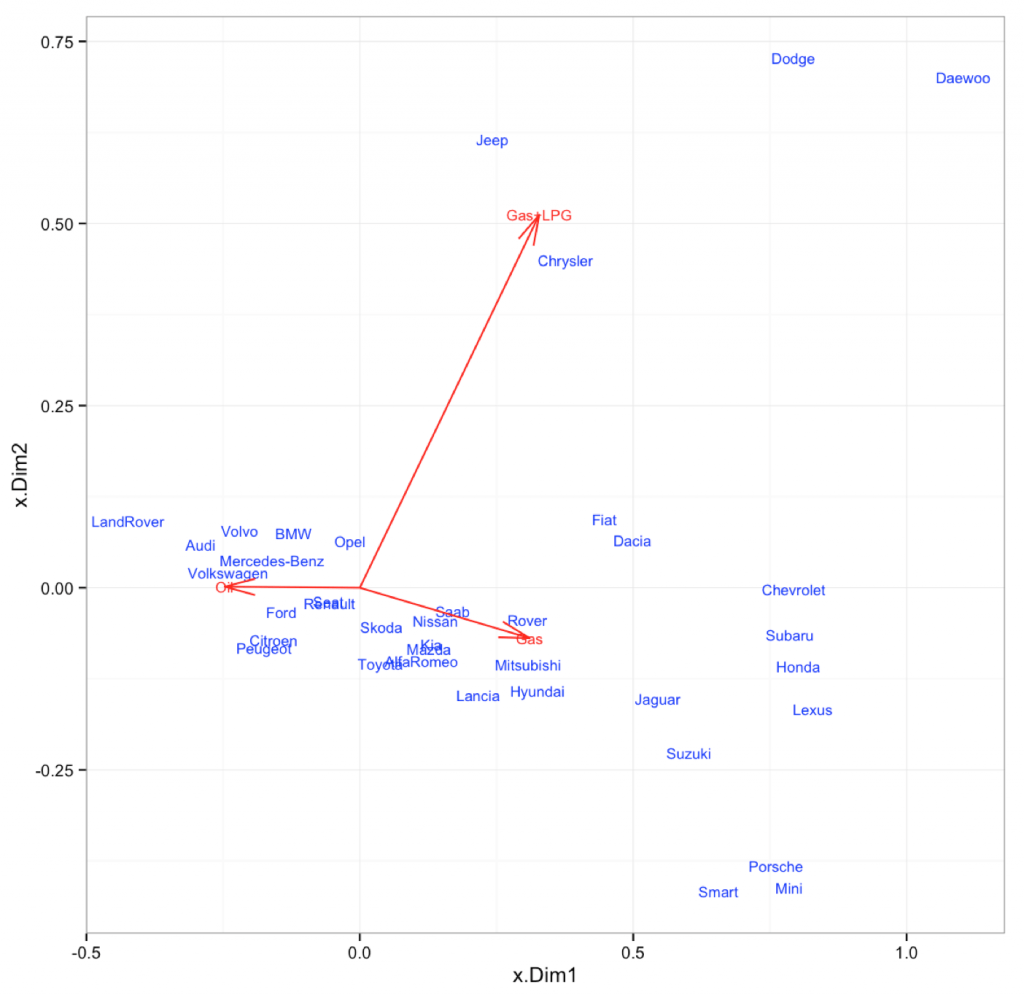
Let’s see what is the relation between a brand and a type of fuel.
Guess in which brands oil is more common than gas?

Let’s see.
Porsche, Mini and Smarts – these brands are mostly gas only.
Daewoo, Dodge – here you will find LPG fuelled cars.
LandRover, Audi, Volkswagen – here oil is most common.
This example was created by these lines:
library(PogromcyDanych)
library(ggplotit)
library(FactoMineR)
# contingency matrix for cars
tab = table(auta2012$Marka,  auta2012$Rodzaj.paliwa)
tab = tab[rowSums(tab) > 300, c(1,2,6)]
# correspondence analysis
obj = CA(tab)
ggplotit(obj, c(FALSE,TRUE), list(rownames(tab), c("Gas", "Gas+LPG", "Oil")))
And full source of the function
function (x, arrows = c(FALSE, FALSE), names = NULL, ...)
{
stopifnot(length(arrows) == 2)
stopifnot(length(names) == 2 | is.null(names))
X = as.data.frame(x$row$coord[, 1:2])
Y = as.data.frame(x$col$coord[, 1:2])
if (!is.null(names)) {
X$Names = names[[1]]
Y$Names = names[[2]]
}
else {
X$Names = rownames(x$row$coord)
Y$Names = rownames(x$col$coord)
}
colnames(X) = c("x.Dim1", "x.Dim2", "x.Names")
colnames(Y) = c("y.Dim1", "y.Dim2", "y.Names")
pl = ggplot() + geom_text(data = X, aes(x.Dim1, x.Dim2,
label = x.Names), color = "blue", size = 3) + geom_text(data = Y,
aes(y.Dim1, y.Dim2, label = y.Names), color = "red",
size = 3) + geom_hline(xintercept = 0, alpha = 0.5) +
geom_vline(yintercept = 0, alpha = 0.5) + theme_bw()
if (arrows[1]) {
pl = pl + geom_segment(data = X, aes(x = 0, xend = x.Dim1,
y = 0, yend = x.Dim2, label = x.Names), color = "blue",
arrow = arrow(angle = 15))
}
if (arrows[2]) {
pl = pl + geom_segment(data = Y, aes(x = 0, xend = y.Dim1,
y = 0, yend = y.Dim2, label = y.Names), color = "red",
arrow = arrow(angle = 15))
}
pl
}


