
Table of contents
In the latest Seahorse release we introduced the scheduling of Spark jobs. We will show you how to use it to regularly collect data and send reports generated from that data via email.
Table of contents
Use case
Let’s say that we have a local meteo station and the data from this station is uploaded automatically to Google Sheets. That is, it contains only one row (i.e. row number 2) of data which always contains current weather characteristics.
We would like to generate some graphs from this data every now and then and do it without any repeated effort.
Solution
Collecting data
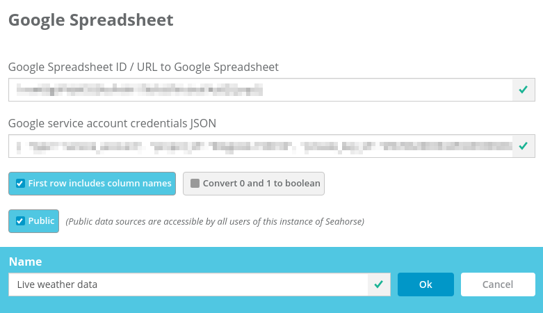
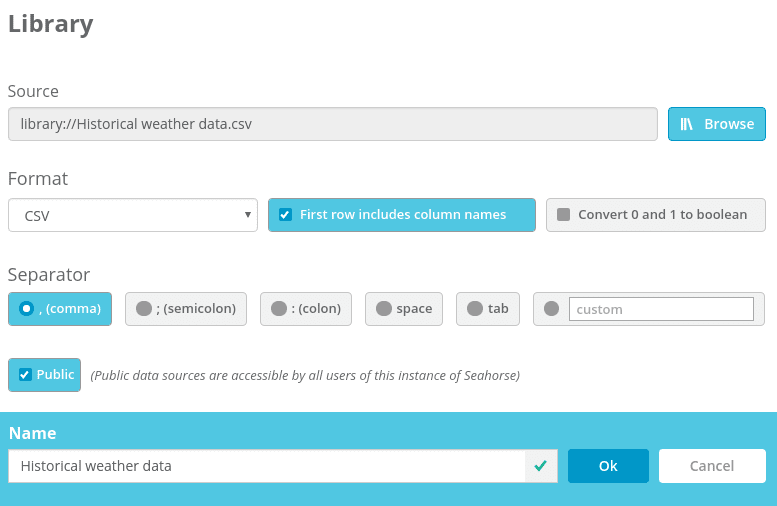
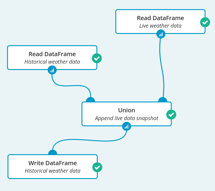
The first workflow that we create collects a snapshot of live data and appends it to a historical data set. It will be run at regular intervals. Let’s start by creating two data sources in Seahorse. The first data source represents the Google Spreadsheet with live-updated weather data:
For the historical weather data, we create a data source representing a file stored locally within Seahorse. Initially, it only contains a header and one row – current data.

Now we can create our first Spark job which reads both data sources, concatenates them and writes back to the “Historical weather data” data source. In this way, there will be a new data row in “Historical weather data” every time the workflow is run.

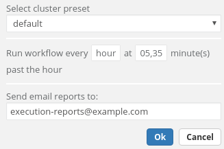
There is one more step for us to do – this Spark job needs to be scheduled. It is run every half an hour and after every scheduled job execution an email is sent.
In the email there is a link to that workflow, where we are able to see node reports from the execution.
Sending a weather report
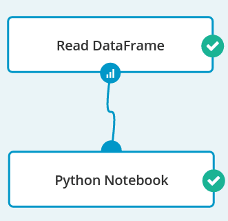
The next workflow is very simple – it consists of a Read DataFrame operation and a Python Notebook. It is done separately from collecting the data because we want to send reports at a much lower rate.

In a notebook, first we transform the data a little:
import pandas
import numpy
import matplotlib
import matplotlib.pyplot as plt
%matplotlib inline
data = dataframe().toPandas()
data['time'] = pandas.to_datetime(data['time'])
data = data.sort('time')
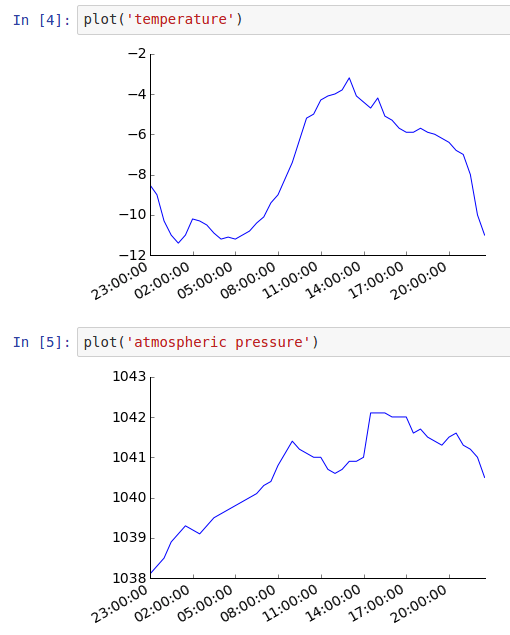
Next, we prepare a function that will be used to line-plot a time series of weather characteristics like temperature, air pressure and humidity:
def plot(col_to_plot):
   ax = plt.axes()
   ax.spines["top"].set_visible(False)
   ax.spines["right"].set_visible(False)
   ax.get_xaxis().tick_bottom()
   ax.get_yaxis().tick_left()
   y_formatter = matplotlib.ticker.ScalarFormatter(useOffset=False)
   ax.yaxis.set_major_formatter(y_formatter)
   plt.locator_params(nbins=5, axes='x')
   plt.locator_params(nbins=5, axes='y')
   plt.yticks(fontsize=14)
   plt.xticks(fontsize=14)
   plt.plot(data['time'], data[col_to_plot])
   plt.gcf().autofmt_xdate()
   plt.show()
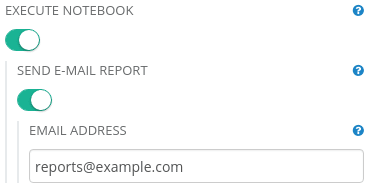
After editing the notebook, we set up its parameters so that reports are sent to our email address after each run.

Finally, we can set up a schedule for our report. It is similar to the previous one, only sent less often– we send a report every day in the evening. After each execution two emails are sent – one, as previously, with a link to the executed workflow and the second one containing a notebook execution result.
Result
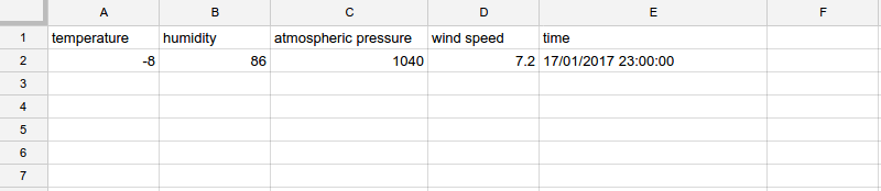
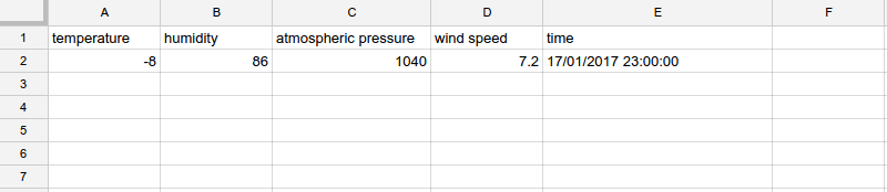
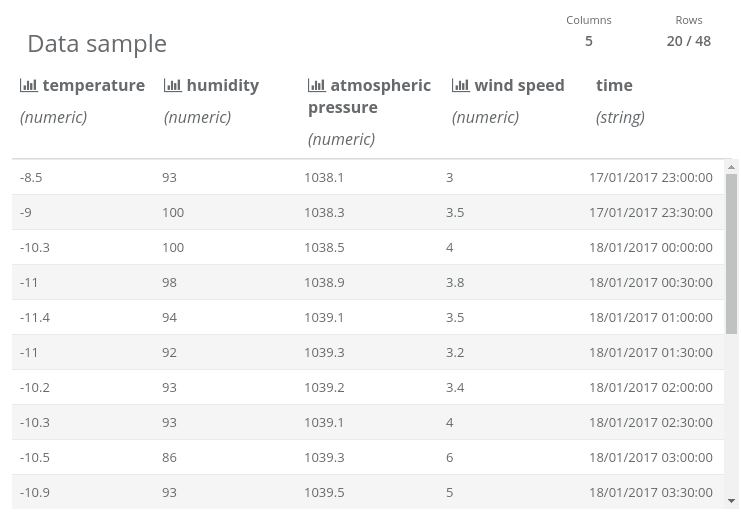
After some time, we have enough data to plot it. Here is a sample from the “Historical weather data” data source…

… and graphs that are in the executed notebook:
Summary
We created a data processing and email reporting pipeline using two simple workflows and some Python code. Seahorse works well not only for big data, but also for scenarios when you need to integrate data from different sources and periodically generate reports – Seahorse data sources and Spark job scheduling are the right tool for the job.


