Circles and films from FilmWeb
I have been working recently on visualization of genetic data. In that field a popular method of presentation are circles generated by the circlize library.
Turning a blind eye to the problem of reading information from circles I must say that the possibilities offered by that library are impressive.
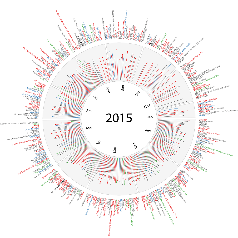
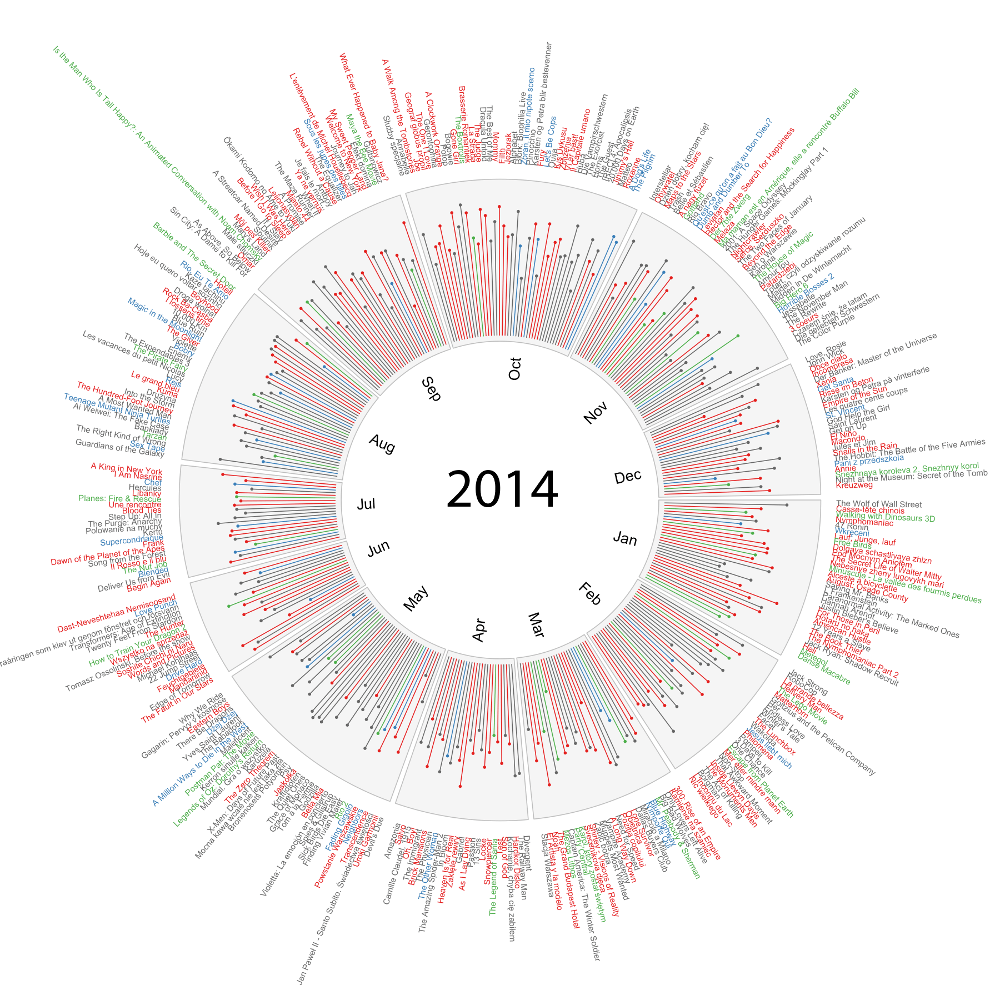
In order to test the possibilities of that library I downloaded data on premieres of movies that took place in 2014 and 2015 from the FilmWeb website. I presented these premieres on a circle assigning different colours to movies representing various genres and giving information on the average rating.
The two graphs below present all the premieres which took place in 2014 and 2015. You can see much more details when you click on them to enlarge them.


You can access both datasets with following instructions.
# Year 2014
archivist::aread("pbiecek/graphGallery/88a0baa22b4165fc9356f86d85afdece")
# Year 2015
archivist::aread("pbiecek/graphGallery/b8fc8cff338fa865af0604f7d22e3840")
And here you can find source code for these plots.
It turns out that premieres are least frequent in June and July – nothing strange about this, everybody is on holidays then.
Interestingly, expected premieres (the second part of 2015) enjoy higher ratings than the films which have already been on in the cinemas ;-). Is the best saved for last or maybe our expectations are better than the reality?


