Data visualization vs. information management
Yesterday I had a presentation ‘Data visualization vs. information management’. The core of the presentation were two examples which I present below. The punch line comes down to a simple statement: It is not enough to present data graphically; its presentation must show the crucial elements of the data. Good communication between people making decisions and people processing the data is a necessary condition for determination what is important and what’s not.
As the first example I used the history of Space Shuttle Challenger disaster which occurred in 1986. The direct cause of the disaster was low elasticity of O-rings (insulation rings) resulting from low temperature. To cut the long story short, the weather on the day of the shuttle launch was too cold for the O-rings to function properly.
But there were tests examining O-rings damage were conducted before the launch. So why engineers allow for the start despite bad temperature condition? Because the data presentation (=data understanding) was bad.
The data was presented graphically on the following diagram. Silhouettes of rockets present temperatures of the tests and scope of damage.
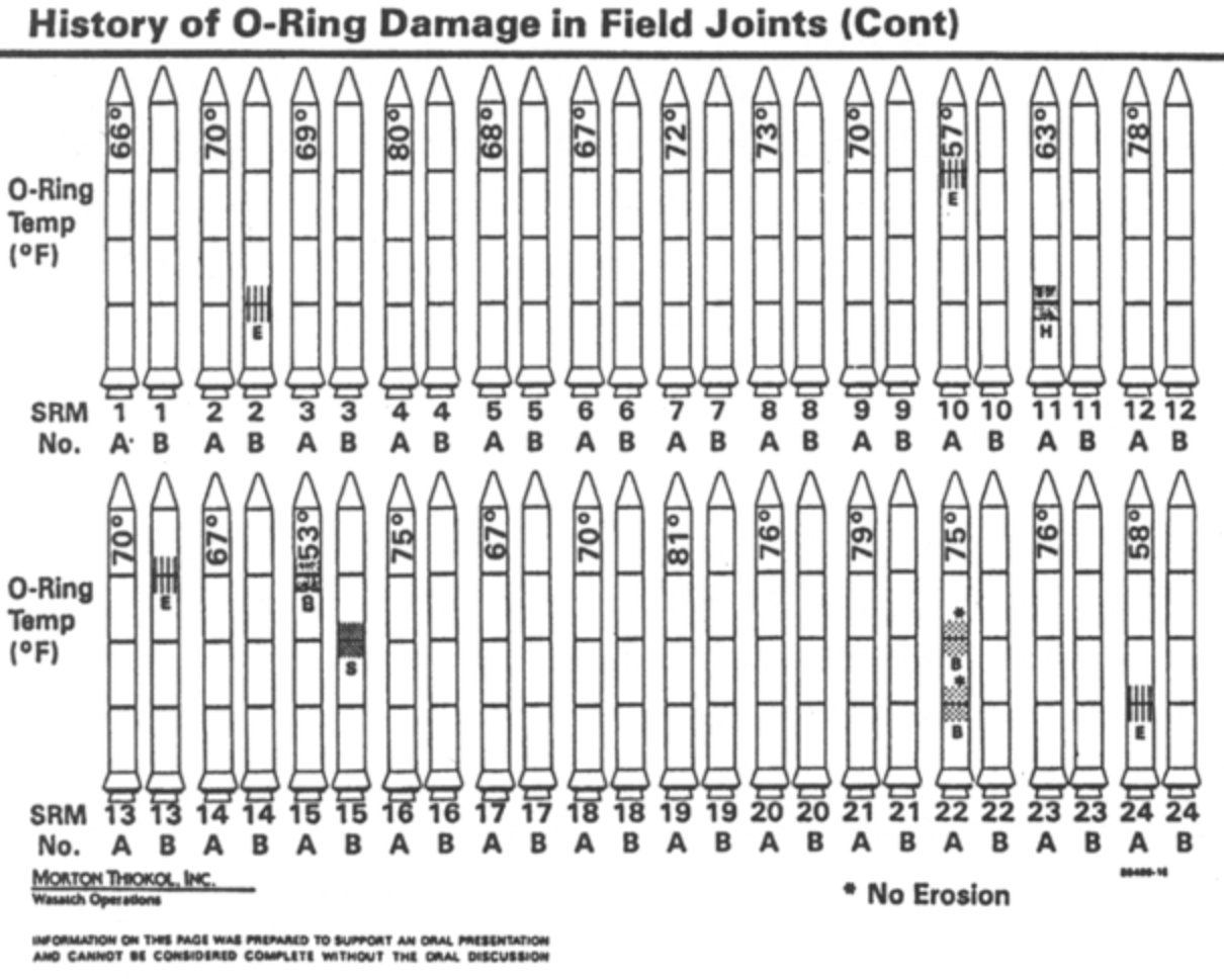
This data visualization may be considered esthetic and interesting, yet it has got one considerable defect.
It does not indicate the most important facts. Edward Tufte in his book displayed the same data in a different manner. He marked damage as a function of temperatures. The diagram presented below clearly shows that the higher the temperature, the greater the damage. On the day of the launch the temperature was several degrees lower than in the test conditions (30F, that is below 0C). Although Tufte’s diagram does not have nice pictures of rockets like the previous one, it emphatically tells us that the shuttle should not have been launched at such low temperature.
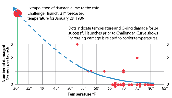
(source: Representing Industry Information Using Graphs)
Data presentation is not about presentation alone; it is about presentation of the crucial facts. Data needs to be interpreted before it can be displayed correctly.
Let us now focus on another example. Now we will examine data from voting intention polls conducted prior to the presidential election in 2015. The tabular presentation of the data looks in the following way:
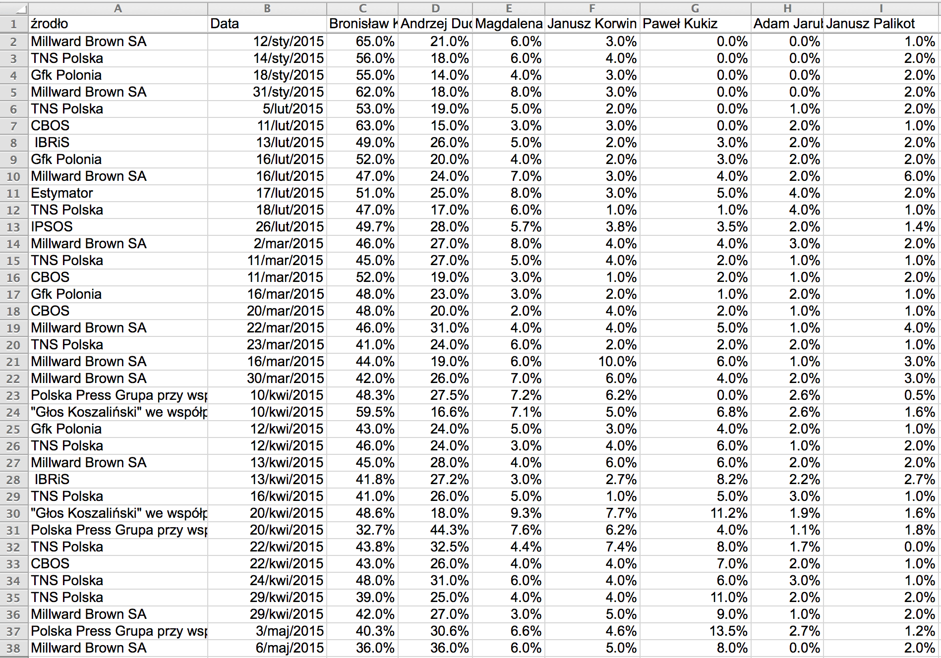
Can you read anything from that table? Majority of normal people reacts with headache to such thick rows of numbers. The rest notices that support for Bronislaw Komorowski in surveys drops while for Andrzej Duda it grows. But can we observe the pace or nature of changes? Was there any turning point or maybe the changes were systematic? No one can tell.
Let us display this data. While the table is objective and it does not enforce any interpretation, every diagram imposes some interpretation. Firstly, we will select the data concerning only two candidates and we will present the support as a function of time.
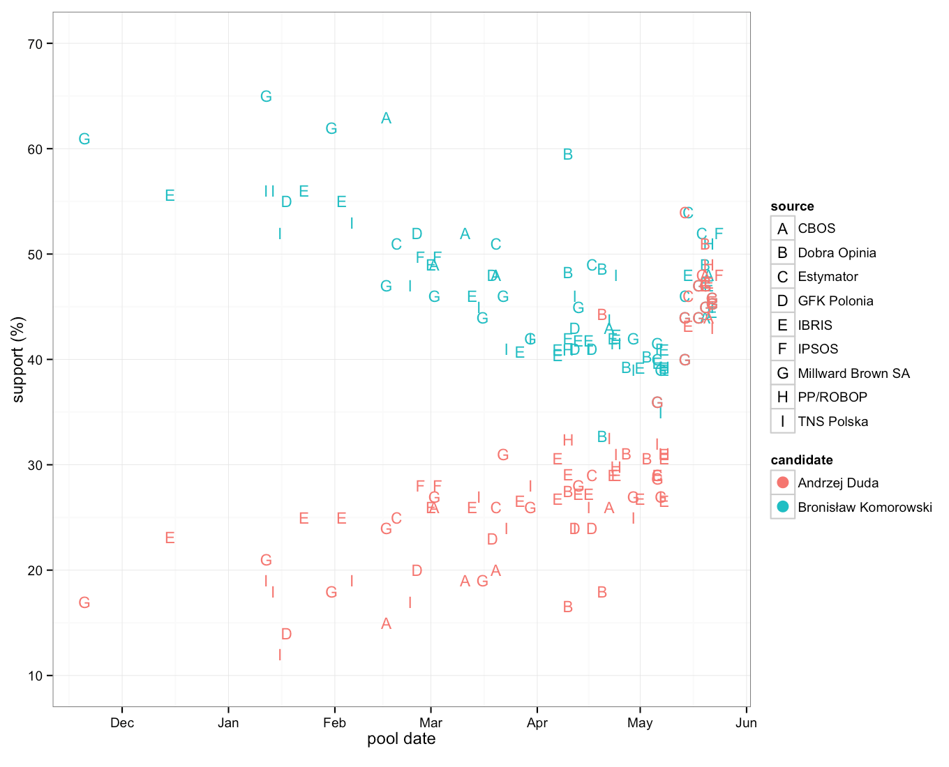
All right, we can see a cloud of dots. We can see that the blue dots are going higher and higher and the orange dots are going lower.
Let us add a trend and let us to this separately –before and after the first round of elections. The type of trend we add is our subjective choice. In this case we choose a linear function.
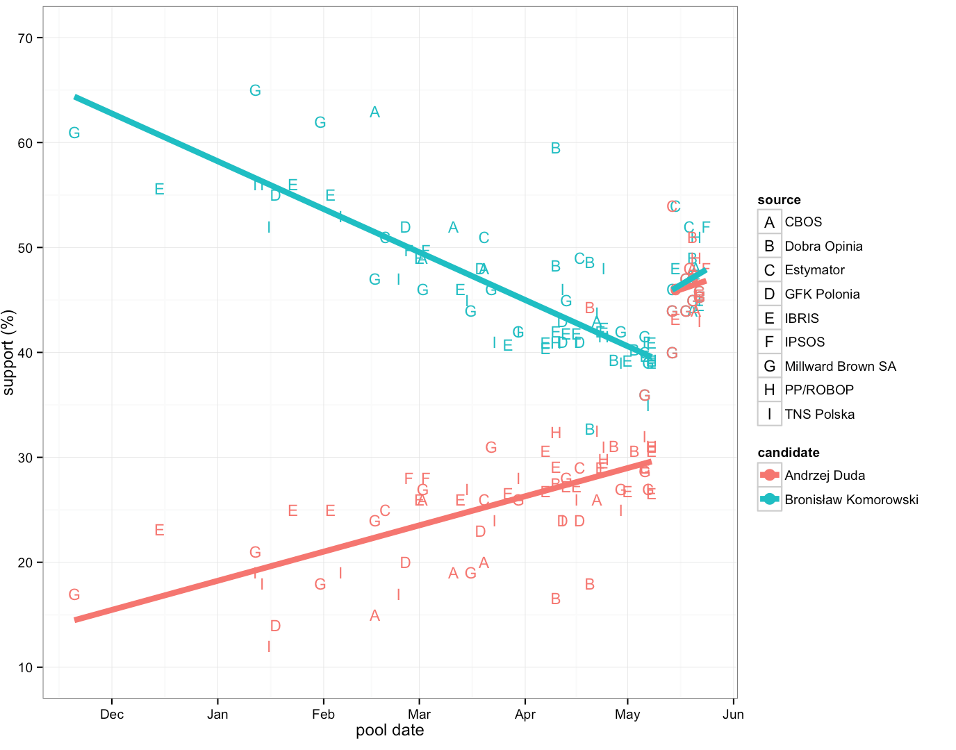
We can read more and more information. The rate of the decline of support for BK is greater than the increase of the support for AD. As we know, Pawel Kukiz gained from that difference. The trend line allows us to notice that individual surveys are evenly distributed around the linear trend. It also lets us see that even extrapolation of the surveys’ results would not reveal a truthful forecast of the results of the first round of elections. A day before the first round the surveys showed 10% advantage of BK. Very far from the actual results of the first round (it’s the AD who won the first round).
It wasn’t the result of one random poll but result of many individual polls. Still results after first round were far from pools.
Answers usually provoke further questions. In case of these results we could ask how would these trends look like if we based our examination on only several opinion poll centers?
Maybe the remaining centers made some mistakes in calculations?
Here we might do with an interactive application allowing us not only to become familiar with the results but also to explore them.
Yet which options should we choose? It is yet another subjective choice.

In this way we moved from a table of numbers to an interactive application. However, during that switch we had to make several decisions which enforced a certain interpretation of the chart. Good data visualization is always an interpretation of numbers.
Let us go back to the topic of communication in companies. It is usually the case that a person who wants to make some decision on the basis of data (product manager, director, management board) orders data extraction or preparation of data visualization from some other person (analyst, statistician, data scientist etc.). The better he indicates what and what for he wants to extract the data, the greater the chance that the presentation of the results reveals the important facts instead of getting struck on a sandbar.
Next week you will learn how to make the diagrams presented above in R and ggplot2.
Przemyslaw Biecek


