IMDB + ggvis, a happy couple
Two weeks ago we showed how to scrap data from IMDB database with the use of rvest package. Last week we showed a shiny application, that compares ratings from two selected groups of users. Today we are going to finish the IMDB trilogy. This time I am going to show how to create an ggvis plot based on IMDB data.
The ggvis package has still smaller expressiveness than it’s older brother ggplot2. But, when it comes to web pages or shiny applications, the plots created in ggvis look pretty good.
Data and source codes for the shiny app and scripts presented below are available on the github webpage.
Let’s start with the data loading. In the data set ‘votesGroup’ we have average ratings for each one out of 14 groups of users. See list of these group names below.
# load the data set with average ratings in groups
load("votesGroup.rda")
# groups in the data
# [1] "Males"              "Females"            "Aged under 18"      "Males under 18"     "Females under 18"
# [6] "Aged 18-29"         "Males Aged 18-29"   "Females Aged 18-29" "Aged 30-44"         "Males Aged 30-44"
# [11] "Females Aged 30-44" "Aged 45+"           "Males Aged 45+"     "Females Aged 45+"   "serialName"
Let us compare ratings between Males and Females. These ratings are available in column names ‘Males’ and ‘Females’. We just need to convert them into numeric variables since originally they are stored as characters. Then we create a new factor variable (gr), which describes if ratings of male are higher than ratings of female, lower or similar.
# select only specific cols
group1 = "Males"
group2 = "Females"
# convert characters to numbers
xx = as.numeric(votesGroup[,group1])
yy = as.numeric(votesGroup[,group2])
gr = cut(xx - yy, c(-10,-0.5,0.5,10))
df = data.frame(x = xx, y = yy, gr = gr,
               name = votesGroup[,"serialName"])
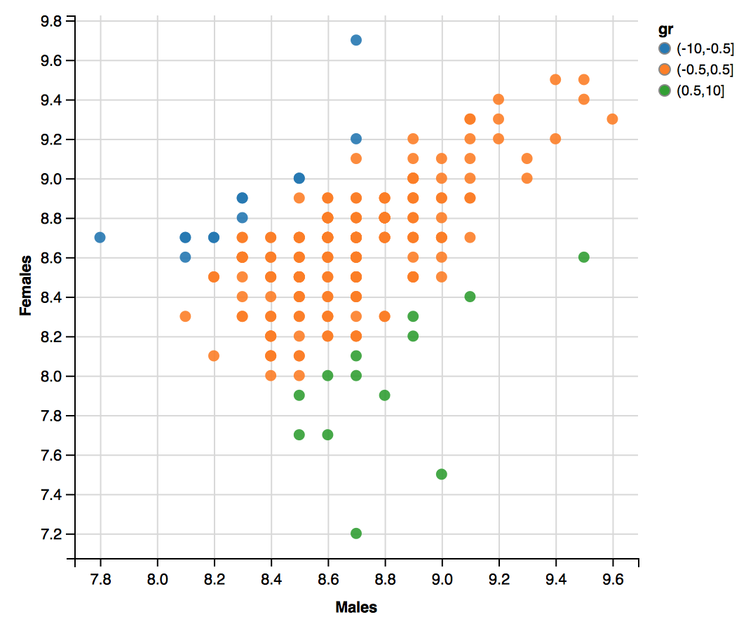
Having this new data we are ready to plot it.
First, load the ggvis library, then create a stub of the plot with the ggvis function, and then add points with the laver_points() function. Last two lines change labels on OX and OY axes.
library(ggvis)
# here goes the plot
df %.% ggvis(x =~ x, y =~ y) %.%
  layer_points(fill = ~gr, size.hover := 200,
               fillOpacity := 0.9,
               fillOpacity.hover := 0.95) %.%
  add_axis("x", title = group1) %.%
  add_axis("y", title = group2)

Not bad.
Just three more things are missing.
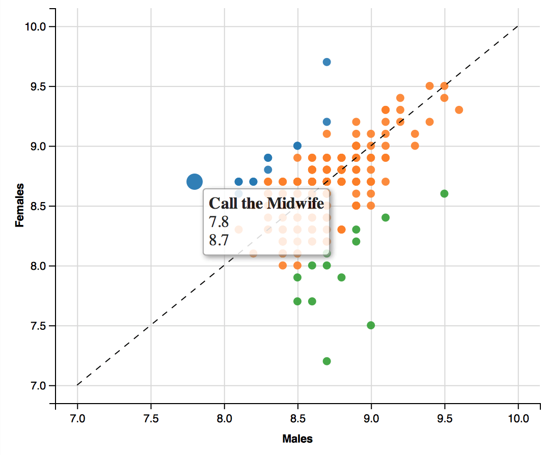
We would like to add interactive labels, that are presented on hover. Below it’s done with the function labs().
Then we would like to add a diagonal to make it easier to see serials that are equally rated by both groups. To do this we create a new dataset with coordinates of this diagonal, the new dataset is plotted as a new layer by the function layer_abline().
And last we remove legend, since it does not look good.
After these changes, the final code looks like this.
# interactive labels
labs = function(data){
  if(is.null(data)) return(NULL)
  paste0("",data$name, "
 ", data$x, "
", data$y,"")
}
# diagonal line
abline_data = function (domain, intercept, slope) {
  data.frame(x = domain, y = domain * slope + intercept)
}
layer_abline = function (.vis, domain, intercept = 0, slope = 1, dash = 6, ...) {
  df = abline_data(domain, intercept, slope)
  names(df) = with(.vis$cur_props, c(x.update$value, y.update$value))
  layer_paths(.vis, data = df, ..., strokeDash := dash)
}
# here goes the plot
df %.%
  ggvis(x =~ x, y =~ y) %.%
  group_by(name) %.%
  layer_points(fill = ~gr, size.hover := 200,
               fillOpacity := 0.9,
               fillOpacity.hover := 0.95) %.%
  layer_abline(c(7,10)) %.%
  add_axis("x", title = group1) %.%
  add_axis("y", title = group2) %.%
  hide_legend(scales = "fill") %.%
  add_tooltip(labs, "hover")


