Pretty heat maps
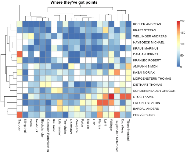
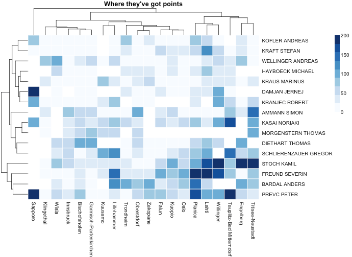
Do you know where Kamil Stoch earns most of his points in season 2013/2014?
Some time ago I came across a pheatmaps package (see here) for R software which generates much nicer heat maps than the standard heatmap() function. This is why the package is named p(retty)heatmaps.
Let us compare these maps through an example. Pheatmap package is usually used in genomics but we will use it below to present results of the ski jumping competitions during the season 2013/2014. For each ski jumper who gained at least 500 points in the general classification we will count number of point he won on each ski jump. Then we will visualize that matrix (ski jumper vs. ski jump) using a heat map.
A heat map is a visualization of a numerical matrix in which color represents the numerical value of a given cell and dendrograms mark the similarity of rows and columns.
We will import data concerning ski jumping from SmarterPoland package for R. (Note, that this dataset was used in the competition for the best visualization during the PAZUR conference 2014).
Firstly, we need some dplyr magic to count the number of points which were won by the individual jumpers on given ski jumps and added to the general classification.
library(pheatmap)
library(tidyr)
library(RColorBrewer)
library(SmarterPoland)
country_jumper_points %
mutate(jumper = paste(jumperSurname, jumperName)) %>%
group_by(jumper, compName) %>%
summarise(max.points = sum(classPoints, na.rm=TRUE)) %>%
group_by(jumper) %>%
filter(sum(max.points, na.rm=TRUE) > 400) %>%
spread(compName, max.points) %>%
as.data.frame()
rownames(country_jumper_points) <- country_jumper_points[,1]
country_jumper_points <- country_jumper_points[,-1]
# how this table looks like
country_jumper_points[1:5,1:5]
# Bischofshofen Engelberg Falun Garmisch-Partenkirchen Innsbruck
# AMMANN SIMON 50 38 32 60 80
# BARDAL ANDERS 40 105 40 20 18
# DAMJAN JERNEJ 0 NA 24 9 NA
# DIETHART THOMAS 100 90 14 100 45
# FREUND SEVERIN 26 11 100 0 16
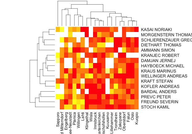
Then we will look at the ugly standard heat maps and much prettier heat maps from pheatmap package.
Default legend, more legible grating, adequately matched colors and more suitable margins. These are some nice advantages of the pheatmaps package.
heatmap(as.matrix(country_jumper_points))
pheatmap(country_jumper_points,
main="Where they've got points")
pheatmap(country_jumper_points, border="white",
color = brewer.pal(9,"Blues"),
main="Where they've got points")


