You’re doing it wrong: surveys concerning the referendum which is to take place on 6th September
I recently came across the presentations of the results of the surveys concerning participation in the planned referenda published by the portal Gazeta.pl.
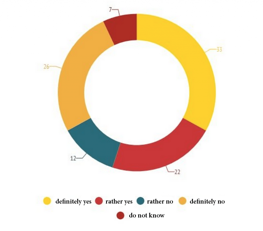
My attention was caught by the diagram presented below which displays a distribution of answers to the question: “Are you going to vote in the referendum scheduled for 6th September?”

[source]
I guess that most of us would like to check on such diagram whether the group of eager voters is bigger than the group of reluctant voters or not.
Is it easy to read such information from this graph?
Absolutely not.
At least three mistakes should be corrected.
Mistake 1. Choice of colours.
Two most similar colors on the diagram are yellow and orange. They correspond to the two most extreme answers: ‘definitely not’ and ‘definitely yes’
Remember: when you present ordered values, the colour scale should be ordered as well.
Mistake 2. Order of the elements in the legend and on the diagram.
The right-hand side of the graph is devoted to the answers ‘rather yes’ / ‘definitely yes’. The right-hand side of the legend concerns the answers ‘rather no’ / ‘definitely no’.
Remember: Make your legend easily understandable. It should be closely adjusted to the diagram.
Mistake 3. Position of the ‘don’t know’ element.
As a neutral element ‘don’t know’ should be placed between ‘rather yes’ and ‘rather no’.
Remember: Use symmetries. If ‘definitely yes’ and ‘definitely no’ begun ideally in the top point of the diagram, it would be much easier to determine whether more people answered ‘yes’ or ‘no’.


