AIOps Network Traffic Analysis (NTA) – a business guide
Network Traffic Analysis (NTA) is a key component of modern cybersecurity in companies. With machine learning and artificial intelligence solutions, the sheer amounts of data to analyze is an asset to be used rather than, as was once the case, a challenge to overcome.
This post looks at:
- What is network traffic analysis
- The benefits of network traffic analysis
- How AI and machine learning can support network traffic analysis
According to Markets and Markets data, the global network traffic monitoring software and traffic analysis tool market is projected to grow from $1.9 billion in 2019 to $3.2 billion by 2024. The growth is driven mostly by the increasing demand for sophisticated network monitoring tools and advanced network management systems that can handle the growing traffic and increasing flow of information.
The growth in internal traffic is a direct reflection of global trends. According to Cisco data, nearly 66% of the global population will be online by 2023. The increase in traffic is driven not only by users but also by the myriad of connected devices that form the IoT cloud around us.
The share of Machine-to-Machine (M2M) connections is estimated to grow from 33% in 2018 to 50% in 2023, while the consumer segment will rise to 74% of this share and business segment for 26%.
What is network traffic analysis

In its most basic form, Network Traffic Analysis (NTA) is the process of recording and analyzing network traffic patterns in search of suspicious elements and security threats. The term was originally coined by Gartner to describe a growing industry in the computer security ecosystem.
The foundation of NTA is the assumption that there is a “normal” situation in the system that reflects daily operations. Due to seasonal or general trends, operations fluctuate naturally, but overall the system remains stable and thus internal network monitoring can be done with a traffic analyzer. Knowing the “normal” situation is the first step in spotting signs of malicious activities within the system.
In addition to spotting security threats, NTA is also used to optimize the system, spotting inefficiencies as well as the system’s need for additional components when it arises.
Network Traffic Analysis software tools analyze a system’s communication flow, including
- TCP/UDP packets
- “Virtual network traffic” done in virtual private networks
- Traffic to and from cloud environments (storage, computing power, etc.)
- API calls to cloud-based apps or SaaS solutions.
This means that nearly all traffic and information flow can be tracked and analyzed by smart network traffic analysis solutions. Modern solutions often use sophisticated techniques like reinforcement learning.
A key component of network analytics tools is the dashboard used to interface with the team, which receives clear information about the network. The dashboard enables easier network performance monitoring and diagnostics and is a convenient way to convey technical knowledge to those who lack it. Reducing complexity to simplicity, the dashboard will
Play its part in convincing your financial director to spring for a powerful new server or another essential component.
NTA solutions are clearly sophisticated and powerful tools. But what are the direct benefits of network traffic analysis?
The benefits of network traffic analysis
There are at least several benefits:
- Avoiding bandwidth and server performance bottlenecks – Armed with knowledge about how information flows in the system, one can analyze network problems, define problems and start looking for solutions.
- Discovering apps that gobble up bandwidth – tweaking the system can deliver significant savings when API calls are reduced or information is reused.
- Proactively reacting to a changing environment – a key feature when it comes to delivering high-quality services for clients and customers. The company can react to increasing demand or spot signs of an approaching peak to harden the network against it. Advanced network traffic analysis tools are often armed with solutions designed to respond in real-time to network changes much faster than any administrator would.
- Managing devices exclusively – with modern network monitoring applications companies can group devices and network components to manage them, effectively making use of network performance analytics done earlier.
- Resource usage optimization – With all apps, devices, components, and traffic pinpointed with a dashboard, the company can make more informed decisions about the system’s resources and costs.
The key challenge in computer network management is processing and analyzing the gargantuan amounts of data networks produce. Looking for the proverbial needle in the haystack is an apt metaphor for searching for insights among the data mined from a network.
Using ML tools is the only way to effectively monitor network traffic.
How machine learning can support traffic analysis

The key breakthrough that comes from using machine learning-powered tools in NTA is in automation. The lion’s share of the dull and repetitive yet necessary work is done by machines. Also, in real-time network analysis, time is another component that can be handled only by machines. Machines and neural networks can spot and analyze the hidden patterns in data to deliver a range of advantages for companies. To name just a few:
Intrusion detection
The first and sometimes the only sign of intrusion into a system is suspicious traffic that can be easily overlooked. Intrusions are often detected only after 14 days.
AI-based solutions are tireless, analyzing traffic in real-time. Armed with the knowledge of infrastructure operations, the system can spot any sign of malicious activity.
Reducing false positives
AI-based solutions are less prone to the false-positives that can turn the life of a system administrator into a living hell. AI-based systems significantly enrich ML-supported NTA with false-positive detection and reduction, enabling the team to focus more on real challenges than on verifying every alert.
Workload prediction
With data about ongoing system performance, the solution can deliver information about predicted traffic peaks or downs to optimize spending.
Thus the benefits are twofold. First, the company can manage the costs of infrastructure, be it cloud or on-prem, to handle the real traffic and avoid overpaying. Second, there is much more predictability in the estimated need for resources, so they can be booked in advance or the costs can be optimized in other ways.
Spotting early signs of attack (DDoS)
Distributed Denial of Service attacks attempts to suddenly overload a company’s resources in an effort to take down the website or other online service. The losses are hard to predict – from the company’s reputation being hit as unable to defend itself against cybercrime attacks, to the staggering and quickly accruing losses due to being unavailable for customers.
With the early information about incoming attacks, the company can set up defenses like blocking certain traffic, ports or locations to keep availability on other markets. Also, network traffic reports can be used by various agencies that fight cybercrime and will hunt for those responsible for the attack.
Malicious packet detection
Sometimes it is not about the intrusion and the malicious activity is not aimed directly at the company. A user could have downloaded malware onto a private device connected with an enterprise network via a VPN. With that, the infection can spread or the software itself can leverage the company’s resources, such as computing power, and use it for its own purposes, like mining cryptocurrency without the owner’s consent.
Summary
Network traffic monitoring and analysis is one of the key components of modern enterprise-focuses cybersecurity. The gargantuan amounts of data to process also make it a perfect foundation for ML-based solutions, which thrive on data.
That’s why deepsense.ai delivers a comprehensive AIOps architecture-based platform for network data analytics.
If you have any questions about the AIOps solutions we provide, don’t hesitate to contact Andy Thurai, our Head of US operations via the contact form or aiops@deepsense.ai email address.


 Job 1
Job 1 Job 2
Job 2 Job 3
Job 3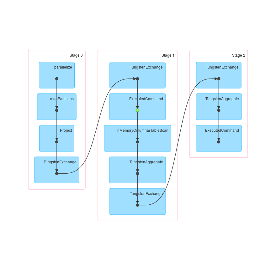 Job 1
Job 1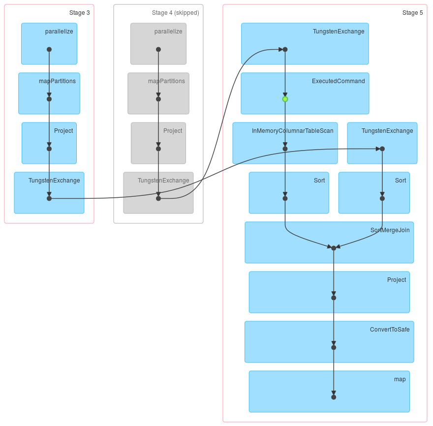 Job 2
Job 2 Job 3
Job 3